| Image |
Comment |
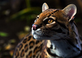
| 01/17/2006 09:58:49 AM |
Captivatedby scalvertComment: Love the colors and the candid capture of this feline. Colors are very rich and the details on the face are sharp enough for you to see all the fine hairs on this wild cat's head. A closer crop or focus such that the composition is filled by just the cat's head would keep the focus on the cat rather than the background. |
 Photographer found comment helpful. Photographer found comment helpful. |
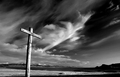
| 01/17/2006 09:53:04 AM |
Crossby BrinComment: B&W tones are wonderful and dynamic - hues are not flat. The 45 degree angle to the cross and looking up adds dramatic interest. My critique on this one is that had you further integrated the background to the object of interest this could have turned into a really unique shot. That cloud formation in the back that looks like it is escaping the main front takes on the appearance of a bird in flight/object in flight/escaping spirit. A slight change in angle would have placed the 'foot'/tip of this cloud at the center crux of the cross such that it would take on the appearance that a spirit is taking flight from the earthly plane. |
| Photographer found comment helpful. |
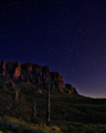
| 01/16/2006 08:46:36 PM |
Moonlight Sonataby kirbicComment: And a sky full of stars....this photo is breathtaking. Love the rich deep hues seen in the sky, the craggy mountains, and the foreground with beautiful floral ground cover. This is the sort of composition that draws one into the beauty of the scene such that we take a seat and just gaze upon the scenery. |
| Photographer found comment helpful. |
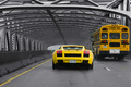
| 01/16/2006 08:41:43 PM |
Schoolboy's Dreamby davequickComment: It is quite possible this was a precariously dangerous shot to take especially if you were the driver - but this is a photo opportunity that does not come around easily so the photographer's eye was working at full speed to recognize this:-) The yellow hues of both vechicles establish a relationship between them that goes beyond them just being modes of transportation. They are nearly side-by-side. One is a sporty racy car and the other is the lumbering school bus. I can see a face in the back window that when you attach the title of thie piece to the overall elements present the meaning is instantly recognized. A boy daydreams of the day of owning a cool car like this...his mind is not at all focused on education at the moment:-) My biggest critique on this piece is that there is too much empty space surrounding the main focus/objects that they become lost in it and focus is drawn away from what you want us to really notice. The composition would be greatly strengthened if you tightly crop the frame to just have the two automobiles fill 90 % of the frame. This would also help us to see that face pressed upon the window of the bus as it seems to be looking at the sporty car passing by. |
| 01/16/2006 08:12:54 PM |
Toma Loby beamsclanComment: Love those reds and pinks that are very vibrant in this candid photo of this (Bolivian or Peruvian?) woman. And to make the composition interesting is the juxtaposition of two 'cultures': one is the south american culture with the woman dressed in the native costume and the other is the red brick wall advertising a bit of americana, Coca-Cola. I have two critiques on improving this photo. The first is to crop out the bit of street that you see on the left hand side of the composition. It adds nothing to the overall composition - in fact it distracts attention away from the main focus. The second is to see if you could get your model/subject to pose a tad more relaxed. It appears here that she is a little too nervous to pose for the camera; she is a bit too wooden. Hmmm, it maybe that the culture might still hold to the ideas that by taking a picture you are capturing there soul which would explain her unease. |
| Photographer found comment helpful. |
| 01/16/2006 07:47:23 PM |
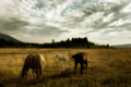
Golden Morningby cools98Comment: Love how the the lens/effect that you used to give this photo a soft look - it creates a magical mood that transports us into this dreamy scene of the horses grazing on the open plain. Rich and warm hues also give this photo an appealing look. My only critique is that I think that you could easily go for a tighter crop cutting out some of the sky & right hand portion of the photo. That would keep the focus on the main subjects and make them the literally the center of attention by having them fill more of the frame. |
| Photographer found comment helpful. |
| 01/16/2006 07:41:48 PM |
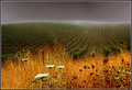
Sonoma Vineyards: Pushing Away the Fogby rjksteschComment: I love the rolling layers of colors and textures you see in this photo. It is a three tier composition. The foreground provides us with the burst of yellows while the middle is the neatly lined green rows of the vineyard. Above in the background is the grey white fog that falls like a blanket top layer. |
| Photographer found comment helpful. |
| 01/16/2006 07:36:29 PM |
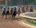
Keenelandby farmer48Comment: This is a great action shot. We can see the horses thundering down the curve of the track as their hooves pound into the ground kicking up dirt. As great as this shot is - timing is sometimes everything. To move this photo out of good to great a better shot would have been very similiar to this but it would be more closely cropped to the action AS Well AS capture the faces of the jockeys as they race towards the finish. The photo here has their faces mostly hidden behind the horses - it would really be great to see the looks and concentration of the jockeys as they spur their horse to the finishline. |
| Photographer found comment helpful. |
| 01/16/2006 07:31:10 PM |
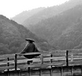
Man at Kintai Bridgeby typologicComment: I like this taste of culture photo. These types of photos have the ability to transport us to different places. There are two things that could improve the composition. First, the tones on this photo are too grey and flat -there needs to be more contrast. Next is that I think the photo composition would be better if you had composed the shot with the man on the far right of the frame so that we, the viewers, could 'visually' turn our heads in the same direction as he is to take in the view. This man is leaning back on the railing of the bridge looking at the view, but we don't really get the opportunity to 'look with him' because his viewing sight is only a small portion of the photo. |
| Photographer found comment helpful. |
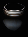
| 01/16/2006 09:28:58 AM |
Mason Jarby FrostyPawsComment: I like this composition of the simple shape of the mason jar as it 'emerges' out of the darkness. The lighting is very good and complements the main object. The curves of the of the lid seem to protrude and not only come out of the darkness but seem to come our direction. My only critique on this piece is that the lid needs a bit more lighting such that the element of curves are continued in the photo. As it stands now the top portion of the lid is a broken circle. By making it an unbroken circle it would add to the curves seen here and add a readily recognized shape that would strengthen the visual appeal. |
| Photographer found comment helpful. |
Home -
Challenges -
Community -
League -
Photos -
Cameras -
Lenses -
Learn -
Help -
Terms of Use -
Privacy -
Top ^
DPChallenge, and website content and design, Copyright © 2001-2025 Challenging Technologies, LLC.
All digital photo copyrights belong to the photographers and may not be used without permission.
Current Server Time: 08/09/2025 10:48:09 PM EDT.