| Image |
Comment |
| 05/31/2006 11:33:39 AM |
Maxwell's Silver Hammerby jimnessComment: The dirty grungy feel to the photo really helps to add to the maniacal look on this man's face as he wields that hammer in a menacing way. The whites of the eyes and teeth really pop as well as the top of the hammer - all three are what the eyes zero in on first and foremost. A good capture of Maxwell. The only critique that I can offer on this piece is that perhaps the model should be holding the hammer higher above his head so the menace of the stance better captures the imminent danger of "ang, bang, Maxwell's silver hammer Came down upon her head. It would then look like he is about to bring that hammer down on someone's head. |
 Photographer found comment helpful. Photographer found comment helpful. |
| 05/31/2006 11:09:11 AM |
Wearing the face that she keeps in a jar by the doorby Breeee123Comment: I really like the mood captured here in this composition. All the elements come together to capture the moody & meloncoly spiritof Eleanor Rigby. The face in the jar in the forefront is the first most notible object. And as it is in the song, it should be for it is this face that she wears in public - it is what most people see. But behind the face - there is a woman that remains hidden/forgotton. Here in this photo there is a woman in the background - hidden and looking into a mirror perhaps trying to find her true self. She may have even forgotten what "face" she truly wears because of the face in the jar that she wears for other people to see. Perhaps she looks in the mirror to ask herself "who is it for?" Also the model sits all alone - very much playing to the sad lines "all the lonely people". Very nicely done, captures mood and feeling of the song. |
| Photographer found comment helpful. |
| 05/31/2006 10:59:36 AM |
Little darling, it's been a long cold lonely winter (Here Comes The Sun) by gaurawaComment: After a long cold spell of this winter scene most would definately be singing "Here comes the Sun" when the sun comes out:-) Beautiful landscape with dark and cold clouds over this white blanketed earth. Though the snow is not a brilliant white it is better this way for it leans more to the mood of feeling blue and being cold. |
| Photographer found comment helpful. |
| 04/26/2006 09:46:48 PM |
Packard Wheelsby TuckersmomComment: Love the flow of curves seen here in this capture. The red helps to attract attention and add vibrancy to the creams & whites seen in the composition. Even though this is identifiable as a portion of a classic car it is a great abstract piece because of all those attractive curves the eye sees as we look upon this photo. My only critique are that it could use just a tad little more saturation to make the tones richer. |
| Photographer found comment helpful. |
| 04/08/2006 08:38:25 PM |
chocolate by ursulaComment: I remember seeing this ribboning in the Industrial Challenge but never got around to commenting on it. I really love those deep rich orange and chocolate browns in this photo. It is those hues that really make the image visually appealing - eye candy if you will. Very well done image to make the stereotypical dirty & cold steel of the industrial age look so beautiful. |
| Photographer found comment helpful. |
| 04/05/2006 12:44:54 PM |
Flowerby MAKComment: A beautiful portrait of an exotic woman holding a flower - with the title playing on the words such that the viewer reflects upon whether it refers to the plant or the lady. Love the soft tones seen in the hues and subject is lit dramatically. There are only two things that detract from the composition as a whole. First, the left half of her face is in sharper focus than the right half which appears more softer. Not this is not necessarily an overt bad thing because it at times adds to the soft delicate mood being portrayed here. Nonetheless the sharp focus of her face in entirty would be nice for it would show more details. Lastly, I think that you have too much empty space to the right of her that adds nothing to the composition. You can easily crop this to a square format to improve the composition such that the viewer's attention remains focused on your main subject. |
| Photographer found comment helpful. |
| 04/05/2006 12:34:31 PM |
Don't Call Me Yellowby cloudsmeComment: The hue of the yellows are vivid, bold, and really pop visually off of the black background. Lighting on the model is very good illuminating her while keeping good skin tones. This is a good 'portrait' shot but I think there are some elements that can be added to improve the composition and help it better match the (heavyweight or lightweight) title (sorry, could not stop myself from making a boxing reference) you have bestowed upon it. First off, I think she should be poised with her gloved fists up like she is about to spar with someone. This will show action and be better suited to match the title of the composition. I know that would remove her hand from her chest but she need not bare her breast at all - all she would have to do is keep her head in the same position and turn her back slightly more to us. Next the model's facial expression should look like she is ready to fight (them's fighting words mister) with the eyes narrowed in irritation/anger and the lips tightly pursed. Her expression in the photo as it is now has neither. |
| Photographer found comment helpful. |
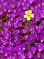
| 04/05/2006 12:18:19 PM |
Outlawby remboComment: The single yellow flower really stands out of the crowd of purple. Sharply focused we can see details with sharp clarity. This is a good picture but compositionally it needs a little help. One suggestion to make it stand out a little more from the crowd is to change the framing. Crop it to a square format so that not only would this flower be equally surrounded on all sides by the purple ones but it would also be a slight nod to 'being locked in the box'. And since this flower stands out of the crowd it would 'be outside the box'. The other thing that may or may not help is to have the purple flowers in sharp focus as well (a smaller aperature setting would give you that depth of field). I mention this as a suggestion because it would give the viewer more details to look upon to add some visual interest. And it could quite possibly make for a better 'textured' purple backdrop for the single yellow flower to visually pop off of. |
| Photographer found comment helpful. |
| 04/05/2006 11:53:53 AM |
Grass Reedsby manic35Comment: Love the sharpness of detail in the reed on the far left. Beautiful in hue and detail especially against that lovely shade of blue sky. Now what is detracting about this composition is that the first thing the viewer's attention is focused on when first viewing this photo is those two blurred reeds that are in the center of the frame. They are almost glowing and because you have positioned them in the center of the frame they are the first elements that are noticed - that is typically not where you want your attention focused if the object in that position is not in focus. The grass reed to the left should be the one to dominate the scene but as that it is off to the side and only comprises mayhap 10% of the space of the composition it gets lost. I would have settled on one or two reeds closely side by side to focus on that would fill about 40% or more of the frame with the rest seen as a golden blur in the backdrop. This photo is good but more attention to the compositional elements and placement is needed before it can move into the exceptionally good category. |
| Photographer found comment helpful. |
| 04/05/2006 11:43:58 AM |
Touch Upby banmornComment: Colors of the yellows are very bold and vibrant in this shot. Lighting and detail sharpness are done exceptionally well. The composition is good over-all but I think it mayhap suffer abit too much with 'over-saturation'. What I mean by that is that the viewer is hit up with a bit too much yellow - the yellow hue of the paint is almost the same shade as the yellow of the daisy and as such there is little contrast/difference between the two elements for the viewer to appreciate. Perhaps if the daisy was a different color the color of the yellow paint would really stand out or vice versa - i.e. painting a white daisy or some natural two-tone daisy that I have seen that are yellow & white. I do hope I am explaining what I mean effectively. Or explained in another way: If you had a painting with just shades of yellow on yellow side-by side with another painting with a shade of yellow paired with white. The two-tone painting will stand out more than the same shade painting only because visually it pops a bit more. That is what I think is needed here - an addition of another partner color that would make this visually pop more. Aside from that the photo is above average but not just yet in the exceptional category. |
| Photographer found comment helpful. |
Home -
Challenges -
Community -
League -
Photos -
Cameras -
Lenses -
Learn -
Help -
Terms of Use -
Privacy -
Top ^
DPChallenge, and website content and design, Copyright © 2001-2025 Challenging Technologies, LLC.
All digital photo copyrights belong to the photographers and may not be used without permission.
Current Server Time: 08/12/2025 11:53:24 AM EDT.