| Image |
Comment |
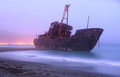
| 09/04/2006 09:40:07 PM |
GHOSTLY Wreckby dmaddenComment: Love the focus of the composition. The shipwreck is certainly a wonderful object of interest and focus. Love how the surf provides an 'errie mist' (the longer exposure really benefited this shot) for wreck and it complements the title very aptly. It makes the ship 'ghostly' and it really sets a mood for this being an errie scene to witness. And it is not just the surf 'mist' that helps set the mood of entering a supernatural world but the pale blues and purples hues. Now just as the long exposure time benefited the composition of the shot it also created a distracting element - namely those city lights that look like the shore off in the background is burning. My first thought is that you could have changed angle to avoid the majority of the light but then that would mean you would have to have taken this as a sraight on shot with us seeing the side profile of the ship. Here you have it at an angle where the front of the ship seems to be sailing right for us - this makes the shot more dynamic and interesting. So, the only other thing I can think of is to crop it closer to the back of the ship and maybe clone out some of those elements. |
 Photographer found comment helpful. Photographer found comment helpful. |
| 09/04/2006 09:30:33 PM |
"Buoy"by whatsthatbeepingComment: An interesting choice of subject but I think that you should either crop it closer to the buoy or zoom in closer. Your main subject is literally swimming in a vast water that is largely uninteresting to look at. Now yes, that does call our attention instantly and directly to the colors & shape of the buoy, but you could do that just as effectively if you presented the viewer with a closer look at the main subject. Bring the buoy to us, make it dominate the scene and strengthen the visual impact by zooming in to make the buoy occupy 70% or more of the composition. Those bold red and the white hues would visually 'pop' off of the flat grey water if it made up 70% of the compositon. A square crop could even more of a dynamic to the visual because it tightens the focus on the subject even more AND it can be a subtle addition of just another shape juxtapositioned with the round shape of the bouy. Good idea and holds promise but the presentation needs improvement. |
| Photographer found comment helpful. |
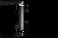
| 09/04/2006 09:20:26 PM |
Silent Rhythmby Jason_CrossComment: Elengance simply stated, simply presented. Love how the light plays around the curve of the drum and illuminates it just enough to give us the identity of this musical instrument. The light carresses the subject perfectly. You present us with just a portion of this drum and that adds visual interest because the shape, the curve of the drum, is heighted. The negative space to the right might make some say it should be cropped out, but I say it serves a wonderful purpose. It serves as the perfect, simple backdrop for the presentation in that the drum slips out from the darkness and "pops" visually off the page. The B&W was an excellent choice for the photo as that colors would have 'complicated' and made the composition 'busy'. |
| Photographer found comment helpful. |
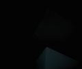
| 09/04/2006 09:13:54 PM |
Creepby NiteseadComment: I am not sure what I am supposed to see here because the image is too dark to make out any details aside from a solid black with a 'hint' at a shape of a corner of a box....Hmmm, mayhap, and I say mayhap, that that is the point. The name of your composition is Creep - maybe because it is because it is just the hint of a shape 'creeping' in on a solid black background. It creeps in the darkness and barely shows us a hint of it's existance. If this was your aim for the composition than it works, but only with a very small crowd who will sit and try to figure out what the artist's reason is for creating such a composition. For most it is just too abstract and most may just miss the point entirely. If this was not your aim then the image is way too dark for most of us to view and you need to either expose the image properly when you snape the picture OR play around with Levels, Brightness & Contrast to make your image more visible. |
| Photographer found comment helpful. |
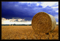
| 09/04/2006 08:51:48 PM |
Harvestby h2Comment: Love how you can see all the detail in the hay bale and of the hay stalks on the ground. Lovely rich colors on the hay. Composition holds interest - with the main hale bale in the foreground and off to the right. We see two more off in the distance as our eyes travel the 'field of gold'. My only critique is that some parts of the sky are a blown out white - several things come to mind on how to avoid that in the future - playing around with a the aperature setting (bracketing might be something to consider which is basically taking the same shot each with a different aperature setting to see what works best), possibly using a colored filter if you have one (it would greatly alter the tonal look of the picture if you went that route) or even waiting for the clouds to move and change position. |
| Photographer found comment helpful. |
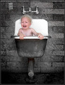
| 09/03/2006 01:24:03 AM |
Bath Timeby TerramarComment: Great expression and capture of the elements in this photo. It challenges the stereotypical thoughts that we picture of a child happily splashing in the bath. This child is absolutey NOT HAPPY! It is that atypical reaction that catches and holds our attention. For most, this capture would make us uncomfortable for no one likes to see an unhappy child - and that is the hook that you caught us by. The hook that makes us stop to look. Lighting and skin tone colors are spot on perfect. The only critique I have on this photograph is that you could eliminate the bottom portion of the image right where the pipe meets the tub and crop it to a square crop. That would strengthen the composition by keeping the attention firmly focused on your main subject - the child in the tub. |
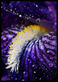
| 09/03/2006 01:13:07 AM |
Pollen Tongueby GraydogComment: Oh! Now the colors and level of detail in this flower macro is stunning!!! Love the hues of the purples and blacks for they are deep & rich. They really 'pop' visually. The additional element of the water drops adorning the flower petals adds even more visual appeal. The crop where the center of the flower (the tongue as you title it) curls down and out of the petals really anthropomorphizes this flower. |
| 09/03/2006 01:04:56 AM |
The Kite Flyersby DemonLlamaComment: The warm tones of oranges and golds invoke the feel of a sunset and some nice warm breezes. Love the silhouettes of the three men/teens and the capture of the action of flying a kite. The colors and the action in the composition really capture the spirit & mood of a carefree day. My only critique/observation is that there seems to be too much negative space on the left. A closer crop would keep the attention focused on the kite-flyers which are your main subjects. |
| Photographer found comment helpful. |
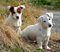
| 09/03/2006 12:57:41 AM |
Not Us!!!by SteveinnzComment: A very cute capture! I love how both pups are looking straight at us. An advantage of having the subject of you photo make eye contact with the viewer is that it draws the viewer in and compels us to look longer. You have done that with this photo. Love the expression of "Not me" that seems to be communicated in the cock of the dog's head on the right! The other dog on the left has his ears perked up which communicates a perplexed look of innocence such as "Wha! Who? Me?" I only have one critique, a small one at that, they both look so cute that one wants to get closer to them. As such, a closer crop (say a third off the bottom and a close shave near the dog on the right's ear) would bring the viewer up even closer to these young pups. |
| Photographer found comment helpful. |
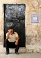
| 09/03/2006 12:41:15 AM |
Thinking...by bamboy755Comment: What really and trully makes this shot interesting and compelling is all the elements in this composition. The man sits outside the building with locked door. His stance and body language with his one hand on this forehead and the other resting on his knee comes off as either he is lost in thought or has been waiting a long time. The fact that the door is a dark black color AND there is a lock on the door invokes the idea of being shut out or locked out. A closer look (I wonder how many will stop to see it?) at the sign off to the side of the door states "The World Peace Center". With that little addition to the composition it trully sets a powerful visual of a world waiting for peace or a world waiting for the door to peace to be unlocked and open. Kudos to you for spotting this. Great eye! My only critique is since the words on the ceramic sign are essential to the message you are trying to convey they could be more legible. A simple way to do it in PS is to select either the individual words or use a square to select the white tile with everything in it. Then play with levels or a brightness & contrast. |
Home -
Challenges -
Community -
League -
Photos -
Cameras -
Lenses -
Learn -
Help -
Terms of Use -
Privacy -
Top ^
DPChallenge, and website content and design, Copyright © 2001-2025 Challenging Technologies, LLC.
All digital photo copyrights belong to the photographers and may not be used without permission.
Current Server Time: 08/13/2025 08:12:47 PM EDT.