| Image |
Comment |
| 02/12/2007 08:29:48 PM |
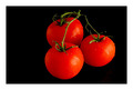
Fresh from the vineby kevip6Comment: Lighting and focus on the tomatoes is fabulous! There are some very nice details of water drops on the tomatoes which gives the impression of freshly picked & washed veggies from the garden. Great job. |
 Photographer found comment helpful. Photographer found comment helpful. |
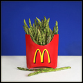
| 02/12/2007 08:21:54 PM |
If Hearts Could Dreamby muur88Comment: McDonald's goes green and heart healthy:-) Only in a dream. Concept is very creative and original. Concept and lighting on the subject is super! Focus is nice and sharp showing us all the lovely details on the asparagus "fries". Well done. I don't have any critiques on this one. |
| Photographer found comment helpful. |
| 02/12/2007 04:56:35 PM |
Garden Fresh , Grown to Perfection.by kiwinickComment: Lighting and focus on the tomatoes are very good. There are some nice details of water drops on the tomatoes which gives the impression of freshly picked & washed veggies from the garden. My only critique is the angle of which you shot the composition. Because of the dark black background and that the angle is at a slightly overhead position so that we can see all three it gives the impression that the main subjects are 'floating' in space. A lower angle that is level with the first two tomatoes will help dispell that illusion. |
| Photographer found comment helpful. |
| 02/12/2007 04:46:14 PM |
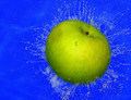
In the Poolby manishComment: Great action shot with the water splashing around the outer surface of the apple as it plunges into the pool. I know it must have been very difficult to capture this shot but I wonder if there was one with a more dynamic and larger splash. The reason why I wonder is because this capture appears as if it just hit the surface of the water. The splash radiates out but does not radiate out and up. The splash factor can increase the WoW factor and I think it just needs a little more visible force of impact upon the water. Next the blue hue is almost overpowering to the eye. While that just may be the surface of the pool there is one way to tone down the overpowering color such that it does not overshadow your main subject. A closer crop - a square crop would have done rather nicely by cutting down on the amount of blue space and bringing more attention focused on the apple & the splash. |
| Photographer found comment helpful. |
| 02/12/2007 04:35:46 PM |
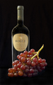
Two forms of grapeby cajayComment: Lighting is nicely done on both subjects - especially on the wine bottle as that there are no distracting reflections nor does the lighting appear flat. One little critique is that I think you could crop the negative space even closer to the bottom of the grapes. On my screen the negative space does adds nothing to the composition and it gives the appearance that the grapes and the bottle are 'floating'. |
| Photographer found comment helpful. |
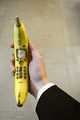
| 02/12/2007 04:30:48 PM |
Banana Phone: Executive Edditionby MarkComment: Heh, cute idea - well done on getting the props to go well with each other. It is a good photograph but it needs improvement in two areas before it can move into the above average category. First, sharpness on the main object. The top and the bottom edges of the bannana are not in as sharp a focus as the middle with the dial buttons on it. A higher F-stop say 5.6 or greater should yield you a better depth of field/sharper focus on all areas in your photo. Next is lighting. The illumination of the main object appears a little flat not to mention that the buttons could be illuminated to show more detail. Natural lighting is good but sometimes it just cannot compensate in lighting up all the important elements in the photo. A light source aimed directly upon your banana phone & at a 45 degree angle and another one perpendicular to the right of the hand at a height just above the hand could illuminate your subject better and get it to pop a little more visually. |
| Photographer found comment helpful. |
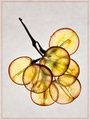
| 02/12/2007 01:16:29 PM |
Grape Bouquet by FalcComment: Now I really like what you were going for here in this presentation! Showing us the texture of the inside of the fruit; illuminating it from the inside out. Are you familiar with Steven N. Meyers who does X-ray Floral Photography? Your entry has a similar style and would really pop visually if it was on a stark white background. The 'aged' splotted paper backdrop's texture takes away from the visual impact of the grape bouquet. The same can be said of the think red border that outlines the composition. A simple & clean backdrop with no texture is needed to make this beauty SHINE by popping off the page and capture & hold our attention. Again good composition and great idea it just needs a little more attention on the execution and this photo could move out of the above average category and into the exceptional category. |
| Photographer found comment helpful. |
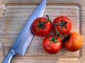
| 02/12/2007 01:03:45 PM |
Q: Fruit or Vegetable?by TonyTComment: Composition is good. Lighting is keen in any photos and this is where the majority of my critique lies. The lighting overall is good but the high gloss sheen on the tomatoes make them appear plastic and unreal. Diffused lighting instead of spot-on lighting may help eliminate the problem. The other solution is to lessen the sheen in post-processsing. Possibly using the clone tool at a setting of 30-40 opacity and going over the spots with the high sheen to tone them down will still give you the rich colors without flattening the tone. I am not sure a cutting board with all those visible cuts makes a good backdrop for the main subjects. The scuffed up/cut-up look to the board detracts some attention away from the knife and the tomatoes because they cannot visually pop off of the surface of the backdrop. Lastly I think it would have added visually if the sharp point of the knife was visible in the composition instead of cropped out. Why? Seeing the sharp edge along with the sharp point of the blade helps add subtley to the connection of slicing the tomatoes. |
| Photographer found comment helpful. |
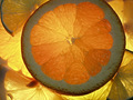
| 02/12/2007 12:52:38 PM |
Citrus Sunshineby EVincentComment: Love the warm tones of the oranges and yellows in this one. Illuminating the sliced portions of the fruit such that the light shines through not only gives us a view of all the lovely details of the fruit BUT it also gives us a warm sunshiny feeling. |
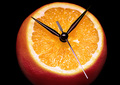
| 02/12/2007 12:49:26 PM |
A Clockwork Orangeby robaComment: Very clever! Love the title and the set-up in this one! Simple in presentation and absolutely wonderful in the execution of this image. Lighting is simply spot on fabulous! We can see all the juicy and mouthwatering details of this orange. My only critique (and it is a very small one really) is that I wish that the point of the hour hand was visible and did not disappear into the black background. 9 |
| Photographer found comment helpful. |
Home -
Challenges -
Community -
League -
Photos -
Cameras -
Lenses -
Learn -
Help -
Terms of Use -
Privacy -
Top ^
DPChallenge, and website content and design, Copyright © 2001-2025 Challenging Technologies, LLC.
All digital photo copyrights belong to the photographers and may not be used without permission.
Current Server Time: 08/18/2025 08:48:12 AM EDT.