| Image |
Comment |
| 05/31/2008 05:18:36 PM |
midhurst 3-June.jpgby wehrmacherComment: Great googly moogly! Look at the cloning job that removes all those distracting cars from the original! You did an excellent job in removing the cars from this shot. I can't figure it out sometimes I go from original to after and I swear that the richness in color tones is not the same in the after like it is in the original. Just one other suggestion now that this stone building is the main subject a boost in the brightness/contrast with a slight adjustment of clarify tool would really help to emphasize the pattern/texture of the stonework not to mention the clouds and trees. |
 Photographer found comment helpful. Photographer found comment helpful. |
| 05/31/2008 05:12:09 PM |
After.jpgby FotoMunkiComment: The closer crop really helps make the main subject take center stage. Good job in removing those distracting glare spots off the sunglasses. In the after image you would never know that they were there. I also like that you added a soft 'diffuser' type look to the final image. It softens the overall image and in my opinion complements the subject. |
| Photographer found comment helpful. |
| 05/31/2008 05:08:31 PM |
aDSC_0179.jpgby JakerComment: Like everyone else I too agree that the the after composition is improved because the clouds appear dark and brooding. It sets the mood for the shot that the original does not. Really nice conversion from color to B&W. The tones and contrasts are excellent and visually pop - they are not flat and dull. |
| Photographer found comment helpful. |
| 05/31/2008 05:05:34 PM |
Bridal Wreath Editedby TCGuruComment: Nice job on isolating the flowers and making them pop off the dark backdrop. While the white of the flowers really pop off nicely off the dark background I think that unless you are adding text/poem to the left that the flowers seem to be pushed too much off to the side and thus the emphasis of them being the main subject diminishes. You removed the green leaves from the composition all together and I think that doesn't help the composition overall. The flowers seem to hang in negative space - a bit of green would help add some color punch and help 'ground' them a bit. I can't tell for certain which bunch of flowers you took from the original my guess is the bottom ones. May I suggest that the top middle might be better for two reasons. First is that that particular group appears to 'extrude' out towards the viewer rather than lean down to the left like the bottom group. Hmmm, mayhap it is because the cluster is more in a tighter round circle than the bottom one but because the appearance 'looks' like it is coming towards you visually it is more appealing. Second, the leaves surrounding that cluster adorn it in a more appealing fashion for you have them loosely 'encircling' the cluster in a starlike pattern. |
| Photographer found comment helpful. |
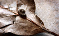
| 05/31/2008 04:46:45 PM |
Worm Friend Editedby TCGuruComment: Cropping to bring the viewer closer the main subject is always a good thing for emphasizes the main subject and brings out details we might not notice in the original. Brightness/contrast and the dodging & burning really help emphasize the textures and patterns. The color balance/shift really brought out more warmer tones. The contrast and color hues in the original are rather flat. In this image they are warm and the contrast between light and dark really helps the image pop visually. |
| Photographer found comment helpful. |
| 05/31/2008 04:30:24 PM |
After Rachelby gwe21Comment: Bringing us closer to your subject is always a plus. The After composition improves dramatically from the original simply because now your main subject fills the frame. The brightness/contrast brightened her face and improved the flat colors in the skin tones seen in the original. The addition of catchlights in her eyes is a nice touch - a twinkle in her eyes. Good job. |
| Photographer found comment helpful. |
| 05/29/2008 10:08:35 AM |
Annie and Henna Lady after.jpgby wehrmacherComment: Wow a lot of nice processing to make the two ladies stand out from the background of the shot. You don't list the steps you took to make the final composition but I can take a guess that it was a combination of blending two images, selection of background (gotta love that select tool:-) ), blur and clone tools that helped make the photo. Good job in blurring the background for now that really makes the two ladies the true focus/stars of the shot. Cloning out some of the people in the background (including that man in the backdrop between them in the original) eliminated the distracting elements that drew attention away from the main subject of your shot. Lighting on your two main subjects was wonderful in the original and they remain beautifully so in the after photo composition. The only change to the lady in pink from the original is that she now has her eyes open rather than squinting. My guess, and only a guess, is that you snapped two shots and one showed better eyes than the other (but this one had more character because of the friendly comraderie that the two woman show here). Good job on the blending of the eyes - it is flawless; had you not posted the original you could not tell she had some work done to 'open' her eyes. |
| Photographer found comment helpful. |
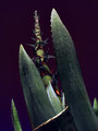
| 05/29/2008 09:55:51 AM |
AgaveTall_IMG_2717eCZ-DPC.jpgby GeneralEComment: Now this is an after where the subject really pops visually and the interest in the photo literally shoots up skyward!! The original has flat contrasts and aside from interesting angle it is compositionally not enough to hold the attention of the eye. But this after image REALLY reaches out and holds one's attention. The agave plant takes on an aspect of some Dark Tower rising up into the brooding night sky. The darker background really allows the textures on the plant to pop and be noticed much more than the original. Love those groves that one can see in the 'leaves'. The 'thorns' take on a much more menacing aspect in this after composition for the spikes are black and sharp extruding from the stalk - seemingly having forcefully punctured through such that 'blood' is adorning the base of the 'thorns'. |
| Photographer found comment helpful. |
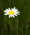
| 05/29/2008 09:47:00 AM |
Daisy Editedby TCGuruComment: Very nicely done. The added punch of color and the contrasts are greater in this after shot than the before. The photo has more visual impact with the greater contrasts such that the daisy now shines out from the backdrop - and the color hues are richer and deeper rather than flat as the original shows. |
| Photographer found comment helpful. |
| 05/18/2008 10:47:11 AM |
Coffee Shop Fossilsby AliciaComment: Wow, this is a cool composition. Makes me think of a coffee house, art center, art deco, and neon lights combined. A very cool, hip, artsy place to hang out, have a cup of coffee and enjoy the art and/or literature in this coffee house. Love the bold colors that pop visually. The striking differences in contrast between light and shadow give it distinctive look that is both appealing and takes on the appearance of a painting. Nice work. |
| Photographer found comment helpful. |
Home -
Challenges -
Community -
League -
Photos -
Cameras -
Lenses -
Learn -
Help -
Terms of Use -
Privacy -
Top ^
DPChallenge, and website content and design, Copyright © 2001-2025 Challenging Technologies, LLC.
All digital photo copyrights belong to the photographers and may not be used without permission.
Current Server Time: 08/19/2025 08:04:18 PM EDT.