| Image |
Comment |
| 04/04/2007 02:42:51 AM |
|
 Photographer found comment helpful. Photographer found comment helpful. |
| 01/10/2007 04:36:03 PM |
Single White Maleby tooleComment: I really like this shot, but I just wish it looked a bit sharper. Very nice idea nonetheless. Good luck! |
| 12/22/2006 11:56:18 AM |
Odd One Out at the Farmer's Market by commendatoriComment: Originally posted by David Ey:
Originally posted by whiterook:
what is the different this picture and the washer machine? I don't see no differnt in both shots! |
I have no idea either,other than this was a 3 and the other was a 2 to me. Why would anyone want to display this photo?
Guess I'm just not artsy enough. |
Sad that you really don't see a difference, but to each their own, I guess.
Thanks to everybody for all the comments, even negative ones (so long as there's a point; "could do better" isn't really helpful, whereas "don't like the contrast, maybe you should've..." is). Thanks again for my first ribbon! Very exciting! |
| 12/13/2006 04:01:40 PM |
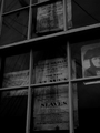
A quantiy of fine silk & other goodsby fredandaudComment: This looks like a really nice shot--I assume that you wanted to keep it a bit dark on purpose, but I think that it's too dark--I have to struggle to make out what's on the signs. You could of taken advantage of the advanced rules to brighten certain things while keeping others darker--could've created a stronger contrast too. |
| 12/13/2006 03:55:27 PM |
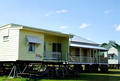
Home Delivery...Literallyby WildcardComment: I really like this idea and the title, but the shot seems to be lacking something to me--it just seems a little uninteresting. Could be that the sky is taking up too much of the frame. Did you try cropping it, or even darkening (burning) the sky? |
| Photographer found comment helpful. |
| 12/13/2006 03:52:05 PM |
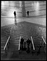
Quiet day at the Mallby e301Comment: Very nice shot. I really like the symmetry of the shot, and how white the handrails look, which form those very distinct lines, but if it wasn't for the title, the shot doesn't convey anything being for sale to me. |
| Photographer found comment helpful. |
| 12/13/2006 03:48:13 PM |
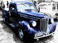
Priceless Saleby dx_powerComment: It seems that there's someone's head sticking out behind the roof of the car that still has it's color. Other than that the selective desat works very well. Looks very sharp! Good luck! |
| Photographer found comment helpful. |
| 12/13/2006 03:46:02 PM |
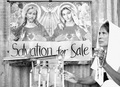
Salvation For Saleby lovemelvinComment: I think that a little more contrast would've worked well here--it seems a little flat to me, but a very nice and different shot. Good job and good luck! |
| 09/06/2006 07:33:16 PM |
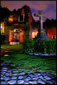
Home sweet homeby patrinusComment: Very nice contrast of colors. All the colors in this shot are actually quite pleasant (as opposed to overwhelming), especially for a night shot. Best of luck. |
| Photographer found comment helpful. |
| 09/06/2006 07:31:13 PM |
Sculpture of Natureby HoddssonComment: Very beautiful shot, but it looks a little washed out to me. Maybe you should try increasing the contrast a little? Besides that, very nice. Good luck! |
| Photographer found comment helpful. |
Home -
Challenges -
Community -
League -
Photos -
Cameras -
Lenses -
Learn -
Help -
Terms of Use -
Privacy -
Top ^
DPChallenge, and website content and design, Copyright © 2001-2026 Challenging Technologies, LLC.
All digital photo copyrights belong to the photographers and may not be used without permission.
Current Server Time: 06/27/2026 06:45:03 PM EDT.