| Image |
Comment |
| 09/04/2005 08:51:33 PM |
ShOe aRtby senojComment: I guess you submitted the wrong pic by mistake or something, yes? If not, then I can't see anything in focus or relating to shoes there at all. |
 Photographer found comment helpful. Photographer found comment helpful. |
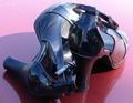
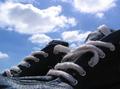
| 09/04/2005 08:49:37 PM |
my favoritesby paholl31Comment: A bit distracting the way you caught yourself (along with a fair bit of your neighbourhood it seems) in the reflection on the heels. Maybe if your cropping was a bit less enthuastic and included the shadow and reflection of the shoe on the bonnet (i assume it's a car) the composition would improve quite a bit. It would strengthen the effect of the glossy shiny textures in this shot. |
| Photographer found comment helpful. |
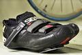
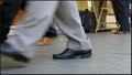
| 09/04/2005 06:25:37 PM |
Dying to Rideby BikeRacerComment: Composition would be stronger if the shoes were seperated slightly. At first glance it just looks like one shoe. Also a small point but, they look more like: 'resting away from the bike' than 'dying to ride'. Wouldn't they be clipped into the pedals? Nice use of depth of field to pick out the subjects. |
| Photographer found comment helpful. |
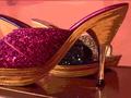
| 09/04/2005 06:20:15 PM |
Sparkle and Shineby rachaComment: The effects are unnecessary and distracting from the textures which are suppossed to be the subject of the shot. The composition also seems awkward. Why is there one shoe facing the opposite way? |
| 09/04/2005 06:02:46 PM |
Suzie Wong's Red Boots.by modprodComment: Seems more like a pic of Suzie Wong than her boots. Even as a portrait of Suzie rather than her boots the hair in her eyes is annoying, and there's a lot of empty space above her serving no discernible purpose. You could have made this fit the challenge by using less, like maybe just the boots and the tattoo. Less is more. |
| Photographer found comment helpful. |
| 09/04/2005 05:58:24 PM |
Sun drying sneakersby pacpintoComment: NIce composition although without the title the image doesn't make sense. The focus seems to be more on the clouds than the shoes. |
| Photographer found comment helpful. |
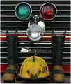
| 09/04/2005 05:56:26 PM |
In Honor Of Our Firemenby LindaEComment: The shot's far too busy and the boots are fighting for position with too many other elements. Could be arranged better. |
| 09/04/2005 05:54:56 PM |
Retired...by ahaywehComment: A very strong image with great potential. It seems like the viewer isn't square on to the window, and is looking up at it. If the shot had been taken straight on, and the top had been cropped to remove the distracting roof details and the bottom cropped to even out the border this would have made the window the canvas and the silhouette would have been even stronger. 5 |
| Photographer found comment helpful. |
| 09/04/2005 05:45:56 PM |
Tight fitby GoliatComment: Not a pretty foot, and I fail to see the relevance of the title. It looks like the shoes fit. The cross dressing theme hasn't been used anywhere near it's potential. The possibilities for farce have been completely passed up for this fairly uninspiring picture. |
| 09/04/2005 05:36:49 PM |
Distant shoe, near shoeby sersalComment: Looks too much like a snapshot and isn't telling me anything about the "distant shoe" or the "near shoe", and why the crop in the closest shoe? Just seems like an exercise in use of DOF (which incidentally was done well). |
| Photographer found comment helpful. |
Home -
Challenges -
Community -
League -
Photos -
Cameras -
Lenses -
Learn -
Help -
Terms of Use -
Privacy -
Top ^
DPChallenge, and website content and design, Copyright © 2001-2025 Challenging Technologies, LLC.
All digital photo copyrights belong to the photographers and may not be used without permission.
Current Server Time: 08/24/2025 12:27:50 AM EDT.