| Image |
Comment |
| 12/03/2002 04:30:00 AM |
My Room Through A Teacupby lamentComment: i bte you're getting marked down due to blurriness issues, right? not from me. this is my favourite type of photo. 10. |
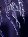
| 12/02/2002 01:56:00 AM |
Icy Coldby RiderGalComment: disregard any other comments on how you used depth of field. i think it works perfectly. it really makes this picture. 9 |
 Photographer found comment helpful. Photographer found comment helpful. |
| 12/03/2002 08:39:00 PM |
Landscape Portraitby GordonComment: the subtle blue works well with the white. the eyes are at just the right height in the shot. pretty good shot. 6 |
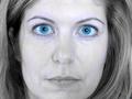
| 12/03/2002 12:26:00 AM |
Portrait in Blueby kathleenmComment: generally, a good idea, if very common this challenge. i would have a liked a different pose (more blue looking, i guess) and the yellow in the skin is really distracting. |
| Photographer found comment helpful. |
| 12/02/2002 01:59:00 AM |
|
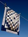
| 12/03/2002 08:28:00 PM |
On Lineby boyte1Comment: so that's what the amish use their phone lines for. the off center diagonal composition works very well, and the dark blue and white of the quilt contrasted with the lighter blue of the sky is really pretty. good show. 8 |
| 12/02/2002 11:43:00 PM |
Self Portraitby jkiolbasaComment: you look rather stressed out. i don't think the blue tint was neccessary, but it's probably resulting in higher votes here. i woulda gone with plain old black and white. |
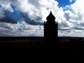
| 12/03/2002 12:40:00 AM |
Dark Blue Skyby victor01Comment: some definition in the lower half would be nice. unless you cut most of that out, then the silhouette would work beautifully. as it is, it's too distracting from the sky, and too void in comparison, and is distracting from the sky, which i assume by the title you mean to be the focus. if you resized it a bit bigger, and cropped down to 640x427 so that the ground took up a third or preferably less of the shot, and the tower was just a little further to the right it would be an absolutely amazing shot. |
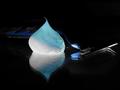
| 12/02/2002 11:50:00 PM |
Smooth as ice, Gillette Mach 3 Blueby f0rceComment: the shaving gel (cream?) is rather interesting, but the razor is too dark against the black background, and is a little hard to pick out. other than that, the composition is well thought out, and the colors work well. the choice of a reflective surface was a good one. |
| 12/02/2002 01:50:00 AM |
|
| Photographer found comment helpful. |
Home -
Challenges -
Community -
League -
Photos -
Cameras -
Lenses -
Learn -
Help -
Terms of Use -
Privacy -
Top ^
DPChallenge, and website content and design, Copyright © 2001-2025 Challenging Technologies, LLC.
All digital photo copyrights belong to the photographers and may not be used without permission.
Current Server Time: 08/17/2025 10:02:13 AM EDT.