| Image |
Comment |
| 09/08/2007 08:22:39 PM |
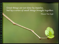
...series of small things...by FocusPointComment: Although I'm not crazy about the choice of font for the header on the left, I like seeing it run vertically. It's a nice change from all the other entries. |
 Photographer found comment helpful. Photographer found comment helpful. |
| 09/08/2007 08:21:08 PM |
|
| Photographer found comment helpful. |
| 09/08/2007 08:20:13 PM |
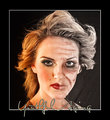
Wisdom of Age w/ the Beauty of Youthby littlegettComment: Hmmm, interesting image, yet for me, not very motivational. The left hand side of the lips looks overly done with the lipstick compared to the shape of the lips on the right. Point for creativity though. |
| Photographer found comment helpful. |
| 09/08/2007 08:13:08 PM |
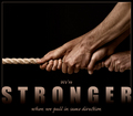
We're STRONGER when we pull in same directionby h2Comment: Good image and header. I like your use of gradient and sans serif font choice. I do wonder how the sub headinggs would look in a thinner sans serif font like optima or maybe century gothic. I'm not sure the cursive font works well with "stronger." |
| Photographer found comment helpful. |
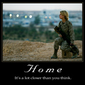
| 09/08/2007 08:10:30 PM |
Homeby CorySmithComment: I like the image. It ties in well with your heading. Nicely done. With a bit more light or color contrast on the image, I would have scored it higher. |
| Photographer found comment helpful. |
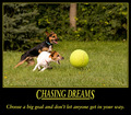
| 09/08/2007 08:02:29 PM |
Chasing Dreamsby StigerComment: LOL - love the photo and the saying below the header. Not so crazy about the header iself. Perhaps if is were spead out a little bit more. The italics make it seem "squished." |
| Photographer found comment helpful. |
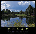
| 09/08/2007 08:00:31 PM |
*R E L A X*by elizadebComment: Nice image. I like the font for the heading. A little too much kearning between the sub-heading, but that's just my taste. |
| Photographer found comment helpful. |
| 09/08/2007 07:58:49 PM |
|
| Photographer found comment helpful. |
| 09/08/2007 07:58:08 PM |
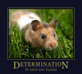
Determinationby Wenders11Comment: Lol - Oh my gosh! How cute is this!! Lol I love it. So very sweet. I truly hope this finishes in the top three. |
| Photographer found comment helpful. |
| 09/08/2007 07:56:42 PM |
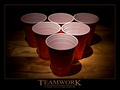
TEAMWORKby SamDoe1Comment: I like the image and lighting. The teamwork heading works, but for the life of me, I don't understand how your subheading fits with it. Hmmm. |
| Photographer found comment helpful. |
Home -
Challenges -
Community -
League -
Photos -
Cameras -
Lenses -
Learn -
Help -
Terms of Use -
Privacy -
Top ^
DPChallenge, and website content and design, Copyright © 2001-2025 Challenging Technologies, LLC.
All digital photo copyrights belong to the photographers and may not be used without permission.
Current Server Time: 06/28/2025 12:02:32 AM EDT.