|
|
|
Showing 1141 - 1150 of ~1485 |
| Image |
Comment |
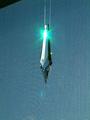
| 12/10/2002 10:35:32 AM | Right from the Sourceby MaytagmanComment: CRITIQUE BY NATASHA FOR CRITIQUE CLUB
CONTENT COMPOSITION
I think that you have a bit too much empty space here, so the impact of the crystal is lost. If you had cropped off the top couple of cms, you would have got rid of the ditracting black corner and added more emphasis on the crystal. A real close up of this could have been interesting and you could try photographing it from different angles. However, I think that the background is good and the way the background is shown through the crystal is interesting.
CAMERA WORK TECHNICAL
Focus appears to be on the backround instead of the crystal, which is a shame as the crystal has some interesting shapes at the bottom and would benefir from being sharper. The lighting is also a little harsh, especially on the left side of the crystal, maybe try a bit of indirect lighting or even candle light could be cool.
MY OPINION
Overall, its a good capture of something blue and with a bit of cropping and sharper focus would be great. Its an original picture and the starburst from the lighting is cool! I hope that this helps! |
| 12/10/2002 10:19:27 AM | Feeling Blueby motoedComment: Critique by Natasha for the Critique club
CONTENT- COMPOSITION
You have captured the feeling off blue well here, theres no mistaking the emotion. Drawn to the sadness of the eyes and the downturned mouth adds to the effect. For some reason, I find the wedding ring a bit distracting (maybe cause I just got married and feel it doesnt relate to blue!) Composition is good and I like the placement of the face, could possibly be moved slightly to the right, to include the edge of the left eye and the head placed slightly lower in the frame, cropping off a bit of the hand.
TECHNICAL -CAMERA
I like the blue tint that you have used, some of your comments say that it is a bit dark, but I think its fine, however the lighting on the hand is a bit brighter than the face, so this could be evened out a bit.
MY OPINION
You did a great job here of capturing the emotion of blue and I give you credit for trying this, most of us took the easier route and photographed something blue. Focus could be a bit sharper overall, to give it a bit more impact. Great job and I hope that you find this critique helpful. |
| 12/09/2002 10:48:24 PM | My Room Through A Teacupby lamentComment: I agree, I like it too! Thought it should have done better, but I suppose this kind of style doesn't appeal to the masses. |
| 12/09/2002 09:57:29 PM | Corne by muckpondComment: Excellent lighting and composition, a very crisp picture. Good Luck |
| 12/09/2002 09:56:29 PM | |
| 12/09/2002 09:52:40 PM | |
| 12/09/2002 09:44:39 PM | |  Photographer found comment helpful. Photographer found comment helpful. |
| 12/09/2002 09:40:48 PM | |
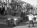
| 12/09/2002 09:39:05 PM | Market Streetby MiekaComment: Just wondering why you chose to use B/W, would have thought that there would be some interesting colours here. Overall the picture is a bright bright, could do with darkening a bit. Good Luck | | Photographer found comment helpful. |
| 12/09/2002 09:37:23 PM | |
|
Showing 1141 - 1150 of ~1485 |
Home -
Challenges -
Community -
League -
Photos -
Cameras -
Lenses -
Learn -
Help -
Terms of Use -
Privacy -
Top ^
DPChallenge, and website content and design, Copyright © 2001-2025 Challenging Technologies, LLC.
All digital photo copyrights belong to the photographers and may not be used without permission.
Current Server Time: 08/20/2025 07:48:00 PM EDT.
|