|
|
|
Showing 1101 - 1110 of ~1485 |
| Image |
Comment |
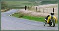
| 12/30/2002 10:53:53 PM | Remote Journeyby autoolComment: Excellent! Great idea, and great composition. Like the use of the complementary borders. |  Photographer found comment helpful. Photographer found comment helpful. |
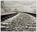
| 12/30/2002 10:49:59 PM | Traveling By Rail by TarbiniComment: Great composition and sharpness. Wonder if less light would have been good here, some areas seem a bit wshed out. Great shot though! | | Photographer found comment helpful. |
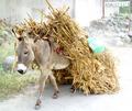
| 12/30/2002 10:46:42 PM | Traveling Through Hidalgoby JEMComment: Love this!! Lighting is a bit harsh, especially on the right of the picture, could have been toned down a bit. Maybe a closer crop of the donkey would have been good | | Photographer found comment helpful. |
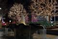
| 12/30/2002 10:43:42 PM | A site to see from the squareby YomiComment: Very pretty. Would like to have seen a bit more, maybe moving back or less cropping could have included more of the fountain and also the top of the tree. | | Photographer found comment helpful. |
| 12/22/2002 08:46:02 PM | Wailin' the Bluesby KarenBComment: This looks great, it has so much chararacter. Great shot! Should have done better. | | Photographer found comment helpful. |
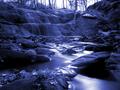
| 12/20/2002 09:25:53 AM | The Fallsby jmsetzlerComment: Hi there John, had just finished writing this and then for some reason unknown to me, it suddenly disappeared. OK, let me try once again!
Critique Club
As always this is an outstanding picture from you, I was interested to see your take on landscape and was unsurprisingly impressed with this beautiful picture. The beauty that you have captured and the process you used to achieve it are both superb. You have met the challenge well and even though photographing a favourite subject, you have managed to create a very unique picture. I love the blue tone and the effect of the infrared, especially on the foreground water, which has become almost metallic, it has a very mythical feel to it. Your composition is great, I especially like the leaves in the foreground. I think that this would make a wonderful panoramic picture, cutting out the waterfall and concentrating on the texture and colour of the foreground water would make a very simple yet etheral picture. Although the waterfall fits the challenge and adds to the overall composition, I feel that the slightly blown out sky, brings us back to reality, in comparison to the foreground. Overall, I love this picture and was surprised that it wasn't in the top three, though to be honest the beauty of this stands alone. I look forward to seeing your future work. |
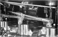
| 12/19/2002 11:54:47 AM | 50's Street Raceby autoolComment: Critique Club
You have done a great job of depicting motion and your idea was both unique and unusual. I love the use of B/W not only cause I am a fan of B/W but also cause it totally suits the subject . You did a great job of controlling the light on the chrome, I am sure that took a while not to have the lighter parts of the metal blown out, however I think a bit more contrast overall would have been good and might have emphasised the motion even more. As the content of this picture is so strong and hard, this would have been very powerful with strong contrast and slightly sharpened edges. I think overall you took a great picture, even though personally machines are not my thing, the composition and original approach to�@motion has impact. Good Luck in the next challenge! |
| 12/19/2002 11:24:23 AM | |
| 12/18/2002 08:56:15 PM | Bloomingdales Candid 1by smellyfish1002Comment: Critique Club
This is a fantastic picture and I think that it should have been in the top three, it's a unique picture. The choice of B/W adds a cool feel to this and emphasises the composition. The guy in this would have been a perfect candid by himself but the billboard behind him adds the WOW factor, great composition and capture of this. The graduation of dark to light from left to right brings you into the picture and brings the viewers eyes to the two faces. To be honest, I have no recommendations to improve this picture, the lighting, exposure and focus all seem perfect, composition is fantastic and the mood of it has impact! Congrats on 7th place! | | Photographer found comment helpful. |
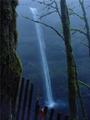
| 12/18/2002 08:42:15 PM | Foggy Mistby MarlaComment: Critique Club
Composition-content
This is a really beautiful picture, the misty blue and mossy green colours are great. The placing of the waterfall is great, the line of the tree totally complements the waterfall. As many people have mentioned, the fence is a real distraction, for me this detracts from the overall beauty of the shot. Did you try leaning over the fence, maybe you didnt want to get too close to the edge, looks a long way down! I also wonder if there was place at the bottom of the fall that you could have taken this, looking up would have placed emphasis on the bottom of the falls and added emphasis to the motion of the water, while at the same time giving you the space to include only the elements that you want.
I love the lighting and the mist really adds a magical feeling to this. The bottom of the waterfall is especially lovely.
Overall, I love this picture, if you could only find a way to get rid of that fence this would be fantastic! Congrats on 7th place! |
|
Showing 1101 - 1110 of ~1485 |
Home -
Challenges -
Community -
League -
Photos -
Cameras -
Lenses -
Learn -
Help -
Terms of Use -
Privacy -
Top ^
DPChallenge, and website content and design, Copyright © 2001-2025 Challenging Technologies, LLC.
All digital photo copyrights belong to the photographers and may not be used without permission.
Current Server Time: 08/21/2025 05:09:59 AM EDT.
|