| Author | Thread |
|
|
12/23/2002 12:47:27 PM |
|
|
|
12/23/2002 12:14:57 AM |
|
this shot is absolutely gorgeous---i would put it on my wall! awesome work. |
|
Comments Made During the Challenge  |
|
|
12/22/2002 09:53:18 PM |
|
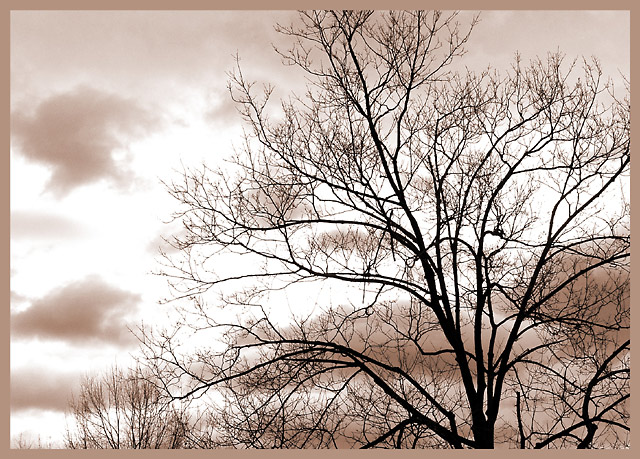
Yes. I like these silhouettes better in B&W/sepia. Goo job. Jacko 8 |
|
|
|
12/20/2002 01:42:22 PM |
|
challenge met. i like how you balance the tree and the clouds as subjects in the photo. i would like to see more of the bottom of the tree, but i suspect the "hand of man" would show itself in some way, shape, or form. i also like the color you have chosen for this photo, it works very well. while the frame matches that color well, i personally don't like it so much. i think a black frame would've worked better here (since you can only use one frame). with multiple frames, maybe just add a thin black line and then test out this frame again. but then, that's just personal taste, anyway. |
|
|
|
12/20/2002 10:20:32 AM |
|
Very nice composition. I like the duotone you used on the clouds. Another of the nicer tree silhouette photos in this challenge. |
|
|
|
12/19/2002 04:56:41 PM |
|
|
|
12/19/2002 01:55:23 PM |
|
Very nice! The sepia tone is perfect. Good composition and focus. Top ten for me this week. |
|
|
|
12/19/2002 11:24:23 AM |
|
I love the toning and the border here, great job! |
|
|
|
12/19/2002 12:39:42 AM |
|
There are a couple patches in the sky that seem just a TAD too bright. Otherwise, I think this is a wonderful shot. I like the sepia tones and the angle and framing/cropping are good. No signs of man here. The focus is nice, and lighting on the subject its self is good. Good luck in the challenge. |
|
|
|
12/18/2002 01:22:56 PM |
|
Nice use of tinting, and framing. The sky seems a little too bright in parts, but overall a very pleasing image! |
|
|
|
12/18/2002 01:05:26 AM |
|
I like the sepia and your border. Good composition as well. DPz |
|
|
|
12/17/2002 08:08:18 PM |
|
Ahhhhh some. Beautiful frame choice too. |
|
|
|
12/17/2002 07:31:11 PM |
|
Nice wintery scene, but it just doesn't excite me much. Maybe it would have been better if the tree top had been left in. |
|
|
|
12/17/2002 07:21:08 PM |
|
Nice shot, good choice of border. I think this might have worked a tiny bit better with just one tree in the frame, but the others don't "ruin" it. 8 Swash |
|
|
|
12/16/2002 10:10:21 PM |
|
nice image, i like the look and feel of the pic. |
|
|
|
12/16/2002 08:11:33 PM |
|
I'm not sure if I get your title. I don't see hills anywhere. Too bad about the trees in the background, This photo would be beautiful without them. Good composition, and great focus. Wish you could maybe see a little more of the main tree. Not extremely interesting, but it fits the challenge. -5 |
|
|
|
12/16/2002 01:51:58 PM |
|
Pretty. Not crazy for the crop at the top. Love the color. Strong shot. |
|
|
|
12/16/2002 01:15:08 AM |
|
Oh this border works great with this shot. I love the way it looks. I think a crop with more of the tree in the shot would improve it, maybe with some sky showing above the highest part of the tree. Overall well done, Looks great. |
|
|
|
12/16/2002 12:37:49 AM |
|
Home -
Challenges -
Community -
League -
Photos -
Cameras -
Lenses -
Learn -
Help -
Terms of Use -
Privacy -
Top ^
DPChallenge, and website content and design, Copyright © 2001-2026 Challenging Technologies, LLC.
All digital photo copyrights belong to the photographers and may not be used without permission.
Current Server Time: 06/27/2026 04:24:53 PM EDT.