| Image |
Comment |
| 04/21/2006 11:14:44 PM |
A New Spring Flowerby TroutbearComment: I find very distracting the shallow depth of field you've used, as it totally blurs the top half of the flower. It's still a good picture, but it leaves something significant to be desired. You might have used a narrower aperture, or focused at an interim portion of the subject, so to leave more of it at both ends in the circle of confusion. |
 Photographer found comment helpful. Photographer found comment helpful. |
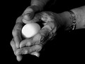
| 04/21/2006 11:12:08 PM |
Renewalby Canadian_ehComment: The shot looks over-processed to me, but, nevertheless, I find it to be a good, solid photograph. |
| Photographer found comment helpful. |
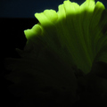
| 04/21/2006 11:06:42 PM |
Dawnby GunnsiComment: I see what appears to be a leaf of lettuce (poorly in focus) the top part of which is over-exposed, and the rest of which (along with the entirety of the photograph) is indiscernible. |
| Photographer found comment helpful. |
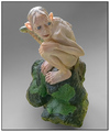
| 04/21/2006 11:04:50 PM |
My New LOTR Modelby BrookiedComment: Ummm...yeah, I don't think this really goes (at all) with the theme of this challenge. You might rack up some points with diehard "LOTR" fans, but I'm going to have to give this "stretch" a low score for being totally inconsiderate of the guidelines. |
| Photographer found comment helpful. |
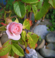
| 04/21/2006 11:03:35 PM |
Blooming Roseby MushComment: I think a shallower depth of field could have helped bring out this subject; also, I'd have liked to see a tighter crop. Nonetheless, it's a pretty shot. |
| Photographer found comment helpful. |
| 04/21/2006 12:37:07 AM |
Old Stumpyby amjltComment: There seem to be some very distracting technical short-comings in this image, mostly "processing-related." |
| Photographer found comment helpful. |
| 04/21/2006 12:35:37 AM |
Donby dsa157Comment: Wow, this picture really didn't look all that impressive as a thumbnail, but � "actual size" � it's awesome. This is one of the bext portraits I've seen recently. |
| Photographer found comment helpful. |
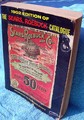
| 04/21/2006 12:34:13 AM |
1902 Sears Catalogueby RubyRedComment: A great subject for the challenge, but technically unimpressive in most regards. The flat blue colors are unappealing, the inclusion of the paper clip seems thoughtless, the blue towel is a poor choice for a "filler"...I just feel that the picture could have been better handled. |
| 04/21/2006 12:32:04 AM |
Serving You Since 1933by GivemeashotComment: What exactly am I looking at? All I see is a noisy, poorly-focused, uninteresting image that bears little resemblance to anything that belongs in this challenge. |
| Photographer found comment helpful. |
| 04/21/2006 12:30:34 AM |
The Oldest -- The Sunset ....by choppersComment: Uhh...it's a landscape shot. Why exactly is it in this challenge? I've seen some "strectes" as far as titles are concerned, but this "stretch" doesn't even make sense. Absolutely no effort to meet the guidelines ought to get you a "0." |
Home -
Challenges -
Community -
League -
Photos -
Cameras -
Lenses -
Learn -
Help -
Terms of Use -
Privacy -
Top ^
DPChallenge, and website content and design, Copyright © 2001-2025 Challenging Technologies, LLC.
All digital photo copyrights belong to the photographers and may not be used without permission.
Current Server Time: 08/05/2025 03:30:10 PM EDT.