| Image |
Comment |
| 10/31/2005 07:49:27 PM |
Xylemby banditComment: The good: Great idea. The focus plane is sharp:
To work on: The vignette in the corner detracts as does the out of focus portion. Use a deeper DOF. |
 Photographer found comment helpful. Photographer found comment helpful. |
| 10/31/2005 07:48:20 PM |
Transparent Ripplesby MattOComment: The good: creative.
To work on: 1) the top of the splash is cut off. 2) The reflections detract (use a polarizer), 3) The ripples just happened to distort the face a little too much (this is just a matter of repitition and picking the best one). |
| Photographer found comment helpful. |
| 10/31/2005 07:46:59 PM |
Samara by kiwinessComment: Been done before, of course, but this is well executed. Was Samara the name of the girl in The Ring? Man that movie creeped me out. Your attempt at looking like her (if this is indeed what you're going for) was great too. The only criticism is the background. Why did you pick the stairs? They don't add to the atmosphere. 7 |
| Photographer found comment helpful. |
| 10/31/2005 07:45:25 PM |
I See You, Grumpy Ol' Fishby SandyPComment: The good: interesting perspective on the fish, the water distorted it in an interesting way.
To work on: the rest of the picture isn't too inspiring. You did about as much as you could with this shot, but your subject keeps you from soaring. |
| Photographer found comment helpful. |
| 10/31/2005 07:44:22 PM |
Windowsby flip89Comment: I like it. If I'm being really picky I clone out the people on the left and I use a polarizer to remove the mild reflections in the windows. Good capture though. 7 |
| 10/31/2005 07:43:35 PM |
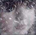
trapped in the bubblesby suemackComment: The good: creative.
To work on: it's always nice to keep an eye unobstructed. Could you have composed with her eye right in one bubble? The lighting isn't very exciting. |
| Photographer found comment helpful. |
| 10/31/2005 07:42:24 PM |
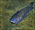
Room with a viewby KiwiChrisComment: Heh, I almost did a shot like this. Good for both of us I didn't. If I have one complaint, it's the fish looks a bit washed out. 8 |
| Photographer found comment helpful. |
| 10/31/2005 07:41:42 PM |
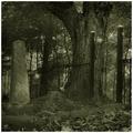
There You Areby JPRComment: I like this one. That "ghost" is just right. Very faint, yet noticeable. Oh, I just noticed the other ghost (the one sitting). That one is perhaps a little too dim as I almost missed it. 8 |
| Photographer found comment helpful. |
| 10/31/2005 07:40:31 PM |
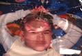
red veilby arngrimurComment: The Good: creative, in a way I like the red tint.
To work on: The red is not kind on her face, mainly her left cheek. The crease right over her eye is also not optimal. |
| Photographer found comment helpful. |
| 10/31/2005 11:34:34 AM |
Window to Her Wondrous Soulby lynnesiteComment: ha, I'm happy I guessed it was you. Sorry to harsh on you about the grain, but this picture should be one you are proud of. It's a great shot. |
| Photographer found comment helpful. |
Home -
Challenges -
Community -
League -
Photos -
Cameras -
Lenses -
Learn -
Help -
Terms of Use -
Privacy -
Top ^
DPChallenge, and website content and design, Copyright © 2001-2025 Challenging Technologies, LLC.
All digital photo copyrights belong to the photographers and may not be used without permission.
Current Server Time: 08/28/2025 03:03:33 PM EDT.