|
|
|
Showing 1231 - 1240 of ~1917 |
| Image |
Comment |
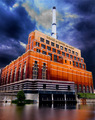
| 06/06/2006 03:26:46 PM | Water and Lightby alfrescoComment: Hello, Greetings from the Critique Club.
As requested, here is an indepth critique of your submission. Please keep in mind this is a personal opinion.
Hello JP!
First Impression - the most important one:
Different! Strange colors. Weird water at the bottom. Hmm. Interesting!
Composition:
The composition looks great. My eyes follow the lines and capture a lot of details in the photo.
Technical (Color, focus, and light):
Focus: Focus is ok.
Color: The colors look surreal, especially the contrast between the orange bricks and the deep / dark blue sky & clouds. And the color in the water.
Light: It looks like you've used a major-fill-light to light up the building. Weird, huh!
I just can't get my head with the how and the why you did it. Some details of the post-processing might be very interesting.
Overall, after looking at your image for a long time, I still can't tell what to think about it. And I think that's good :)
I hope you've found this critique helpful. Good luck with future challenges! |  Photographer found comment helpful. Photographer found comment helpful. |
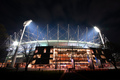
| 06/06/2006 03:16:21 PM | Modern Day Colosseum: The MCGby hotpastaComment: Hello, Greetings from the Critique Club.
As requested, here is an indepth critique of your submission. Please keep in mind this is a personal opinion.
First Impression - the most important one:
Sharp & detailed.
Composition:
Composition looks good for me. I love super wide angle lenses with architecture, so I think that's a great decision. Makes everything look a bit "different" with the distortion. The dark road / sides and sky really work here.
Subject:
The subject doesn't really do much for me (sorry!)
Technical (Color, focus, and light):
Focus: Focus is very sharp, maybe a bit too sharp with USM, but that doesn't bother me.
Color: Colors look allright.
Light: I think you've exposed just the right time. Nothing to say about that. The lights at the top of the stadium look quite awesome. Great to see how they spread over the top of the building.
Overall I think you did a nice job with this long exposure shot. The only reason I could think this didn't end higher is because I think the subject is a bit boring. But that's a personal opinion :)
I hope you've found this critique helpful. Good luck with future challenges! | | Photographer found comment helpful. |
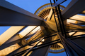
| 06/06/2006 02:53:39 PM | The Space Needle- 44 years old.by cabaComment: Hello, Greetings from the Critique Club.
As requested, here is an indepth critique of your submission. Please keep in mind this is a personal opinion.
First I want to say I have absolutely no idea what I'm looking at ;-)
The image you're showing is a complex one, full of lines and shapes. That's a thing I find very interesting. The composition is great and well balanced.
There are two things I think could have been better.
- The colors (blue and yellowish/goldish) look nice, but I think bumping up the contrast with an S-curve would have made the colors pop up just a little bit more.
- The image doesn't look tack sharp to me. A bit more USM might have worked, but I'm not sure about it.
Overall I like this image very much, and I think you got a nice score with it.
I hope you've found this critique helpful. Good luck with future challenges! | | Photographer found comment helpful. |
| 06/04/2006 01:09:00 PM | | | Photographer found comment helpful. |
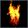
| 06/04/2006 10:59:31 AM | Burning Issuesby adjustabletoolComment: Hello, Greetings from the Critique Club.
As requested, here is an indepth critique of your submission. Please keep in mind this is a personal opinion.
First Impression - the most important one:
Focus seems to be off, but a great shape of the flames
Composition:
Composition doesn't really appeal much to me. I think, if you cropped different, the subject out of the center of the image, it would've been a bit better.
Subject:
This does fit the challenge, but lacks a bit of creativity.
Technical (Color, focus, and light):
Focus: Like I said, the focus is off... pity! I think if you used a smaller aperture (F5.6 maybe?) and compensating with the ISO, the focus would have been better. 2.8 is a small area for sharpness, especially with a moving object. It would be interesting to have a better view at the newspapers.
Color: The colors in your image look great, nothing to say about that.
Light: The newspaper could have been a bit lighter IMO, you could use the dodge tool for example.
I hope you've found this critique helpful. Good luck with future challenges! | | Photographer found comment helpful. |
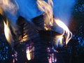
| 06/04/2006 04:52:06 AM | Burning down the Houseby snafflesComment: Hello, Greetings from the Critique Club.
As requested, here is an indepth critique of your submission. Please keep in mind this is a personal opinion.
First Impression - the most important one:
Aaaw.. too bad it isn't in focus... but the colors are amazing!
Composition / PoV:
The composition looks allright, might have cropped a bit off the right. I'm guessing lots of voters thought it was a real house (very clever of you to use a tea-candle burner!). To increase that effect, you might have taken the photo straight and a bit lower (from the ground).
Subject:
This does fit the challenge.
Technical (Color, focus, and light):
Focus: I think you lost a lot of points with the focus.. that's a pity!
Color: The purple & yellow colors are great, but the blue doesn't really fit here IMO.
Light: The light seems to be ok.
Like I said, I think you were voted down because of the focus. But I think with your creativity, after practicing with focus, it will be better.
I hope you've found this critique helpful. Good luck with future challenges! | | Photographer found comment helpful. |
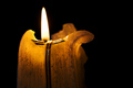
| 06/04/2006 04:31:53 AM | Meltdownby marvinComment: Hello, Greetings from the Critique Club.
As requested, here is an indepth critique of your submission. Please keep in mind this is a personal opinion.
First Impression - the most important one:
Nice shapes in the candle. The colors work for me.
Composition:
You used the 1/3 rule in your photo, but it looks a bit dull to me.
Subject:
It fits the challenge, but you might have played around with the suet (?), bend and shape it, so it becomes a bit more interesting for the voters.
Technical (Color, focus, and light):
Focus: focus looks good, allthough it might have been better to use a smaller aperture and have the flame in focus too. But I'm not sure, and you've probably tried that too.
Color: colors look allright to me. The pure black background works great with your image.
Light: The light of the candle is ok, and you did good to not use another fill-light or something like that.
I think this image looks good enough as it is, but it might have been a bit boring for the voters. A little experimenting with the candle (if you'd like to do that, of course) might have worked.
I hope you've found this critique helpful. Good luck with future challenges! | | Photographer found comment helpful. |
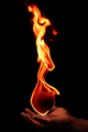
| 06/03/2006 03:42:01 PM | Vulcan - Roman God of Fireby RikkiComment: Hello, Greetings from the Critique Club.
As requested, here is an indepth critique of your submission. Please keep in mind this is a personal opinion.
Well Rikki, what can I say? ;-)
First of all, I really liked to read how you've arranged this shot. I'm sure a lot of people were thinking: "How did he do this?!"
Ok, about the image. You've managed to shoot a great photo again. The compo looks great and the shape of the flames are gorgeous. I think I might have cloned the top (left) part of the flame away, because it's pretty tight at the frame of the image.
I think the high ISO was a bit too high, right now the hand and the flames look very grainy and I think that didn't do good for the photo.
The hand at the bottom is great and with my monitor not too dark. I'm glad you included your hand, allthough it must have been hurting a lot.
Compliments to you for another great photo and for being so brave ;-)
I hope you've found this critique helpful. Good luck with future challenges! Message edited by author 2006-06-03 15:44:49. | | Photographer found comment helpful. |
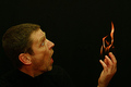
| 06/03/2006 03:02:25 PM | O M G !!!by Ecce_SignumComment: Hello, Greetings from the Critique Club.
As requested, here is an indepth critique of your submission. Please keep in mind this is a personal opinion.
Auwtsj! That must hurt! Love the expression on your face. What people will do to get a great humorous photo! Taking a look at your score and the 10th place, you did a great job.
But, there is one thing I'd like to add.
First of all, The cropping is a bit strange. You've got a big space at the top & right of the image, and a bit tight at the left of the image. That makes the composition a bit weird. I don't know if there was a chance to change the crop, and this might be just nitpicking ;-)
Lighting, black background and focus are great, so no comments about that.
The shape of the flames are awesome, like they're arranged.
Big compliments for being so brave and taking a wonderful shot like this!
I hope you've found this critique helpful. Good luck with future challenges! | | Photographer found comment helpful. |
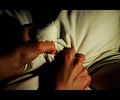
| 06/03/2006 02:29:29 PM | In the heat of anger.by TNCameronComment: Hello, Greetings from the Critique Club. As requested, here is an indepth critique of your submission.
Please keep in mind this is a personal opinion. This is also my very first critique for the CC ;)
My first impression was a good one. Great visible textures.
The composition looks pretty good, though my eyes keep going to the lighter right part of the image. The sheet seems to look a bit too straight, a couple of wrinkles might have fitted better.
The subject is recognisable, and clear. Everybody has been angry once in a while ;)
Focus is spot on, and in a way you can see the textures of the hands and the sheet. That looks great! I'm not quite sure about the colors, the hands look a bit too red. Have you tried B&W with this image? Or maybe a B&W-layer, with an opacity of, let's say, 75%. But it all comes down to taste, and I think this is what you were looking for. The light might be a little brighter at the left side of the image.
The border seems to fit in this kind of image, but it's not my personal taste.
I like the fact you've tried something different then the "usual" heat. This is a unique idea for the challenge, and I think you did a great job overall.
I hope you've found this critique helpful. Good luck with future challenges! | | Photographer found comment helpful. |
|
Showing 1231 - 1240 of ~1917 |
Home -
Challenges -
Community -
League -
Photos -
Cameras -
Lenses -
Learn -
Help -
Terms of Use -
Privacy -
Top ^
DPChallenge, and website content and design, Copyright © 2001-2025 Challenging Technologies, LLC.
All digital photo copyrights belong to the photographers and may not be used without permission.
Current Server Time: 08/12/2025 09:32:40 AM EDT.
|