| Image |
Comment |
| 07/01/2006 06:13:20 PM |
|
 Photographer found comment helpful. Photographer found comment helpful. |
| 07/01/2006 02:13:25 PM |
|
| Photographer found comment helpful. |
| 07/01/2006 01:16:33 PM |
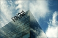
Exploreby ohanapicsComment: Even though you might get comments about the photo-size (640px at the largest size) I really love this shot and I won't vote it down for that. The contrasts & the reflections of the sky are fantastic, and the letters are brilliant.
I hope you'll post a larger image after the challenge, so I can see more details in your image. Bumping to 9 :)
uhm, bumping to 10 and added to faves :) |
| Photographer found comment helpful. |
| 07/01/2006 01:15:32 PM |
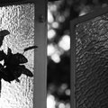
North Windowby billymontegroComment: you're probably gonna get comments about the photo-size (640px at the largest size) and here's another one ;-) nice B&W's though, but I think the framing could be improved. |
| 07/01/2006 01:11:34 PM |
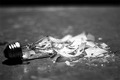
Lights out!by acrotideComment: nice sharpness & edgy post-processing. I think I'd get rid of the black line at the top of your photo and / or frame the broken bulb a bit less tight. |
| Photographer found comment helpful. |
| 07/01/2006 01:03:55 PM |
Glass in the makingby ingannaComment: Even though you might get comments about the photo-size (640px at the largest size) ths is a pretty image. The lighting at the right is a bit low, I can't really see what I'm looking at at that point. |
| 07/01/2006 01:02:51 PM |
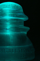
Insulatorby rox_roxComment: pretty lighting, love the green hue in your entry. maybe a bit bigger DoF would be nice, so the words at the bottom were a bit sharper. |
| Photographer found comment helpful. |
| 07/01/2006 01:01:26 PM |
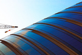
Angelino's Wallby Man_Called_HorseComment: nice abstract view of glass with beautiful colors. PoV could be a bit different to get rid of the floor at the left bottom. |
| Photographer found comment helpful. |
| 07/01/2006 12:59:59 PM |
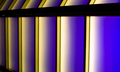
//Glass/||\Gradient\\by tmhallingComment: Nice playing around with your camera, right?! ;-) love the PoV, colors seem a bit over-saturated, but the weirdness of the crane makes that ok ;) |
| Photographer found comment helpful. |
| 07/01/2006 12:58:04 PM |
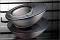
We hold a candle...by IreneMComment: I really like the metallic look you've created with the candle-holders & the background! I think the compo could be a bit more balanced, for example a bit further from the holders away and using the 1/3 rule |
| Photographer found comment helpful. |
Home -
Challenges -
Community -
League -
Photos -
Cameras -
Lenses -
Learn -
Help -
Terms of Use -
Privacy -
Top ^
DPChallenge, and website content and design, Copyright © 2001-2025 Challenging Technologies, LLC.
All digital photo copyrights belong to the photographers and may not be used without permission.
Current Server Time: 08/13/2025 08:38:36 PM EDT.