| Author | Thread |
Comments Made During the Challenge  |
|
|
07/04/2006 08:18:22 AM |
|
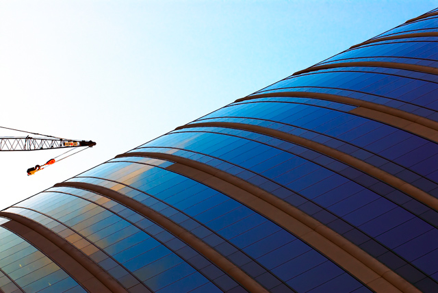
Really neat photograph, but I think it would've been MUCH better without the piece of construction equipment on the side. |
|
 Photographer found comment helpful. Photographer found comment helpful. |
|
|
07/03/2006 10:41:13 AM |
|
Really interesting to look at - nice one. |
|
| Photographer found comment helpful. |
|
|
07/03/2006 10:19:32 AM |
|
Like the gradient effect and the perspective of this this shot. |
|
| Photographer found comment helpful. |
|
|
07/02/2006 11:45:16 PM |
|
| Photographer found comment helpful. |
|
|
07/02/2006 11:36:24 PM |
This is a stunner.
I love the idea of making the crane the horizontal element - inspired. And the range of blues in the windows and the sky is great. |
|
| Photographer found comment helpful. |
|
|
07/02/2006 07:59:57 PM |
|
Interesting perspective you've given us. Why the odd rotate? It's a cool looking shot regardless. |
|
| Photographer found comment helpful. |
|
|
07/02/2006 02:44:07 PM |
|
beautiful color and composition! |
|
| Photographer found comment helpful. |
|
|
07/01/2006 11:18:58 PM |
|
Interesting choice of angle! Love the blues on the glass. |
|
| Photographer found comment helpful. |
|
|
07/01/2006 05:45:12 PM |
|
sort of needed to crop out the hook and the cable, as they give a reference for plumb and mock the rotation which otherwise has good effect. |
|
| Photographer found comment helpful. |
|
|
07/01/2006 12:59:59 PM |
|
Nice playing around with your camera, right?! ;-) love the PoV, colors seem a bit over-saturated, but the weirdness of the crane makes that ok ;) |
|
| Photographer found comment helpful. |
|
|
06/30/2006 03:41:07 PM |
|
I like the colors but it seems it would be better if it were rotated 90 degrees clockwise. It makes me tilt my head to look at it. |
|
| Photographer found comment helpful. |
|
|
06/30/2006 02:00:32 PM |
|
I think the crane takes away the gradient feel a bit But I see what you mean in the title. |
|
| Photographer found comment helpful. |
|
|
06/30/2006 12:56:01 PM |
|
I love this. The colors and the angle of the composition are great. The crane adds an extra interest in my mind and orients the viewer - helping bounce between abstract and reality. |
|
| Photographer found comment helpful. |
|
|
06/30/2006 06:20:59 AM |
I don't take points for it, but the title... is a bit too far.
The more I look at it the more I like that crane being there. Good job. |
|
| Photographer found comment helpful. |
|
|
06/29/2006 09:44:13 PM |
This could easily be a 10 if not for the crane. This is worthy of a reshoot.
VERY nice photo ! |
|
| Photographer found comment helpful. |
|
|
06/29/2006 12:40:06 PM |
|
Just wish the sky was in tune with the blue coloring of the building, don´t want it as dark as that but definately darker than it is now. Nice composition though, I like tha slanting. |
|
| Photographer found comment helpful. |
|
|
06/29/2006 11:15:30 AM |
|
| Photographer found comment helpful. |
|
|
06/29/2006 07:44:35 AM |
|
love the perspective and colour, well done |
|
| Photographer found comment helpful. |
|
|
06/28/2006 10:53:28 PM |
|
I like the angle, but don't care for the crane when tipped this way. Colors are very nice. 8 |
|
| Photographer found comment helpful. |
|
|
06/28/2006 04:33:07 PM |
|
| Photographer found comment helpful. |
|
|
06/28/2006 02:30:45 AM |
|
Without the crane this would be an awesome angle. It's a little uncomfortable this way. 6 |
|
| Photographer found comment helpful. |
Home -
Challenges -
Community -
League -
Photos -
Cameras -
Lenses -
Learn -
Help -
Terms of Use -
Privacy -
Top ^
DPChallenge, and website content and design, Copyright © 2001-2026 Challenging Technologies, LLC.
All digital photo copyrights belong to the photographers and may not be used without permission.
Current Server Time: 06/29/2026 04:46:37 AM EDT.