| Image |
Comment |
| 09/21/2002 09:58:00 PM |
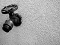
Tapped Outby ShiiizzzamComment: I like the contrast, and the detail of the texture of the negative space area, but I don't like the angle of the valve, and the drop isn't defined enough, you can almost miss seeing it. |
| 09/20/2002 10:08:00 AM |
|
 Photographer found comment helpful. Photographer found comment helpful. |
| 09/19/2002 11:59:00 PM |
|
| 09/20/2002 12:24:00 AM |
Ignitionby MarkRobComment: just something missing... hmm.. I think you should have used a more interesting candle. |
| 09/20/2002 12:20:00 AM |
Graceby OakleyComment: could use a bit more negative space on top. |
| 09/20/2002 12:20:00 AM |
|
| Photographer found comment helpful. |
| 09/20/2002 10:21:00 AM |
|
| 09/20/2002 12:17:00 AM |
|
| 09/21/2002 09:54:00 PM |
Highway Fatalityby CLarson557Comment: Too white, not enough color variation, not rich or vibrant enough, feels dull and washed out. |
| 09/19/2002 11:27:00 PM |
|
| Photographer found comment helpful. |
Home -
Challenges -
Community -
League -
Photos -
Cameras -
Lenses -
Learn -
Help -
Terms of Use -
Privacy -
Top ^
DPChallenge, and website content and design, Copyright © 2001-2025 Challenging Technologies, LLC.
All digital photo copyrights belong to the photographers and may not be used without permission.
Current Server Time: 06/19/2025 09:46:19 AM EDT.