| Image |
Comment |
| 06/19/2009 12:11:05 PM |
|
 Photographer found comment helpful. Photographer found comment helpful. |
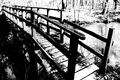
| 06/19/2009 12:10:45 PM |
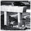
"Over there"by Yo_SpiffComment: The cement support has brighter tones than the workers, and thus draws the eye directly to it. Since it's not the main subject, nor very interesting, this takes away from the essence of the image. Perhaps a tighter crop would have been better. |
| Photographer found comment helpful. |
| 04/29/2009 09:27:40 PM |
stephanie.jpgby AndyMac24Comment: Great series, but I don't like this pose - the way her hips are angled out, and the way the left side of them blends with the chair before falling into shadows makes them look really big, much more so than the rest of her body - it's an optical illusion sort of thing, but I find it very distracting. |
| Photographer found comment helpful. |
| 03/11/2009 08:12:37 PM |
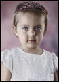
Princessby TCGuruComment: The skin tone here is really gray and makes her look like she's dead - I think the processing was off. |
| Photographer found comment helpful. |
| 03/11/2009 08:06:11 PM |
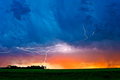
August Lightningby bmartinComment: The colors are a bit over-saturated, but in a way it works for the image. The shot itself is very, very cool! Wonderful capture and interesting way of presenting it. 8 |
| Photographer found comment helpful. |
| 01/25/2009 09:32:07 AM |
|
| Photographer found comment helpful. |
| 01/25/2009 09:31:38 AM |
|
| Photographer found comment helpful. |
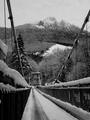
| 01/25/2009 09:05:10 AM |
Whispering Watersby kebbieComment: Solid entry, overall I like it, although I think the snow on the bridge could be more white. I'm confused by your title, however - there are no waters visible in the scene! |
| 01/25/2009 08:43:36 AM |
|
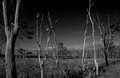
| 01/25/2009 08:43:06 AM |
Bone Dryby GIS_boyComment: Your sky went too black halfway to the top - there isn't enough of a gradient for that amount of darkness to work, and it ends up looking very strange. |
| Photographer found comment helpful. |
Home -
Challenges -
Community -
League -
Photos -
Cameras -
Lenses -
Learn -
Help -
Terms of Use -
Privacy -
Top ^
DPChallenge, and website content and design, Copyright © 2001-2025 Challenging Technologies, LLC.
All digital photo copyrights belong to the photographers and may not be used without permission.
Current Server Time: 07/30/2025 11:13:03 PM EDT.