| Image |
Comment |
| 10/21/2002 05:00:00 PM |
Pearby KarenBComment: good lighting, decent subject, decent photo with limited appeal. 5 wingy |
 Photographer found comment helpful. Photographer found comment helpful. |
| 10/24/2002 11:57:00 PM |
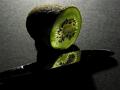
Lucent Kiwiby elgominComment: great idea. a larger reflective surface might have made it even cooler. 9 wingy |
| Photographer found comment helpful. |
| 10/21/2002 04:44:00 PM |
Wrongfully Accusedby lmhrComment: Excelent composition, great shadows, great background. I don't know what that black thing behind the fork is though. All around great shot. 9 wingy |
| 10/24/2002 02:36:00 AM |
Cat and Candleby jbolingComment: the cat isn't lit well enough. the subject is uninteresting. the reflection just looks blurry and dull, so it ends up not adding to the shot. 3 wingy |
| 10/24/2002 04:26:00 AM |
|
| Photographer found comment helpful. |
| 10/21/2002 04:53:00 PM |
Evil Wizardby ScottLComment: wow.. awesome shot. It's slightly difficult to see the small figure, and if this weren't in the current challenge I might suggest a subtle light on him so that he showed up better... but given the single light requirement, this is excelent. 9 wingy |
| 10/24/2002 02:38:00 AM |
clam by torchlightby fluffyComment: shot isn't clear enough to tell what the subject is (aside from the title). The table detracts from the shot. 3 wingy |
| 10/21/2002 04:52:00 PM |
Young Samuraiby GekkerComment: The subject seems uninteresting to me, and it seems too cluttered to be effective in this sort of minimalistic lighting. In technical terms not a bad shot, but it comes across with little appeal. 4 wingy |
| Photographer found comment helpful. |
| 10/24/2002 02:35:00 AM |
Candle-Glowby ppritcheComment: So-so profile shot.. not particularly interesting (the expression doesn't have any impact on me at all), but not all bad. 4 wingy |
| 10/21/2002 04:47:00 PM |
thoughts aloneby takethatComment: too dark.. a brighter light would have made the colors stand out more and the shadows on the table much more effective and drawing. Also I'm not sure if I like the pose of the guy in back and the parts of him that are shown, cut out. Perhaps a little bit more complete view of him, or an even more minimalistic suggestion of his presence. Good idea, but the technical side needed some work. 5 wingy |
Home -
Challenges -
Community -
League -
Photos -
Cameras -
Lenses -
Learn -
Help -
Terms of Use -
Privacy -
Top ^
DPChallenge, and website content and design, Copyright © 2001-2025 Challenging Technologies, LLC.
All digital photo copyrights belong to the photographers and may not be used without permission.
Current Server Time: 08/24/2025 09:51:46 PM EDT.