| Author | Thread |
Comments Made During the Challenge  |
|
|
10/27/2002 03:14:00 PM |
|
|
|
10/26/2002 11:50:00 PM |
|
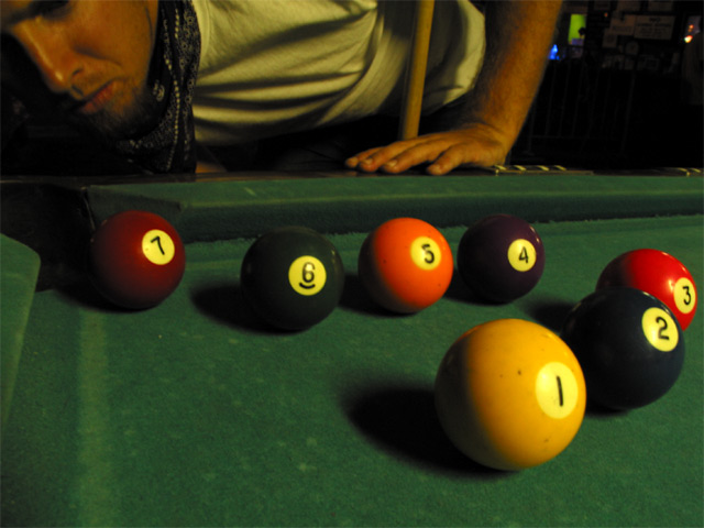
I would like it better if the numbers didn't line up. I think it would make it more natural. It also seems a bit fuzzy (face) but otherwise I really like it. |
|
|
|
10/26/2002 09:08:00 PM |
|
A little on the yellowish side... maybe something that could have been corrected with white balancing? |
|
|
|
10/24/2002 05:16:00 PM |
|
Just fire it into the corner, you're bound to get one of them in. :) I like the angle and framing/cropping of this shot. The set up could use some work though. It looks TOO set up in my opinion. I think that the numbers all facing the camera is a bit odd and unnatural looking. your lighting source is great. You did a good job of keeping harsh glare off the balls. Nice shot. Good luck in the challenge. ~Hbunch7187~ |
|
|
|
10/24/2002 12:17:00 PM |
|
I like the composition. Cool! |
|
|
|
10/22/2002 11:32:00 AM |
Interesting, makes me look at every detail, but the lighting is so yellow.
Vote 6
Sonifo |
|
|
|
10/21/2002 11:53:00 PM |
|
There's alot of potential with this idea. I'm no photography gearhead, can't suggest what to do interms of lightmetering, field depth etc, but from an aesthetic point of view this appears a little flat. |
|
|
|
10/21/2002 08:36:00 PM |
|
needs color correction, white light balance. |
|
|
|
10/21/2002 04:47:00 PM |
|
too dark.. a brighter light would have made the colors stand out more and the shadows on the table much more effective and drawing. Also I'm not sure if I like the pose of the guy in back and the parts of him that are shown, cut out. Perhaps a little bit more complete view of him, or an even more minimalistic suggestion of his presence. Good idea, but the technical side needed some work. 5 wingy |
|
|
|
10/21/2002 03:42:00 PM |
|
poor lighting. B&W would have helped. Try converting it and increase the contrasts. nice effort. 4 |
|
|
|
10/21/2002 12:27:00 PM |
|
balls set up a little too organized, looks staged, sorry but that's a pet peeve of mine. either it's set up and that doesn't matter, or it's candid and not staged, and never the twain shall meet. but that's just me. you did a nice job. |
|
|
|
10/21/2002 09:38:00 AM |
|
A little dark too give much drama to the shot. Appears to be slightly out of focusl |
|
|
|
10/21/2002 08:44:00 AM |
|
|
|
10/21/2002 08:27:00 AM |
|
The background is bad, an the picture needs morg light... |
|
|
|
10/21/2002 06:37:00 AM |
|
white balance :) the yellow tungsten glow here could be improved quite a bit :) - setzler |
|
|
|
10/21/2002 12:46:00 AM |
|
THe yellow hue is a nice effect, suiting for the environment. |
|
Home -
Challenges -
Community -
League -
Photos -
Cameras -
Lenses -
Learn -
Help -
Terms of Use -
Privacy -
Top ^
DPChallenge, and website content and design, Copyright © 2001-2026 Challenging Technologies, LLC.
All digital photo copyrights belong to the photographers and may not be used without permission.
Current Server Time: 06/28/2026 11:14:53 AM EDT.