| Image |
Comment |
| 02/18/2003 08:38:43 PM |
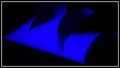
Rhythm in Blueby karmatComment: Interesting abstract. I don't think I like the framing of the shot. Maybe rotating the shot so that the bottom line of the blue object would parallel the bottom edge of the frame would create a good effect. Currently the visable blue shapes seem somewhat random and don't really have any pattern or form. 4 |
 Photographer found comment helpful. Photographer found comment helpful. |
| 02/18/2003 08:35:42 PM |
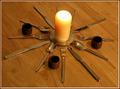
Silver Starby 3boyzMomComment: I don't think the subject makes for a very interesting photograph, at least not from this angle. The lighting is too dim as well. Perhaps an overhead shot or an angle that would create symetry would create a more interesting effect. A plain white backdrop might be something to experiment with as well. 3 |
| 02/18/2003 08:33:07 PM |
Grandstand Piano Keysby DougPazComment: I like the crop on this shot, and I think the subject works very well. I think the title is too over the top (but that's not the type of thing I'd take off points for). Solid photo. 7 |
| 02/18/2003 06:29:23 PM |
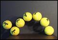
Bouncing Balls Stopped in Timeby GolferDDSComment: I'm not sure if the negative space at the top is necessary, but it doesn't really detract from the shot. I like the concept and I find it interesting that you used balls with different numbers, showing that it obviously was not one ball in motion. I think the lighting should have been better distributed so as to avoid the right side being overexposed, and to avoid the shadows. I enjoyed this shot. 6 |
| Photographer found comment helpful. |
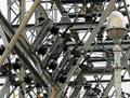
| 02/18/2003 06:21:42 PM |
Organized Chaosby boyte1Comment: Unfortunately, this shot ends up just looking like chaos. The numerous lines in this picture don't form any strong patterns or structures (even though I'm sure they do in real life). Perhaps the subject is just too cluttered to come up with a good clear shot from, or perhaps another angle would have yeilded better results. I also think the barbed wire and lightpost don't add to the shot, but instead add to the clutter. Good luck. 3 |
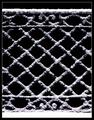
| 02/18/2003 06:18:50 PM |
Benched Snowby crabappl3Comment: It has a sort of dark cryptic look to it. I like the texture very much. Good work. 8 |
| Photographer found comment helpful. |
| 02/17/2003 11:34:42 AM |
|
| Photographer found comment helpful. |
| 02/17/2003 12:44:56 AM |
Vinerowsby lennierComment: way too dark. All I can really make out is the clouds. |
| 02/17/2003 12:42:43 AM |
|
| 02/17/2003 12:36:23 AM |
Starsby pitsamanComment: The crop makes it seem unbalanced. I'd have prefered a symetrical approach. |
| Photographer found comment helpful. |
Home -
Challenges -
Community -
League -
Photos -
Cameras -
Lenses -
Learn -
Help -
Terms of Use -
Privacy -
Top ^
DPChallenge, and website content and design, Copyright © 2001-2025 Challenging Technologies, LLC.
All digital photo copyrights belong to the photographers and may not be used without permission.
Current Server Time: 08/25/2025 01:38:25 PM EDT.