| Image |
Comment |
| 03/14/2010 03:13:31 PM |
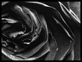
Obliqueby colorcarnivalComment: 4 - A more refined crop, especially upper right, be better in my opinion. |
 Photographer found comment helpful. Photographer found comment helpful. |
| 03/14/2010 03:12:57 PM |
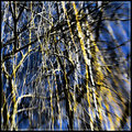
Weeping Willowby MinsoPhotoComment: 4 - Don't mind the concept but I find the composition is unstructured (could be intentional) and the colors harsh and clashy. The white inner border detracts, in my opinion. |
| Photographer found comment helpful. |
| 03/14/2010 03:11:52 PM |
into the futureby claudia26Comment: 4 - I like the concept and your call to not convert this/convert this further - but for me there is potential for a dramatic scene, especially with your title, with b&w or toning, with this image. |
| Photographer found comment helpful. |
| 03/14/2010 03:09:54 PM |
Spinogueby kingskingdomComment: 4 - Somewhat interesting shapes, but not abstract enough perhaps - I'm not connecting with the image. |
| 03/14/2010 03:08:59 PM |
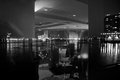
Dining by the Riverfrontby banmornComment: 4 - For me, this with much more 'drama', depth, contrast, etc - would pack more punch and bring it to life more. |
| Photographer found comment helpful. |
| 03/14/2010 03:08:03 PM |
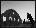
Behind the Sceneby wildirisComment: 5 - I like the potential here - in my opinion it is much stronger without the 'assistant'. |
| Photographer found comment helpful. |
| 03/14/2010 03:07:36 PM |
|
| Photographer found comment helpful. |
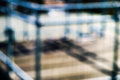
| 03/14/2010 03:06:13 PM |
balanceby AVPComment: 4 - Perhaps a more refined crop, otherwise the shapes and patterns don't hold my attention enough to wander around the image. |
| Photographer found comment helpful. |
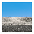
| 03/14/2010 03:04:38 PM |
Magnetic Fieldsby LimescopeComment: 5 - I like the blue sky aspect and the color but the earth feels like it has lost its texture. |
| Photographer found comment helpful. |
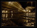
| 03/14/2010 03:03:03 PM |
Train station elegyby redpandaComment: 5 - I like the perspective, the water element and of course the train - which is easy to miss on first go - (no pun intended) - but at this size, wonder whether the OOF fore dominates a little too much. The border, also at this size, especially the grey in it, is detracting - in my opinion. |
| Photographer found comment helpful. |
Home -
Challenges -
Community -
League -
Photos -
Cameras -
Lenses -
Learn -
Help -
Terms of Use -
Privacy -
Top ^
DPChallenge, and website content and design, Copyright © 2001-2025 Challenging Technologies, LLC.
All digital photo copyrights belong to the photographers and may not be used without permission.
Current Server Time: 09/03/2025 06:17:31 PM EDT.