| Image |
Comment |
| 02/07/2003 04:46:06 AM |
What is this?by christybenhoffComment: Sorry, but this shot doesn't look very nice to me. O.K., your cropping is IMHO well done and thereby you are dirceting the attention of the viewer to the face / eyes of your cat. But unfortunately the face is extremely out of focus. Personally I think, that it is impossible to achieve an interesting lighting by using the cameras flash. Nevertheless, good luck with your next submission :-) |
| 02/06/2003 04:42:45 AM |
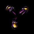
Decaying Beautyby stephanComment: "Out of the dark" could have been an other apposite title, but yours is much more cliche :-). Personally I like, that you don't show more of the stem by your lighting. Perhaps I would have cropped a little different. IMHO there is too much black space around the blossom. But this is only marginal. Great work, good luck! |
 Photographer found comment helpful. Photographer found comment helpful. |
| 02/06/2003 04:20:16 AM |
house plantby jjbeguinComment: A very clear and professional looking picture with perfect lighting. The selective use of water is well done too. Perhaps I would have cropped a little stronger on the top and the bottom of this shot. But that's only marginal. Great work, good luck! |
| 02/06/2003 04:11:29 AM |
Weathered Perfectionby ShiiizzzamComment: WOW, what a great photo! Your composition / cropping is perfect, the texture und the colours are highly impressive. IMHO only the vertical wrinkles in your background are disturbing a little bit. But this is nerly nothing and marginal. One of my favourites this week, good luck! (10) |
| Photographer found comment helpful. |
| 02/04/2003 07:16:17 AM |
Mistery roseby deadbirdComment: Interesting try to make something different. Unfortunately the rose is out of focus and has some overexposed parts. |
| 02/04/2003 07:10:03 AM |
|
| Photographer found comment helpful. |
| 02/04/2003 07:00:52 AM |
|
| Photographer found comment helpful. |
| 02/04/2003 06:58:32 AM |
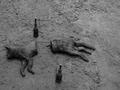
Gotcha!by ebrantiesComment: Your admin note made me lough, thanks a lot :-)! But I don't like your photo very much. Nevertheless a very unique and humorous submission! |
| 02/03/2003 12:32:48 PM |
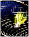
Backhand Driveby ndsComment: Thanks a lot for your comments and for giving me a higher score, than this shot deserves. I like the motion blur of the birdie myself. It took about 20-30 shots, to get this IMHO satisfying result. But you are absolutely right with your criticism on the wrinkles in the background. I didn't realise this mistake while shooting. But unfortunately I didn't had the time to make it better with a new shot... |
| 01/30/2003 06:58:55 AM |
Square competition gone to my head.by SharQComment: A very creative interpretation of the challenge, I like the posture of your model too. Bit IMHO there is some space for improvement. A different lighting could have made this shot more impressive. Perhaps an other and less distracting back(under)ground could be helpful too. I'm not sure, that I like the wrinkles very much. Nevertheless a very unique submission! Good luck for the challenge, I voted 7. |
| Photographer found comment helpful. |
Home -
Challenges -
Community -
League -
Photos -
Cameras -
Lenses -
Learn -
Help -
Terms of Use -
Privacy -
Top ^
DPChallenge, and website content and design, Copyright © 2001-2025 Challenging Technologies, LLC.
All digital photo copyrights belong to the photographers and may not be used without permission.
Current Server Time: 08/23/2025 12:11:47 PM EDT.