| Image |
Comment |
| 06/23/2007 06:06:05 PM |
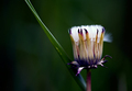
Taraxacumby sigrun_thComment: Fit Challenge Criteria: 1/2
Contrast/Color: 2/2
Composition: 2/2
Photo Quality: 1/2
My Subjective Affinity: 1/2
I really like the colors in the photo. The greens and purples are amazing. I like how dark the background is, but feel that, although it supports the subject well, it doesn't really make it stand out to me and stun me when I look at it. I think the DOF is too shallow, and would like to see the entire flower in focus. The stray green leaf? coming through the photo really doesn't do much except lead me out of the photo. |
 Photographer found comment helpful. Photographer found comment helpful. |
| 06/23/2007 01:03:07 AM |
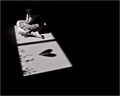
Wild Hearts Can't Be Brokenby ShannonLeeComment: Fit Challenge Criteria: 1/2
Contrast/Color: 1/2
Composition: 1/2
Photo Quality: 1/2
My Subjective Affinity: 0/2
The idea is nice, and the negative space supports the subject well, but it lacks any real punch to make this shot stand out above the rest. The shadows are too dark. It would be much better to see a small bit of detail throughout the photo to tell more of the story. |
| Photographer found comment helpful. |
| 06/23/2007 12:55:05 AM |
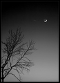
Night Worshipby BradComment: Fit Challenge Criteria: 2/2
Contrast/Color: 2/2
Composition: 2/2
Photo Quality: 1/2
My Subjective Affinity: 2/2
I really like your composition on this shot. It is excellent. My only dislike: the moon is a bit overexposed. The grey gradient is excellent. |
| Photographer found comment helpful. |
| 06/23/2007 12:48:27 AM |
The peeking Seussby spartacus9Comment: Fit Challenge Criteria: 0/2
Contrast/Color: 1/2
Composition: 1/2
Photo Quality: 1/2
My Subjective Affinity: 1/2
This photo does have negative space, but there is no impact in it at all. The only real impact is the subject's blue eyes. The white sheet needs to be whiter, and the red hat also lacks the vivid colors that would really make that stand out. |
| Photographer found comment helpful. |
| 06/23/2007 12:45:34 AM |
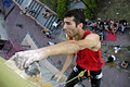
Climbing...by gipomontesantoComment: Fit Challenge Criteria: 2/2
Contrast/Color: 2/2
Composition: 2/2
Photo Quality: 2/2
My Subjective Affinity: 2/2
Excellent work. I'm not a big fan of the limited DOF for this shot, but it doesn't really detract from the image either. Your negative space definitely adds the impact that this photo needs. Nice job. |
| Photographer found comment helpful. |
| 06/22/2007 05:36:01 PM |
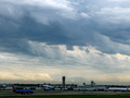
Southwestby DefyTimeComment: Fit Challenge Criteria: 1/2
Contrast/Color: 0/2
Composition: 1/2
Photo Quality: 2/2
My Subjective Affinity: 0/2
In order to have negative space, there must be positive space. I have a difficult time really determining what the subject is. To me, the subject would be either the overall landscape as a whole, or the clouds. And if that is the case, then the negative space would be the airport, which really doesn't have any "wow" at all. The colors in the clouds are nice, but the airport is extremely underexposed. Perhaps the use of an ND grad filter would benefit this shot. Then you could have had a brighter foreground and still maintained the stormy look in the clouds. |
| 06/22/2007 05:32:39 PM |
Man In Poolby LipstudiosComment: Fit Challenge Criteria: 2/2
Contrast/Color: 1/2
Composition: 1/2
Photo Quality: 1/2
My Subjective Affinity: 0/2
The silhouette works well, and the negative space complements it perfectly. I do find the silhouette a bit boring. I think it could have improved the photo with a bit more definition on the swimmer. The lighting is very harsh in the pool, with the upper-right corner losing all detail. I don't agree with the semi-panorama crop of this shot. When I look at a photo, one question I always ask myself is how well it would work being displayed in a gallery, and I think more pool on top would make this shot feel a bit more natural. |
| Photographer found comment helpful. |
| 06/22/2007 05:29:31 PM |
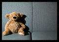
Boring party, no date and a drink neededby bragurComment: Fit Challenge Criteria: 2/2
Contrast/Color: 1/2
Composition: 1/2
Photo Quality: 1/2
My Subjective Affinity: 0/2
The shadows are too harsh. The cropping is too tight on the left side. The symmetry of the shot makes the negative space effective with the empty seat. |
| 06/22/2007 05:27:51 PM |
Looking At Medusaby ElliottjmsComment: Fit Challenge Criteria: 2/2
Contrast/Color: 2/2
Composition: 1/2
Photo Quality: 2/2
My Subjective Affinity: 1/2
Nice image. I'm surprised at how well you captured the tones throughout all of the white. Nice work. I feel the the cropping is a bit tight in the upper-right corner of the photo. I do think that more colorful glasses would have added a bit more impart on this shot. |
| Photographer found comment helpful. |
| 06/22/2007 03:56:56 PM |
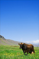
Cowby russiComment: Fit Challenge Criteria: 2/2
Contast/Color: 2/2
Composotion: 1/2
Photo Quality: 2/2
My Personal Affinity: 0/2
I really like the yellow flowers, green grass and blue sky. The mountain protruding from the left side is very distracting to the overall composition. There are some distracting elements in the front of the picture that are out of focus that really draw from the image as well. |
| Photographer found comment helpful. |
Home -
Challenges -
Community -
League -
Photos -
Cameras -
Lenses -
Learn -
Help -
Terms of Use -
Privacy -
Top ^
DPChallenge, and website content and design, Copyright © 2001-2025 Challenging Technologies, LLC.
All digital photo copyrights belong to the photographers and may not be used without permission.
Current Server Time: 08/20/2025 03:02:39 PM EDT.