| Image |
Comment |
| 09/09/2008 05:05:19 PM |
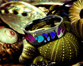
Swatch Designs for the Real You!by docpjvComment: Fit Challenge Criteria: 2/2
Contrast/Color: 1/2
Composition: 0/2
Photo Quality: 1/2
My Subjective Affinity: 0/2
Definitely a good idea, and a little more setup could really make this photograph stand out. Currently, the shadows are too dark. The photo is too busy. A shallow DOF could make this work a little better. The ring should be off-centered, following the guidelines of the rule of thirds. The object in the foreground should be removed to limit unwanted distractions. |
 Photographer found comment helpful. Photographer found comment helpful. |
| 09/09/2008 05:02:44 PM |
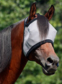
DuraMask V (Equine Fly Mask)by sfmorrisComment: Fit Challenge Criteria: 1/2
Contrast/Color: 1/2
Composition: 2/2
Photo Quality: 2/2
My Subjective Affinity: 0/2
Although this appears more like a substitution for a product set up than an actual product shot, this photograph turned out fairly decent for such a topic. The rule of thirds and limited DOF make this photo work. It seems a bit contrasty. The highlights are not blown out, but the shadows are just a bit on the dark side. Overall a very decent photograph. |
| Photographer found comment helpful. |
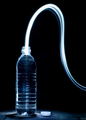
| 09/09/2008 04:59:07 PM |
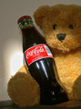
Like An Old Friend...by JeffryZComment: Fit Challenge Criteria: 2/2
Contrast/Color: 0/2
Composition: 1/2
Photo Quality: 1/2
My Subjective Affinity: 0/2
The idea is great, but the execution leaves something to be desired. The lighting is extremely harsh. The attempt to make the label stand out with the lighting was a bit overdone. I find the cropping a bit too tight. I think this would have worked better placed further from the background, and had an extra light to completely white out the background. And then perhaps limited DOF instead of lighting to make the label on the bottle stand out. |
| Photographer found comment helpful. |
| 09/09/2008 04:56:47 PM |
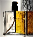
Boss by IreneMComment: Fit Challenge Criteria: 2/2
Contrast/Color: 2/2
Composition: 1/2
Photo Quality: 2/2
My Subjective Affinity: 1/2
Nice work. I'm not sure how I feel about rotating the photo, but it seems to work all right. I like the setup and limited DOF the best. |
| Photographer found comment helpful. |
| 09/09/2008 04:55:19 PM |
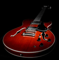
Greg Bennett Royale RL1 - $259.00by arron_christensenComment: Fit Challenge Criteria: 2/2
Contrast/Color: 2/2
Composition: 2/2
Photo Quality: 2/2
My Subjective Affinity: 2/2
Excellent work here. It's nice to finally see a photo that took more thought than simply grabbing a camera quickly and shooting something as it passes by, and trying to pass it off as a product shot. The placement of the guitar is perfect, with just enough room on all sides to really make it stand out, but not look crowded in the frame. The lighting is spot on, and the guitar is perfectly sharp. I really like the light trailing off on the guitar strings. Excellent photograph. |
| Photographer found comment helpful. |
| 09/09/2008 04:53:23 PM |
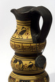
Greek vaseby hajekaComment: Fit Challenge Criteria: 1/2
Contrast/Color: 2/2
Composition: 1/2
Photo Quality: 2/2
My Subjective Affinity: 1/2
I think the inclusion of the entire vase would have improved the composition for the challenge, advertising the entire product, not just a piece of it. The photo is tack sharp, with just enough DOF. The isolation of the subject from the background with the plain white always works well for product shots. Nice work. |
| Photographer found comment helpful. |
| 09/09/2008 04:51:27 PM |
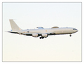
Boeing E-6A (Crew not included)by BlackboxComment: Fit Challenge Criteria: 0/2
Contrast/Color: 1/2
Composition: 0/2
Photo Quality: 1/2
My Subjective Affinity: 0/2
The first thing I notice is that the photo looks like a snapshot taken with a good zoom. The plane should not be dead center on the vertical axis of the photo. The white sky doesn't help either. The contrast on the plane is too high, leaving the underbody and wheels completely underexposed. |
| Photographer found comment helpful. |
| 09/09/2008 04:48:32 PM |
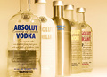
the Absolut mixby DiScComment: Fit Challenge Criteria: 2/2
Contrast/Color: 0/2
Composition: 1/2
Photo Quality: 2/2
My Subjective Affinity: 1/2
The white balance looks really off in this photo. Also, everything seems underexposed, except for the second bottle, which appears completely blown out on my monitor. There are also several hot spots on the bottles and lids that should have been removed. I also think the inclusion of the entire first bottle could have improved the overall composition of the photograph. |
| Photographer found comment helpful. |
| 09/09/2008 04:46:07 PM |
The Illusion of Needby tateComment: Fit Challenge Criteria: 2/2
Contrast/Color: 2/2
Composition: 2/2
Photo Quality: 2/2
My Subjective Affinity: 1/2
I don't exactly get the idea here, but the photo is well executed. Nice work. |
| Photographer found comment helpful. |
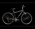
| 09/09/2008 04:45:16 PM |
TREK 7100........$395by aimeethetooComment: Fit Challenge Criteria: 2/2
Contrast/Color: 1/2
Composition: 2/2
Photo Quality: 2/2
My Subjective Affinity: 2/2
Excellent idea. The lighting is a bit harsh, leaving a bit to be desired, especially with the tires and seat. Aside from the lighting problem, everything else looks great. |
| Photographer found comment helpful. |
Home -
Challenges -
Community -
League -
Photos -
Cameras -
Lenses -
Learn -
Prints! -
Help -
Terms of Use -
Privacy -
Top ^
DPChallenge, and website content and design, Copyright © 2001-2024 Challenging Technologies, LLC.
All digital photo copyrights belong to the photographers and may not be used without permission.
Current Server Time: 04/25/2024 01:04:38 AM EDT.