| Image |
Comment |
| 07/02/2006 08:36:31 AM |
Growing Wildby KelliComment: Trading Post
I love the color and the focus. Nicely done. Bokeh could have been a larger feature by cropping further out from the flower. Over all, though I think this is one of your better efforts. I would have given this a 6, possibly 7 with more bokeh. |
 Photographer found comment helpful. Photographer found comment helpful. |
| 07/02/2006 08:33:29 AM |
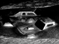
End of the worldby KelliComment: Trading Post
I would like to have seen this be a bit sharper. I like the idea a lot and the composition is good. B&W is a good choice given the subject matter. I would have given this a 5 if I had been able to vote. It's just to blurred for my taste. |
| Photographer found comment helpful. |
| 07/02/2006 08:30:01 AM |
Stuckby KelliComment: Trading Post.
I like the framing and the expression on the boy's face. I might have cropped this a bit closer to emphasize the boy rather than the frame...but either way it works for me.
The lighting seems harsh...like the flash was working overtime. The effect is to put light a bit unnaturally on his face.
I was out of town and couldn't vote. But had I been able, this would have been a 5, perhaps 6, for me. I think it is better than the scores indicate (a score of 1,2,or 3 seems pretty harsh, IMHO) |
| Photographer found comment helpful. |
| 07/02/2006 08:23:23 AM |
Trees on a fenceby KelliComment: Trading post
I am afraid this is going to sound like a broken record, but I also think that the focus is off and the shadows are not crisp. I didn't vote in this challenge because I was out of town, but I probably would have been in the 4 - 5 range. I almost think this might have been better if the crop was not so close...to give more perspective at what I was looking at (beyond a shadow)...is it a window? ...a wood carving? I can't tell. (o.k. I just saw the title. Now I know what I am looking at. All the same the picture didn't really clue me in.) Message edited by author 2006-07-02 08:24:53. |
| Photographer found comment helpful. |
| 07/02/2006 08:18:10 AM |
Beyond Understandingby nards656Comment: Trading Post
This one is too processed for my taste especially the leaves in the background. I am not sure I get the point of the shot...looks like he is just hanging out on the deck, so I am afraid I don't see the "desolation". The black area lacks definition so I can't tell what it is. The culmination of all of this is that I really can't quite figure this one out, I am sorry to say. I didn't vote in this challenge, because I was out of town. It's probably just as well as I wouldn't have helped your score any given my inability to figure it out and the extent of the PP. lol. |
| Photographer found comment helpful. |
| 07/02/2006 08:12:30 AM |
Mickey to the Rescueby nards656Comment: Trading Post
I like the idea, but the colors are a bit over the top for me. I was out fo town and couldn't vote, but I would have scored it a 5 or 6. I would have leaned toward a higher score if the colors weren't so saturated (especially his hat, which has few details). |
| Photographer found comment helpful. |
| 07/02/2006 08:08:16 AM |
Time of Death IIby nards656Comment: Trading Post
I have a hard time seeing the gun because it matches the background color so much. The watch is much better, but it suffers from some out of focus portions. I was out of town and could not vote, but I probably would have scored this a 5 or 6, pretty much like most people. I like the idea well enough, but the lighting and focus just don't allow you to quite carry this off IMHO. |
| Photographer found comment helpful. |
| 07/02/2006 08:03:24 AM |
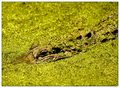
Don't Feed the Gatorsby ericwooComment: Trading Post
Interesting photo. I see you used a zoom lens. I hope you were on the 200mm end of that one given the subject. This certainly meets the Green requirement of the challenge. The murkiness of the water is a bit distracting...like having too noisy or grainy a picture. I was out of town and couldn't vote, but would have probably put this down as a 6. |
| Photographer found comment helpful. |
| 07/02/2006 07:59:09 AM |
Gammaby LouisComment: Trading Post
I like the simplicity of this shot and the bokeh. The textures are good, but the light is a bit flat IMHO. I was out of town and didn't vote on this one. I probably would have gone with a 5 or 6. |
| Photographer found comment helpful. |
| 07/02/2006 07:55:55 AM |
Dollhouseby LouisComment: I'm sorry to say this one doesn't work for me. On my monitor I can barely see beyond the light on the floor. I didn't even notice the back wall during voting because it was so dark. I didn't get the feeling of an empty room at all. On the otherhand the doll is kind of scary. |
| Photographer found comment helpful. |
Home -
Challenges -
Community -
League -
Photos -
Cameras -
Lenses -
Learn -
Help -
Terms of Use -
Privacy -
Top ^
DPChallenge, and website content and design, Copyright © 2001-2025 Challenging Technologies, LLC.
All digital photo copyrights belong to the photographers and may not be used without permission.
Current Server Time: 08/05/2025 05:36:58 PM EDT.