| Image |
Comment |
| 07/11/2006 03:14:07 AM |
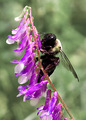
Amazing Beautyby tngrndreamComment: Trading Post
Nice close-up and focus. Awsome insect, colorful flowers. Bokeh is excellent too. This is the background I would like to have seen in your "Swinging" blurred motion offering.
The light is pretty bright here and that may account for what might otherwise be some over sharpening. I am not sure what the cause may be, but some of the flowers seem over done.
I didn't vote on this image but would have given it a 5 or 6. |
| 07/11/2006 03:07:58 AM |
Death of a Kingby tngrndreamComment: Trading Post
Good idea, but I think there are a couple of problems. (I may be over critical on this first observation but...) I am not sure how a king is slayed in chess without another piece out of position. As a chess player, this can't happen...which is to say, the photo has an inherent "issue" which is unnecessary. Also, while I am on this subject, using a pawn to slay the king is less interesting than using a more ornate piece such as a knight. O.K. I realize I may be going overboard here, but those kinds of things cloud my appreciation for the image. It also appears that the focus is a bit off...with sharpness in the background and fuzziness beginning at about the point of the king and worsening in the foreground.
Now, less you think I don't like this image (because of my nit-picking) let me set this straight. I like the idea, I like the use of glass pieces (I think more direct light from a side angle may have been more dramatic) and I even like the red tone of the picture. If I were you I would try this set-up again sometime when you can work it into a challenge because it has a lot of possibilities and the deficiencies are pretty easy to correct. I think the DPC scores are a bit low for this image. I also think I need to buy a glass chess set for challenges (oh yeah, and for playing chess). Message edited by author 2006-07-11 03:08:29. |
| 07/11/2006 02:53:52 AM |
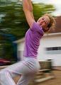
Just a Swingin'by tngrndreamComment: Congrats on adding a new image to your top five. I like the model and her smile. I like the clarity of this image at her eyes and face. I like the blurring. What I wish you could do over is the background. Even though it is blurred is still manages to compete with your attractive model - and that is distracting. I assume you didn't have much choice because the swing is in the school yard or back yard of your home...but if there were a better angle to make the background simpler this photo would score much better with me. As it was, I gave it a 5. |
| 07/11/2006 02:46:09 AM |
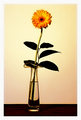
Fire Flowerby KelliComment: Trading Post
I like the image - the well rounded shape of the "flower", the bokeh for a background, and the off-center position. I would have preferred to have the crop be less severe on the bottom, showing more of the "stem"...but since I don't know what was down there, perhaps you made a wise choice. |
 Photographer found comment helpful. Photographer found comment helpful. |
| 07/11/2006 02:41:34 AM |
Celebrateby KelliComment: Trading Post
Congrats for having this image land in the middle of your top five. I like the abstract quality of the fireworks, the multiple colors, and the slightly off-center capture/composition. Given that I like fireworks this photo works for me. Since PP is not permitted, I guess that sums this up. |
| Photographer found comment helpful. |
| 07/11/2006 02:37:43 AM |
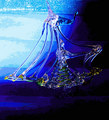
Sailing towards calmer waterby KelliComment: There are two things I like about this image: (1) the idea of using color to simulate a storm or rough waters, and (2) the blue colors themselves and the way they fill the whole frame. Having said that, I am not a fan of posterizing and other heavy filters. Here it is particularly tough, because the subject is glass which by its nature is transparent. The posterized treatment comes right through the glass and makes the focal point of the picture hard to discern. With glass, less is more IMHO. |
| Photographer found comment helpful. |
| 07/11/2006 02:25:40 AM |
Marching Alternatesby nards656Comment: I am not sure what to say in this challenge. Since PP is not allowed, there is not much to critique. The focus seems a bit soft to me...with the outer portions of the shafts and the cotton a bit out of focus...along with the shafts in the last couple of swabs on the right. Lighting seems a bit flat, with very little shadow. On the other hand, perhaps that is exactly what you wanted. |
| Photographer found comment helpful. |
| 07/11/2006 02:15:23 AM |
Blackeyeby LouisComment: Trading Post
This truly is art. As good as your score was (76 out of 374) it was still underated. I think this is your best work to date...I gave it an 8. The flower has as much emotional punch to it as any flower I ever remember seeing. The simplicity of the set-up is also powerful. I don't know much about Mapplethorpe (I saw one gallery exhibit of his work in Chicago some years back) other than his controversial nudity, but as I recall his technique is solid. So is the technique in your image. Well done. Message edited by author 2006-07-11 02:17:11. |
| Photographer found comment helpful. |
| 07/11/2006 02:06:18 AM |
Three generationsby MelethiaComment: Terrific picture. I love the color of the bloom, the brown center, the blurring of the leaves and the sweep of the stem to the right of the flower. Setting it off with the white background also works for me. I voted this a 6 as there was some pretty steep competition.
...as for your cat knocking over your set-up, I suspect that he/she was upset for not having a leading role in this image after starring in the twisted glass photo. Divas are like that. |
| Photographer found comment helpful. |
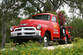
| 07/11/2006 01:52:31 AM |
Joe's Fruit and Vegetablesby MelethiaComment: Trading Post
I like this photo because of the rich colors of the truck and foreground flowers as well as the PoV. I did think that the focus was a bit off (none of the lettering on the grill, license plate, or door seems sharp to me). The background is also a bit busy (the trees compete with the plants in the back of the truck) making it a bit difficult to distinguish the details of the primary subject from its surroundings. I gave this a 5 (...he says honestly while ducking to avoid being hit with one of Joe's fruit or vegetables), but I generally scored all of the photos in this challenge down a bit because most of them seemed to suffer from the inability to do a little PP. |
| Photographer found comment helpful. |
Home -
Challenges -
Community -
League -
Photos -
Cameras -
Lenses -
Learn -
Help -
Terms of Use -
Privacy -
Top ^
DPChallenge, and website content and design, Copyright © 2001-2025 Challenging Technologies, LLC.
All digital photo copyrights belong to the photographers and may not be used without permission.
Current Server Time: 08/05/2025 05:37:57 PM EDT.