| Author | Thread |
|
|
07/11/2006 09:06:15 PM |
Trading post...
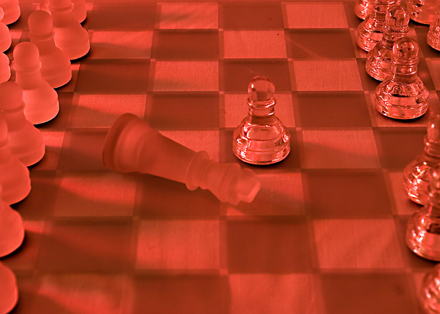
I didn't really like the redness of the image. I tend to associate red with anger, not death. The focus seemed to be a bit off and I'm not really sure about the way the shadows fall. I do like the way you see more of the pieces the further up the board you go. |
|
|
|
07/11/2006 03:07:58 AM |
Trading Post
Good idea, but I think there are a couple of problems. (I may be over critical on this first observation but...) I am not sure how a king is slayed in chess without another piece out of position. As a chess player, this can't happen...which is to say, the photo has an inherent "issue" which is unnecessary. Also, while I am on this subject, using a pawn to slay the king is less interesting than using a more ornate piece such as a knight. O.K. I realize I may be going overboard here, but those kinds of things cloud my appreciation for the image. It also appears that the focus is a bit off...with sharpness in the background and fuzziness beginning at about the point of the king and worsening in the foreground.
Now, less you think I don't like this image (because of my nit-picking) let me set this straight. I like the idea, I like the use of glass pieces (I think more direct light from a side angle may have been more dramatic) and I even like the red tone of the picture. If I were you I would try this set-up again sometime when you can work it into a challenge because it has a lot of possibilities and the deficiencies are pretty easy to correct. I think the DPC scores are a bit low for this image. I also think I need to buy a glass chess set for challenges (oh yeah, and for playing chess).
Message edited by author 2006-07-11 03:08:29. |
|
|
|
07/09/2006 11:57:46 PM |
Trading Post -
Can you say red? A bit too red. Doesnt give the shot a nice feel. I guess you were going for a "bloody" feel to it. The focus really seems off on the front part of the pic and it sits too far in back. Sharp focus ont he center would hav ebeen nice. The setup is odd as well - no way a pawn would take out a king first move so it seems a bit silly. You did meet the challenge (unless those pieces are plastic - lol) and you did attempt somehting creative but I think you fell short on execution. |
|
|
|
07/09/2006 06:05:12 PM |
Ummmm.... I like the composition here, with the lines of pawns on each side, surrounding the "action". I wish the pieces on the left were slightly different - the frosted glass makes them stand out a lot less than the others.
There does seem to be something going on with blur in the front half, and I personally am not such a fan of the red colour.
While it may seem pernickety, I can't help but notice its an impossible move, so would prefer a checkmate position even if it may not be compositionally so strong |
|
|
|
07/05/2006 11:42:30 PM |
Trading Post comment
I remember this one from voting - I'm pretty sure I said something about it being a bit too red, though I did think it was red to signify death. I think this was a good choice for the challenge and I like the pieces lined up but not fully visible on each side. Technically, it seems a little soft, but I kinda like soft. The pieces in the upper right seem sharper than those in the center, though, which implies the focus was just a tad closer to that corner than the center pieces. |
|
Comments Made During the Challenge  |
|
|
07/03/2006 03:40:59 AM |
|
I like the red cast, but would prefer a bit more contrast between the pieces and the board. |
|
|
|
06/30/2006 09:10:31 PM |
|
The positioning of the pieces is pretty good, but the board looks rather wavy, almost underwater near the front. I'm assuming the red is used to signify "death" but it's a little overpowering. |
|
|
|
06/30/2006 10:11:54 AM |
|
The color and compostion are well done. It would be nice to see a bit more contrast in the squares. |
|
|
|
06/29/2006 10:54:27 AM |
|
 Photographer found comment helpful. Photographer found comment helpful. |
|
|
06/29/2006 10:18:21 AM |
|
Not really crazy about the red hue in this one, I think I would have liked it better with a more neutral hue, I get the reference, red=blood=death but still, not to my taste. Nice idea though! |
|
| Photographer found comment helpful. |
|
|
06/29/2006 07:21:58 AM |
|
great for the challenge...love the red |
|
| Photographer found comment helpful. |
|
|
06/29/2006 06:41:51 AM |
|
this is a great concept but there are quite a few marks in this that shouldnt be which are very distracting. two lines and also two black dots at the top and a smudgy circle in the lower right hand corner. with advanced editing this would be much better. |
|
| Photographer found comment helpful. |
|
|
06/29/2006 12:30:13 AM |
0-2 Meets Challenge: 2
0-3 Technical Merit: 2
0-3 Creativity: 2
0-2 The Wow Factor: 0
Total = 6 |
|
| Photographer found comment helpful. |
|
|
06/28/2006 11:06:07 PM |
|
I've seen this a few times in this challenge, and everybody seems to cast one solid color light over the entire chessboard. I think it would be much better with a spot on the fallen king, red is a good warm color, and then perhaps a cool color like a blue surrounding the rest of the board... |
|
| Photographer found comment helpful. |
|
|
06/28/2006 05:57:25 PM |
|
Should have made it a check mate move. But it works. |
|
| Photographer found comment helpful. |
|
|
06/28/2006 04:27:08 PM |
|
| Photographer found comment helpful. |
Home -
Challenges -
Community -
League -
Photos -
Cameras -
Lenses -
Learn -
Help -
Terms of Use -
Privacy -
Top ^
DPChallenge, and website content and design, Copyright © 2001-2026 Challenging Technologies, LLC.
All digital photo copyrights belong to the photographers and may not be used without permission.
Current Server Time: 06/29/2026 06:55:08 AM EDT.