| Image |
Comment |
| 02/02/2009 10:41:52 PM |
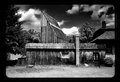
Week 3: Canon G2 CRW3290 r720 Edited.jpgby NeilComment: I really like the perspective you chose on this, as well as your processing. The texture on the fence is really good, and the colours much stronger. The leading lines are very effective too.
Not a fan of the border though... though thats entirely a personal thing (and judging from my own portfolio, I havent been consistent with abandoning the borders myself). |
 Photographer found comment helpful. Photographer found comment helpful. |
| 02/02/2009 10:38:52 PM |
761623by undieyatchComment: Nice rustic feel to this. I like the high contrast B&W processing, but feel that a little noise reduction in the sky wouldnt hurt. Overall a nice photo though. |
| 02/02/2009 10:36:21 PM |
At the Beachby HipychikComment: Your editing brought the colour screaming back to life... I like your choice of crop too. You seemed to capture them without them knowing it, and it gives a nice, innocent feel to the photo. |
| Photographer found comment helpful. |
| 02/02/2009 10:34:31 PM |
Week 4: Someone To Watch Over Meby lynnesiteComment: I gotta tell you, my girlfriend absolutely loves this shot. Thanks for putting a smile on her face.
Any chance you could choose a different crop to include more of the white horses face (if you did crop it out to begin with that is), or to crop out the white horse altogether? |
| Photographer found comment helpful. |
| 02/02/2009 10:31:43 PM |
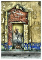
unravelledby RetroesqueComment: A nice simple shot, but the texture makes is look awesome. As mentioned, you found art in the most unlikely place. |
| Photographer found comment helpful. |
| 01/23/2009 11:54:20 AM |
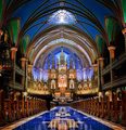
Cathedral of Biblical Proportions by LVicariComment: Holy smokes Leo, best photo of 2008.
Well deserved, and nice shot. Especially considering that that wasnt an HDR.
Congrats. Message edited by author 2009-01-23 11:54:37. |
| Photographer found comment helpful. |
| 01/19/2009 09:58:25 PM |
Week 3: Sunset on the Bayby tinky2Comment: I love the colour in this shot, makes for a nice relaxing mood overall. I agree with nshapiro in that you should crop out the bottom, leaving the reeds, but eliminating the pool of water in the foreground. That would also put your horizon on the 1/3 line, giving a nice pleasing composition.
Great photo. |
| Photographer found comment helpful. |
| 01/19/2009 09:55:58 PM |
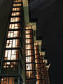
Any port in a storm #2by Yo_SpiffComment: For me, its a toss up between this edit, and the third edit (the yellow/orange one). Followed closely by the fourth edit, and first edit.
Yeah... I think I had the same dilemma you had, I like all the edits. The photo overall has a nice grungy texture to it, which I really like. |
| Photographer found comment helpful. |
| 01/19/2009 09:53:59 PM |
Wadingby HipychikComment: I like your crop, and your editing in this photo. The crop gets rid of the distractions at the top, and the contrast you added give a nice texture to the water. This would also look really good in black and white IMO. |
| Photographer found comment helpful. |
| 01/19/2009 09:52:15 PM |
Week 03 by KenComment: I like the edits you did, and it did bring out more detail in the building. I do notice a slight "halo" around the roof line, but only if I look hard for it, or when I compare it to the original. Nice photo :D |
| Photographer found comment helpful. |
Home -
Challenges -
Community -
League -
Photos -
Cameras -
Lenses -
Learn -
Help -
Terms of Use -
Privacy -
Top ^
DPChallenge, and website content and design, Copyright © 2001-2025 Challenging Technologies, LLC.
All digital photo copyrights belong to the photographers and may not be used without permission.
Current Server Time: 08/14/2025 11:45:48 PM EDT.