Historic home healthcareby
ClayaComment: Hi from the Critique Club!
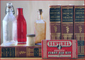
This is a really interesting collection of health related items. I particularly like the old bottles and the first aid kit.
Compositionally the image is quite flat; as one or two of the voters suggested, an arrangement that gives depth from front to back may have created a more powerful image. Also the placing of the bottles in one half of the image and the books in the other, has created a division in the photograph, where each half competes for attention, rather than being a unified whole.
You have chosen items that complement each other as far as colour goes, which is pleasing on the eye. But I do find the red border a little distracting - with so much to look at in the image, the last thing you need is a border that competes for attention.
You have used the window light and reflector well, getting some nice highlights on the bottles. Had the right-hand side been a little darker so that the bottles stood out more, you may have created a more dramatic image, but the evenness of light across the picture makes it a tiny bit flat as far as contrasting light is concerned.
A really interesting and unusual still life.