|
|
| Image |
Comment |
| 12/30/2002 12:01:00 AM | |
| 12/22/2002 11:02:27 PM | http://www.what-I-do.comby Fibre OptixComment: hmmm...your DOF doesn't do much justice to an otherwise original photo. Having the entire thing in focus would have been a 9...like this....7 :( Nice macro, though. |
| 12/20/2002 03:38:57 PM | |
| 12/17/2002 08:30:27 AM | A Splash of Color by RackatComment: I don't know who gave you the 1 (i'm not a member, so it wasn't me) but I wonder if that person would have given you the same critique as mine :)) ...and mean it!
Kate, I personal congrats on this fabulous photo. I think it would be worth doing a 'How To' for this one. Regards. |
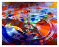
| 12/16/2002 10:31:08 PM | A Splash of Colorby RackatComment: ...from Critique Club...
Hi Rackat...ain't I lucky..they assigned your photo to me..ha
FIRST IMPRESSION:
Horrible shot...what were you thinking????
COMPOSITION:
Totally off. It would have worked much better if it were upside down...and reversed horizontaly.
TECHNICAL:
Focus is toooo sharp. Lightin is poor, cause the dark parts are dark...and the light parts are light. DOF is hard to tell, so I won't comment on that.
ARTISTIC:
Completely boring to look at. There is no dynamic to your photo, it's flat, uninteresting. Oh, and it does NOT meet the challenge...there's nothing 'Free' about this 'Study'
OVERALL:
I am very disappointed in you, Rackat. I enjoyed most of your work, but this is just plain horrible. I expect better next time.
Best of luck in the future. Don't hesitate to PM me if you have any questions about this critique.
Cheers...zadore.
...and now the serious part :) I don't have to repeat what everyone has already mentioned about this photo. I hope some day to create a piece of art as great as this.
CONGRATULATIONS FROM THE CRITIQUE CLUB!!! :) |  Photographer found comment helpful. Photographer found comment helpful. |
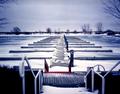
| 12/16/2002 10:20:25 PM | Marina in Decemberby MorganComment: ...from Critique Club...
Hi Michael
FIRST IMPRESSION:
Nice...very nice.
COMPOSITION:
Kill the bottom third of the photo...that's all, IMHO. I think that the stair railing not being symmetric like the rest of the photo really ruins it. It's too bad that the stairs don't line up with the pier leading into the water. (Is this by Ontario Place or Harbourfront?? I'd like to know...so I can have a shot at this setup :)
TECHNICAL:
Focus is great. I like how you used DOF to try and eliminate the railings. Lighting is nice and even...perhaps a bit overexposed in the middle, to the left of the 'E'. :)
ARTISTIC:
Michael, I think this is an awesome scene to shoot. I love the colors, the branches peeking from the sides. The mood is very nice. :)
OVERALL:
If it weren't for the railings on the foreground, I would say this is a perfect shot.
Best of luck in the future. Don't hesitate to PM me if you have any questions about this critique.
Cheers...zadore. | | Photographer found comment helpful. |
| 12/16/2002 10:07:08 PM | Birds Eye Viewby spidermanComment: ...from Critique Club...
Hi John
FIRST IMPRESSION:
Nice lines.
COMPOSITION:
Interesting enough. Like most, I did miss the bird at the first look...maybe cause it's so close to the frame and in the back of all the 'metal madness'. :|
TECHNICAL:
Man, I don't think you want me to repeat what everyone has already said? :) Noise, sky too bright, noise, digi zoom, noise. I do think that the focus is fair enough...unless you sharpened the photo to do that...which would create noise :)
ARTISTIC:
John, I think that at the moment you took this you did see something quite unusual, and I have to agree with you. There is something is this image that is quite attractive...the nature element contrasting with man-made-industrial element. Nicely seen.
OVERALL:
I know that you know what went wrong. :( ..and you still didn't come last :)
Best of luck in the future. Don't hesitate to PM me if you have any questions about this critique.
Cheers...zadore. |
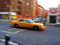
| 12/16/2002 09:57:09 PM | taxi!by tomzinhoComment: ...from Critique Club...
Hi Tom
FIRST IMPRESSION:
Very nice. :)
COMPOSITION:
A bit centered, but it works. It could be that a bit more space in front of the car would give it 'room to drive into'. I am not sure about the car seeming to be going 'downhill' :|
TECHNICAL:
Perfect. The focus on the car is very nice. Your panning technique worked nicely (even though the car is a tad blurred :) I wonder if bit longer exposure would get a better effect...hard to do if you are doing it hand held. :)
ARTISTIC:
Tom, I must admin that this is not an original shot, IMO. BUT...I think you did a better job than most would. The colour of the cab contrasting with the 'blueish' road works nicely.
OVERALL:
A strong image that could easily appear in an ad for 'Crazy NY taxi drivers....glad to see a nice finish of a photo taken with the same camera as mine :)
Best of luck in the future. Don't hesitate to PM me if you have any questions about this critique.
Cheers...zadore. | | Photographer found comment helpful. |
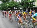
| 12/16/2002 08:58:04 PM | Veloby pikytoComment: ...from Critique Club...
Oi Paulo, tudo bom por ai no Rio? Eu vou escrever em Ingles para todo o mundo perceber. Ta?
FIRST IMPRESSION:
Nice colours! :|
COMPOSITION:
Fairly nice, IMO. The only problem I have is with the guy on the far right being 'cut in half' :)
TECHNICAL:
Focus seems a bit soft on the foreground. I think a tighter aperture would have been nicer. Lighting seems even throughout, and works nicely here to show the uniform colours. :|
ARTISTIC:
Paulo, I think there were a lot more ways to shoot this 'crowd' of cyclist that would make for a more interesting shot. A slower shutter speed to capture them in motion, or pan to catch the background blurring. But this seems a bit too static of the 'motion' challenge. :(
OVERALL:
A fairly uninteresting photo that could have a lot of potential to really show motion.
Best of luck in the future. Don't hesitate to PM me if you have any questions about this critique. Pode escrever em Portugues se quizer...eu sou de Lisboa mas vivo no Canada.
Ate a proxima...zadore. |
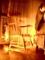
| 12/16/2002 08:46:03 PM | ROCKING CHAIRby howzaComment: ...from Critique Club...
Hi Alan
FIRST IMPRESSION:
Freaky!! I like it!
COMPOSITION:
Perhaps the weakest point of the photo. There seems to be too much stuff in the frame distracting from the main subject..'da chair' (still freakin' me out). The shot also doesn't seem to be leveled. The lamp reflection is the biggest distraction though. :(
TECHNICAL:
Good. I don't mind the 'brightness' of the shot as it sure sets the 'freaky' mood. Focus is good...just by looking at the floor. But that lamp, Alan...it's gotta go. :|
ARTISTIC:
Awesome. It sure is an original shot. The tones you used and the harsh lighting make this a creative shot, IMO....and that chair is still freakin me out..I swear, it's moving on the screen. :)
OVERALL:
Very cool idea which could be improved by 'removing' alot of the useless elements...IMO. :))
Best of luck in the future. Don't hesitate to PM me if you have any questions about this critique.
Cheers...zadore. | | Photographer found comment helpful. |
Home -
Challenges -
Community -
League -
Photos -
Cameras -
Lenses -
Learn -
Help -
Terms of Use -
Privacy -
Top ^
DPChallenge, and website content and design, Copyright © 2001-2025 Challenging Technologies, LLC.
All digital photo copyrights belong to the photographers and may not be used without permission.
Current Server Time: 08/24/2025 07:03:41 AM EDT.
|