| Image |
Comment |
| 07/30/2005 12:33:50 AM |
|
 Photographer found comment helpful. Photographer found comment helpful. |
| 07/30/2005 12:28:27 AM |
|
| Photographer found comment helpful. |
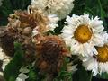
| 07/29/2005 01:43:37 AM |
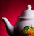
Absence of Crumpetsby CorySmithComment: ** Greetings from the Critique Club **
Excellent still life photo.
As for fitting in with the challenge theme - I think even you know you were really stretching it here.
As for the photo itself - very good use of lighting. The red background contrasts well against your subject. The colors in this image are all appealing. I especially like the way you cropped this.
- Linda
|
| Photographer found comment helpful. |
| 07/29/2005 01:20:25 AM |
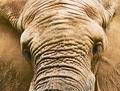
Lone Elephant Bullby docpjvComment: ** Greetings from the Critique Club **
A stunning creature the elephant is! My suggestions would be to take this at more of an angle, tone down the highlights, and not sharpen so much. As for fitting into the challenge theme - it does fit, but does not speak it right out loud without the title.
- Linda
|
| Photographer found comment helpful. |
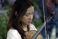
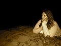
| 07/29/2005 01:15:04 AM |
I am on my ownby michaelgrasserComment: ** Greetings from the Critique Club **
Beautiful photo. Colors and lighting are executed well. Personally I would have cropped more of the left side off - having the lady's shoulder right at the edge. When I hold up a paper to block off the left side, I get drawn in even more this way.
The bow is in a good position in my mind - just a bit OOF.
- Linda
|
| 07/29/2005 01:04:37 AM |
Shining on in the light of deathby lytaComment: ** Greetings from the Critique Club **
Composition, colors, and lighting are all well done here. There is only one very distractin element and that would be the green leaf in the bottom left corner. Might have pulled that out of thew way before taking the shot.
- Linda |
| Photographer found comment helpful. |
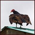
| 07/29/2005 01:00:47 AM |
On the Roofby cloudsmeComment: ** Greetings from the Critique Club **
Composition is executed very well here as the roof lines lead my eye straight to the bird. Looks to be just a tad over sharpened. I like the framing you chose also. It really compliments the birds colors.
The sky is your biggest enemy in this shot as it lacks color. Cropping closer would have hurt the composition though. Not much you could do with basic editing - but for your own private use/print I would try to add some color to the sky.
- Linda |
| 07/29/2005 12:54:59 AM |
Growing up fast.by Phonic MonkeyComment: ** Greetings from the Critique Club **
Might just be my screen - but there looks to be a smudge on the wall to the right of the girls face and the sippy cup. It is distracting to me at least. The wall color is not a great background choice - but we cannot control everything, can we? Otherwise, the color balance is nice and vibrant. Would have been good if you could have caught her eyes looking upward just a tad so that you could see them a bit.
- Linda
|
| 07/29/2005 12:47:43 AM |
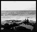
Escaping The Ordinaryby annahComment: ** Greetings from the Critique Club **
I'm sorry I did not get to vote on this photo as it really is a great shot. I love that it is in B&W - really pulls the viewer into their relaxing moment. The contrast of the water against the shore and rocks is perfect.
There are only two things I would have changed to improve this image - one is to crop out the top 1/3 of the sky. The sky is almost distracting as there is so much of it. The second would be to make the frame thinner - not a lot, but a bit thinner.
Keep up the great shooting
- Linda
|
| Photographer found comment helpful. |
| 07/29/2005 12:39:00 AM |
Independence from Routineby SeaSailComment: ** Greetings form the Critique Club **
Composition is strong here, a great use of negative space. The color cast however is too yellow throughout. I am assuming you were going for the warm tone feeling, but you are lacking the warmth of reds. The model looks to possibly have red hair - would have loved to see the color come through more. The facial expression does not say independence to me, or freedom from routine. It looks too posed - like a waxed museum piece. The eyes are fixed into a stare. Would have been more convincing if the model was in a more relaxed, care free pose.
- Linda |
Home -
Challenges -
Community -
League -
Photos -
Cameras -
Lenses -
Learn -
Help -
Terms of Use -
Privacy -
Top ^
DPChallenge, and website content and design, Copyright © 2001-2025 Challenging Technologies, LLC.
All digital photo copyrights belong to the photographers and may not be used without permission.
Current Server Time: 08/17/2025 04:12:49 AM EDT.