|
|
|
Showing 611 - 620 of ~1242 |
| Image |
Comment |
| 01/01/2007 01:05:01 AM | |  Photographer found comment helpful. Photographer found comment helpful. |
| 01/01/2007 12:51:09 AM | | | Photographer found comment helpful. |
| 01/01/2007 12:38:53 AM | Photographer by ZoomdakComment: The shot is very nice, but I'd like to see more of the area. The strength is that you (or the model) do appear to be standing on water. Strong work. Message edited by author 2007-01-01 00:44:30. | | Photographer found comment helpful. |
| 12/31/2006 01:54:21 AM | Moreno Lindaby SquishyBComment: Hey there from the Critique Club
Camera Work/Technical: I'll have to agree with those that have already commented, the overall image looks a bit out of focus. The image is also over-processed in certain areas, the most noticeable of which is just underneath the eyebrows. Careful with post-processing. I'd also recommend looking into NoiseNinja or NeatImage. While it is easy to overdo it with these as well, they do provide a much nicer, overall cleanup.
Lighting: You did a nice job with a difficult lighting situation. Combing natural and artificial light often taxes the white balance settings on most cameras. In this case, the result looks fine.
Composition/Content: The image feels uncomfortable cropped the way it is. Chopping off the mouth looks like more of an accident than an intentional composition. I'd recommend cropping half the face vertically, including half the mouth and just one of the eyes. These shots often come out very well.
My Opinion: 3.88 is a tough score, but this site is all about learning. Take the comments and criticisms and apply them to your future images. While this one met the challenge well, I think the flaws were just a bit too noticeable.
Eric
| | Photographer found comment helpful. |
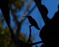
| 12/31/2006 01:45:56 AM | Waiting for the Wormsby charlievComment: Hey there from the Critique Club
Camera Work/Technical: The colors you captured are terrific, but I think the overall image could use a little more sharpness.
Lighting: You did a really nice job using lighting to create a very strong silhouette. I think you captured a really strong balance between the shadows and the colorful background.
Composition/Content: I think here is where your score fell. Echoing other voters that have commented, the background is too busy. I think if you'd have shifted a bit to the left and shot him without that tree in the background, this capture would have finished much stronger. I know, nature is very hard to script.
My Opinion: Nice job meeting the challenge. I do believe that this one came pretty close to its potential as is. With a different composition, the score would have surely grown.
Eric
| | Photographer found comment helpful. |
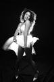
| 12/30/2006 11:35:02 PM | A soul in tension thats learning to flyby danica22Comment: Hey there from the Critique Club
Camera Work/Technical: Everyone always talks about the WOW factor here, and this image is packed full of it. Your crisp focus is spot-on, your tones are truly remarkable and the textures you captured just top it all off. This should have been up there with the best of this challenge.
Lighting: Your lighting is near flawless in this capture. The only area that I think is lacking is the upper right hand corner. It is just a bit too dark and competes mildly for the eye's attention.
Composition/Content: In a word, wonderful. Her flowing shape and the tastefully hidden details (face and nipples) keep the eye moving around the frame and peering deeper for more. It really disappoints and disheartens me that voters are so skewed that they vote based on the bare human body. Aside from the upper right hand corner, this is a near flawless image. Its being added to my favorites as soon as I submit your critique. You did an amazing job with the tight crop to produce a feeling of tension and searching even without reading the title.
My Opinion: Without a doubt, this one got hit with low marks simply based on nudity. This is, without a doubt, one of the best 5 or 6 images in the challenge. You were far underrated. Excellent work, and I can't wait to see more!
Eric | | Photographer found comment helpful. |
| 12/30/2006 10:28:34 PM | Can't keep my eyes from the circling sky, Tongue-tied and twisted just an earthbound misfit -Lyricby JuliadavisComment: Hey there from the Critique Club
Congrats on your highest official score to date. Looking through portfolio, I am impressed with your work. Just watch those rule sets closely.
Camera Work/Technical: Nice, crisp focus and great sky tones.
Lighting: I think that the lighting is the main strength of the image. The silhouetting of the subject works very nicely with the gloomy sky for a great moody image.
Composition/Content: The tilt seems a bit much, but it really helps to pair the image with the title. It is a nicely, dizzying angle.
My Opinion: Great job meeting the challenge in a creative manner. I look forward to seeing much more of your images in the future.
Eric | | Photographer found comment helpful. |
| 12/30/2006 10:15:31 PM | Concentrateby RulerZigzagComment: Hey there from the Critique Club
Camera Work/Technical: Nice settings that yielded the colors and tones just as the eye would expect to see them. I also like the crisp focus you captured here.
Lighting: I think you ended up with too much shadow. Perhaps a little bit of flash would have helped lighten some of the dark areas just a bit.
Composition/Content: When doing people or animal portraits, be conscious of everything you have in the frame. Chopping off his feet here seems more accidental than an intentional composition. Try not to chop appendages off right at the joints.
My Opinion: I think that you met the challenge well, and, with a little more attention to your composition, would have pulled a much better score.
Eric | | Photographer found comment helpful. |
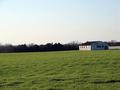
| 12/30/2006 10:09:27 PM | Empty Spacesby jcapps25Comment: Hey there from the Critique Club
Camera Work/Technical: Nice focus, but the horizon tilt really destroys any chance that the image might have had. If you only look at one thing when composing an image, make absolutely sure that you have the horizon straight.
Lighting: You did a pretty good job with harsh lighting conditions. The trees in silhouette do a nice job at setting your subject off from the background. No detail was lost with harsh shadows or blown highlights in the subject of the capture.
Composition/Content: I can easily make the relation to the title, but I think you needed a little more.
My Opinion: Meets the challenge, but I think that this one still scored pretty close to its potential. Use this one to learn what the voters like, as well as to get that horizon line level.
Eric
| | Photographer found comment helpful. |
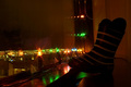
| 12/30/2006 10:02:39 PM | Sticky lights and a bootby marvinComment: Hey there from the Critique Club
Camera Work/Technical: I like your choice of settings that yielded every element in crisp focus, as well as the tones and colors that you captured. I also like the long exposure that you used to make the Christmas lights flare into stars.
Lighting: Also very nice. Your use of the Christmas lights provides a very warm, inviting feel to the image.
Composition/Content: Also very strong, in my opinion. I really like how the window sill draws the eye into the image and the boots, Christmas lights and city lights hold it and keep it moving.
My Opinion: I think you really stretched this one to meet the challenge, as did most of the voters. When I'm going through voting, I rarely look at the image titles. Rather, I rely on the content of the frame to meet the challenge. I have been hammered on this at times myself, so I fully understand. I think that it is a strong image, but it just doesn't fit into the challenge.
Eric
| | Photographer found comment helpful. |
|
Showing 611 - 620 of ~1242 |
Home -
Challenges -
Community -
League -
Photos -
Cameras -
Lenses -
Learn -
Help -
Terms of Use -
Privacy -
Top ^
DPChallenge, and website content and design, Copyright © 2001-2025 Challenging Technologies, LLC.
All digital photo copyrights belong to the photographers and may not be used without permission.
Current Server Time: 08/11/2025 11:21:27 PM EDT.
|