|
|
|
Showing 371 - 380 of ~804 |
| Image |
Comment |
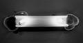
| 11/27/2003 03:36:21 AM | Burning the Candle at Both Endsby EmerauldeComment: Good morning from the critique club.
I suspect this one did not quite turn out the way you had imagined it. Candle light photography is not a piece of cake! And dealing with melting subjects is not always very practical.
You final result is pleasantly intriguing and, without the title, some might wonder what they are seeing if they do not see the flames.
To have the flames stand out better, choosing a dark colored candle would probably do the job. It is not obvious to me if you added some other lighting too this scene. If not, some would certainly diminish the contrast factor between the flames and the rest of the composition, allowing you more editing possibilities.
Presentation wide, always go to the largest possible size allowed. Your picture is 460 wide while it could have been 640.
Hope this helps, all the best, JJ
|
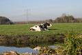
| 11/25/2003 08:40:45 AM | High Wire Cowby KINGComment: Critique Club Time
Your Highness,
Congratulations on finding the appropriate book title for your entry!
It seems, though, that the excitement related to your new purchase has led you to show some uncustomary haste I your creation process.
At first glance, I see two �classic flaws� and an incongruity you could have avoided easily by:
1°) leveling your horizon (slanted horizons will invariably give a snapshot feel to a picture)
2°) placing you main subject in a more harmonious manner (this is debatable and certainly not an absolute rule but main subjects placed dead center in an open environment rarely enhance a composition.)
3°) moving one step ahead to by-pass the blurry grass patch hiding the cow�s reflexion in the foreground.
I think you will probably agree with me that this is not your most accomplished or well thought of shot and lets keep it at that.
Good luck with your new camera
JJ
|  Photographer found comment helpful. Photographer found comment helpful. |
| 11/25/2003 07:12:11 AM | King Arthurby deemerComment: Critique Club Time,
Welcome to DPC, Timothy.
Will not try to get too much into your very personal views on royalty and kingly attitudes and therefore will not bore you discussing the �conformity level� of your entry.
The space dedicated to your main subject, I think, is a tad incongruous. If the surrounding space would have been a valorizing and luxuriant setting for your monarch this would not be questionable but in this image the �negative space� dangerously flirts with non-existence. I would like to see more of this creature, feel the feather texture and the expression in his eye. Whether this was possible, at the time, or not, I don�t know.
Here is a rule of thumb of �classic� photography that proves to be useful most of the time: If the space surrounding you main subject is not adequately contextual to your message or intent, zoom in.
I wish you success for your next entries in the challenge.
JJ
| | Photographer found comment helpful. |
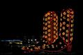
| 11/25/2003 06:16:23 AM | Sure will be hard to fill his Boots!by JC_HomolaComment: Critique Club Time,
Excess and superficiality, I really like this one, a high impact, out of the norm image. You have nicely depicted a scene from your corner of the world. �Texas style� space: lots of depth, a big sky and a generously oversized main subject that very adequately illustrates your title in more than one way.
The only thing I could think could improve this photograph would be to place a moon somewhere in the upper left corner in same tone as the �neon artwork�, just for the fun of it!
If you want to improve your rankings: stick to simple close-ups and tabletop photography. My advice would be that you continue doing exactly what you have been doing so far and getting better at.
All the best
JJ
|
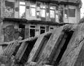
| 11/24/2003 04:27:38 AM | Gracefully Insane- The rise and fall of America's premier mental hospitalby mighty_bisonComment: welcome to your first from the critique club,
MightyB, this was a good idea, and a good choice of location; decay and chaos are always inspiring subjects.
Composition wise the diagonal that separates the picture in two equal parts makes it a bit static to me.
Content wise, what I would expect to see in this kind of setting is to sense how the humanity related actually lived and suffered. Unfortunately you show us only vertical parts (where only things belong) that do not really hint us the past function of this recent ruin. A glimpse of what is inside one of these openings, a partial view of a courtyard or any relevant object (door handles, bars, bench etc. would add some strength to the photograph and help the viewers, more adequately, imagine a scene from this building�s past.
All the best, JJ | | Photographer found comment helpful. |
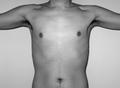
| 11/22/2003 08:08:50 AM | Body... Temple of the soul.by cimarron98Comment: In my Critique Club incarnation.
Won�t go into technicalities here, you probably have gotten the idea from the previous comments left of what your co-challengers expect from you I this domain�
I support your decision not to aim for the obvious in this challenge. Although, from your picture, I can�t decide if this �body is a temple� concept is something you stand for or not. Most of you audience here was raised with the metaphysical concept that the body is a cumbersome incarnation that we are finally delivered from at death. If you are suggesting the contrary, your message should be more convincing. Even if your torso hints an image of the great Leonardo, the arid bluntness of it says to me: �the temple of the soul� sure�and what next? If this were your message, an oversaturated color version of this same pose would deliver the idea even better. On the other hand, if you were to illustrate your title more adequately, let yourself be inspired by some of the countless examples of artworks celebrating or transcending the human body in a variety of ways. I just went through some pictures on grigrigil's website that could be of inspiration.
Keep having good ideas. Just give a little more thought on how to defend them best.
All the best, JJ
| | Photographer found comment helpful. |
| 11/19/2003 12:32:08 PM | |
| 11/17/2003 01:01:50 PM | Vase and flowersby trainComment: Good Evening Live from the critique club:
Why did this classic, neatly composed and technically above average image get so little commentaries and just a mid-range score? I hope I can give you a few elements of response in that regard.
Re-visiting classics is a fine way to improve skills. But with such subjects, if you want to capture the attention of viewers, your presentation must be really outstanding. Your audience has seen this type of scene not only in photographic forms but in paintings, film and in everyday life so many times that the evaluation standards for this type of image will be rather high. Technically the main flaw I feel in your picture is that the emphasis seems to be given to the background and the vase rather than to the fine hibiscus branches. A more subtle and directional lighting on the plants with a darker background could have taken care of that. Reflecting props such as your vase are always tricky to work with if you use directional lights or flash (difficult to avoid these distracting pure white zones).
Another aspect of this photograph that I don�t feel good about is that there is no �story� attached to it as I see it. Just a vase with a flower in it, I am not learning much about you looking at it either.
If you were to include some unexpected element to the composition, this might stop the viewer, have him think about it, try to imagine how you came up with such an idea and, eventually make up his own story and keep him distracted from the minor flaws of your shot. I a very classic way, your �nostalgia� pic is one that tells a story for example. We should always try to tell a story. Facts (real or invented) are more interesting than things.
Good luck and don�t forget to surprise us,
JJ
| | Photographer found comment helpful. |
| 11/17/2003 05:03:03 AM | St. Peter's at Dusk by mbardeenComment: Great timing! this shot would be practically be impossible to succeed at with no natural light at all. congrats for the blue! | | Photographer found comment helpful. |
| 11/17/2003 04:57:19 AM | The Heavenlies by GraciousComment: All three winning entries clearly illustrate the fact that the "time factor" in rendering a atmosphere of sacredness or at least a glimpse of bliss through photography is as important as the location itself. What metaphysical strength would these three images have if they had been shot at high noon?
On this occasion you clarly were blessed with a perfect sense of timing.
congratulations. |
|
Showing 371 - 380 of ~804 |
Home -
Challenges -
Community -
League -
Photos -
Cameras -
Lenses -
Learn -
Help -
Terms of Use -
Privacy -
Top ^
DPChallenge, and website content and design, Copyright © 2001-2025 Challenging Technologies, LLC.
All digital photo copyrights belong to the photographers and may not be used without permission.
Current Server Time: 08/05/2025 05:44:19 AM EDT.
|