| Image |
Comment |
| 10/01/2008 04:53:38 AM |
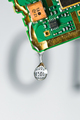
Tripletby BrinComment: Originally posted by sekarmalathy:
Though I like your imagination, I don't accept with your point that a better camera can give better results. |
That was and is not my point, but I can see now that it is possible to understand the photo that way. Message edited by author 2008-10-01 04:55:43. |
| 10/01/2008 02:55:17 AM |
Tripletby BrinComment: Originally posted by K10DGuy:
interesting idea, although I'm sure you've polarized some people. The idea that the type of camera is an indicator of the type of ribbon that you can win is amazingly silly :) |
I agree that it would have been a silly idea, but that is just your understanding of this pucture. It was not my idea in this case. I used the ribbons as a known colored signs and decided to connect them with a very good cameras. The ribbons were supposed to be the cameras prize and not connected to any winning photos. |
| 09/23/2008 07:50:37 AM |
|
 Photographer found comment helpful. Photographer found comment helpful. |
| 09/23/2008 07:37:39 AM |
|
| Photographer found comment helpful. |
| 09/23/2008 07:36:58 AM |
|
| Photographer found comment helpful. |
| 09/19/2008 07:08:48 AM |
|
| Photographer found comment helpful. |
| 09/17/2008 10:42:11 AM |
|
| Photographer found comment helpful. |
| 09/17/2008 10:37:55 AM |
Friendsby BrinComment: Originally posted by dikois:
Hi Brin,
What do you use to cut out the background...that's definitely not the extract tool in PS....are you using Fluid Mask?
Cheers |
Hi Jeremy
I did not cut the background out in this image, the sky was very gray (nearly white) when I took it and in the post processing I used curves to make it completely white like this. Thanks! Message edited by author 2008-09-17 10:38:15. |
| 09/17/2008 10:32:08 AM |
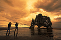
Overby BrinComment: Originally posted by ambaker:
Critique Club Review:
Brightness and Contrast: Image is mildly over exposed, which is part of the challenge. I think perhaps it could be taken up a bit more with an increase in the contrast. I'd like to see the rocks a little lighter, a little brighter, but would still want the figure dark the way it is now.
Focus and depth of field: Focus is nice and sharp. Depth of field is great.
There is really not much more you can do with this image. What makes the image is all the detail in the rocks, and the sky. If you brightened all that much more, the detail would be lost, and the final result would be less than you have now.
I see what looks like a small island beyond the subject. Perhaps that against a bright sea and bright sky, would have worked better for an overexposed challenge.
This is an excellent image, just one that has a harder time carrying the theme of the challenge. |
Many thanks Alex for your good critique - much appreciated. |
| 09/08/2008 05:28:51 AM |
Double Take with a Double Twist by StructorComment: And another ribbon, two out of three ain't bad. Congratulations!
I really think the models make this shot :~) Message edited by author 2008-09-08 05:29:34. |
| Photographer found comment helpful. |
Home -
Challenges -
Community -
League -
Photos -
Cameras -
Lenses -
Learn -
Help -
Terms of Use -
Privacy -
Top ^
DPChallenge, and website content and design, Copyright © 2001-2025 Challenging Technologies, LLC.
All digital photo copyrights belong to the photographers and may not be used without permission.
Current Server Time: 08/04/2025 05:02:17 PM EDT.