|
|
|
Showing 1781 - 1790 of ~3109 |
| Image |
Comment |
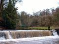
| 02/19/2003 05:15:28 AM | There He Is... I See Him!!by vestanpanceComment: Greetings from the Critique Club
By Inspzil
Composition - Well in a lot of photos there is a white sky. Its like that for us in the States too especially this time of year. Seems like we don't have blue sky here except for the day after a good snowstorm. Odd how that works. The white sky is definitely not helping matters in this photo. The water color though I think is fine. The concept of where's waldo was to hide him so we couldn't see all of him, but enough of him to tell he's there. This is not particularly well done in that aspect. That is probably the biggest reason this photo did not do as well as it could have. The photo is really pretty dreary without anything to really "wow" the viewers. Maybe framing this shot more centered around the falls with waldo stuck in the corner would've made it a little better. Who knows?
Technical - The waterfall is a little blurred. I'm sure it has something to do with the exposure values due to the crappy day. If the shutter speed were just a tad faster, I think they would've been clearer. The picture lacks some sharpness to it too, which ironically enough may be from trying to sharpen it too much in PS. Your camera takes pretty good clear photos (my wife has one) so it definitely is possible to have this come out well. The exposure value of the dreary day may be playing a part in this too with the shutter at 1/60 s. This is not super slow, but might be enough to make a slight difference, which in the focus world is enough.
Overall - Conceptually not very well done in terms of meeting the challenge. Not a bad photo imagewise, but lacking a little in terms of good colors or interesting subjects. It is a difficult time of the year to be doing much outside. I'm going to go take some pictures outside right now for despair. Good luck in your future endeavours - Bob |
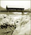
| 02/19/2003 04:56:09 AM | Waldo's Creekby DJLubaComment: Greetings from the Critique Club
By Inspzil
Composition - Good job meeting the challenge on this one, it is very well conceived. Waldo is just visible enough, but not too visible. Cool bridge and good foreground stuff as to not be distracting but not be too boring. The biggest problem I have with the composition on this photo is that its just a plain old crappy winter day. The white sky leaves no contrast between the roof of the bridge and the sky. It sort of just blends together. The haze makes the background a little less appealing too by simply making it less visible. On a nicer day, I'd see this scoring quite well.
Technical - The framing on this shot is pretty good. I wasn't so sure I like waldo in the middle of the pic horizontally, but I don't think it hurts the image. The exposure of this picture is pretty difficult but I think you did pretty well. Its so easy to blow out a snow picture. The subject seems pretty well focused too. DOF is as it should be for this shot. Doesn't look like a ton of processing went into this either. Thats great, even if it did have a lot done to it.
Overall - A good solid photo that would've done much better I think if the day were nicer to add a little color and a little contrast to the snow covered stuff. Meets the challenge well. Good image and good luck in future challenges - Inspzil |  Photographer found comment helpful. Photographer found comment helpful. |
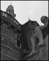
| 02/18/2003 05:24:36 AM | Shipmates of Bontekoeby AzrifelComment: Greetings from the Critique Club
By Inspzil
First off, that is far and away the longest comment I've ever seen regarding a picture. It will most likely be longer than my critique.
Composition - I think you could've focused solely on the statue and gotten a good image. The statue is my favorite part of this image. Unfortunately I can't stop looking at the white spot on his left foot where it looks like once there was a toe. The spotlight on top of the wall keeps catching my attention now and again. That would've been a nice thing to spot edit out as you said above. The building looks huge, which I'm sure is what you were going for. I like the overall composition and the choice of black and white is very good. I think this might be a little dark for my taste though.
Technical - This does look a little dark but if you lightened it up any I think you might lose the sky. The photo looks pretty clear with good DOF. Fill flash looks like it was a good idea, but that might be where the white spot on the toe came from. Processing - Overall I think you did a very nice job with this one. If there ever was a flash on the spotlight, I can't tell.
Overall - A solid image, but a little dreary with the dark colors and greyscale. By your description of what you did to the shot to make it better I'd say you really did a good job saving a picture. I think the statue should've been a stronger part of this picture. Hats off to your comments, they've proven to be helpful to some degree!! Interesting story - Good luck in upcoming challenges - Bob | | Photographer found comment helpful. |
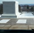
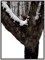
| 02/17/2003 12:22:02 PM | In the Shadow of Heroesby ClubJuggleComment: Greetings Terry from the Critique Clubjuggle
By Inspzil
Composition - Would be a nice pic without that pesky foot in the bottom corner. Oh wait, that's waldo.... I see now. I thought it was for the other challenge at first. It would be a good perspective shot though methinks. The monument is great. I like the little snow frosting on top of it. The background is very good too. The sky is really.. blah looking unfortunately. This would've been a better photo for springtime, but that would be a little after the challenge deadline. I wish there were some more color.
Technical - For a snow picture, very well exposed. The monument is very clear and readable. Good DOF and the framing is pretty good. It wouldn't have hurt it to be a little further back. Processing could've added a little color to this scene, but I think spring would add even more. I think a little more contrast would have helped but it's a touchy thing to get right with snow anywhere. marble is pretty white, but not like new snow.
Overall - Not a badly taken picture really, but the conditions just weren't quite right for it. In a few months I bet it would've been much better. It does meet the challenge pretty well and is well conceived in that right. It might take a few tweakings on the levels or greyscaling it to make it come out better. Good Luck on coming challenges and have some :pie - Bob | | Photographer found comment helpful. |
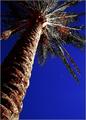
| 02/17/2003 12:00:46 PM | Moon Palmby AnnidaComment: Greetings from the Critique Club
By Inspzil
Composition - Great angle for this challenge. I think this is a great subject and the little spec of moon looks nice. The sky is so blue...too blue. The colors of this photo look very odd. As much as I like the angle and the subject, I dislike the colors.
Technical - This photo is really soft. It needs to be focused badly. The exposure needs to be just a little longer to give everything the light it needs. The focus is really a killer to this picture though. It's hard to see past when looking at it. The framing is really good though. The processing is too much tho. The sky is blue to an unbelievable degree. The green seems to be lacking and the lack of clarity on the leaves makes it seem even moreso. There appears to be a little red on the bottom of the tree in the leaves. This also seems odd. My feeling is that it is generally overprocessed.
Overall - This picture could've been really exceptional with a couple of minor changes. THe focus is the biggest one. The processing is the other. The choice of subject was awesome and the addition of the moon is a nice touch but it isn't enough to overcome the lack of focus though. Hope this could be of some help to you. - Inspzil | | Photographer found comment helpful. |
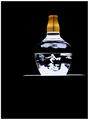
| 02/17/2003 11:46:22 AM | Magic Carpetby NatashaComment: Greetings from the Critique Club
By Inspzil
Composition - This is very cool. I think that if you could've had your comments shown it would've helped the voters. Most of the time I don't think its an advantage, but in this case I do. I think that a lot of folks were wondering how it met the challenge. There's only one thing I think I'd change about the pic in terms of composition - I don't like all the space at the bottom of the pic. If it were me I'd have cropped it a bit tighter and put it at the bottom. I understand that you left the space on the bottom for the floating illusion, but I don't think it was very effective. But the actual bottle is very cool and I do think the concept is great also.
Technical - Just a little overexposed for my taste. Other than that, very very nicely done. Good clear photo. I can't tell if you did anything else to it processing, If you did, it looks great.
Overall - I would've figured this would've done very well, but I think people were wondering what it was and how it met the challenge. I can sort of see their point, but I still think it's a quality photo. I still think that lowering the subject in the frame would've proven beneficial. If I scroll up I'm looking for it right away but obviously its up toward the top. Hope this could be a little helpful to you. Good luck in future challenges. - Bob | | Photographer found comment helpful. |
| 02/17/2003 04:56:48 AM | Waldo Goes to the Deer Woodsby kandyjComment: Greetings from the Critique Club
By Inspzil
Composition - Awesome background. The snowy trees are great. I'm not so sure about the foreground part. I think you may have had a little more success with this shot if you didn't take it so close. I think you'd have been better served it the photo was from 20 feet or so. I do think you met the challenge.
Technical - Snow exposures are always tough. I think you did fairly well with this one. Honestly I think I probably wouldn't have done much better, if at all. Dark trees + snow=something is over or under exposed. Focus might be a little sharper but not bad. I think putting this in black and white might've helped a little. This is not an easy photo to take and with the substantial contrast, hard to even process into a good photo.
Overall - I think you did well with your estimate. It wasn't posted to win any awards and I'm glad you realize that. The composition is cute, but not anything to write home about. The photography isn't bad, but for the conditions, you did pretty well. Sorry this can't be more helpful for you. All things considered on this end, I'm doing ok for 5:00am by writing this! Good luck in the upcoming challenges - Inspzil | | Photographer found comment helpful. |
| 02/16/2003 10:59:14 AM | NYC sunsetby BeeGeeComment: Greetings from the Critique Club
By Inspzil
My comments pretty much summed up what I thought, so this isn't going to be a lot different than that, just warning you... :)
Composition - Awesome photo. You picked the right time to take it. I love the silhouettes. The construction equipment is a bit distracting. The crop could've been a little tighter to elimate some of the stuff on the left side and a little of the emptier sky. It also would bring us a trifle closer to lady liberty and the seagull. Sky is wonderfully lit with a few clouds to give it some character. It may have been difficult to crop more just due to the photo already being cropped quite a bit. Great Capture
Technical - Looks very well taken. Colors are nice and warm. Great exposure. I'd be trying to PS all the equipment out of it and make a pic for myself.
Overall - A very serene pic. I like this shot a lot. Hopefully you can get more opportunities to take this shot again when they get all that crap out of the frame. Maybe you could ask them to move it for a day or two? Yea, sure. Anyway, great shot. Look forward to seeing more of this cliche stuff from you. - Inspzil | | Photographer found comment helpful. |
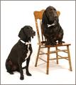
| 02/16/2003 10:45:34 AM | Bahsworth & Brodamireby GotchaComment: Greetings fromt the Critique Club
by Inspzil
Composition - I really liked this shot during voting. The dogs look great. They have a great expression on their face and they're looking the right way and everything. Their positions in the frame are great and I do like the chair there. It NEEDS to be there. I had one small complaint earlier and I'm still sticking to it - I don't like the way they are sinking into the floor. Aside from that, I wouldn't change a thing.
Technical - Very well taken photo. Exposure is a little tricky here with the dark dogs and white background but I think you nailed it. They are wonderfully focused and framed. Awesome. Processing is very good too. The wrinkles are one of those necessary evils in the amateur photography game. Busy backgrounds will kill you every time though on DPC. Its good you didn't blow out anything. It's really very good.
Overall - Loved the shot then, still love it. I have a dog about this color and a rottweiler too. I'm feeling inspired to pose them similarly and see if I can do something like this. Great pic gotcha. I thought you deserved to place better, but I know I would be very pleased to finish even close to where you did. Keep up the good work and thanks for sharing this gem with us on DPC. - Bob | | Photographer found comment helpful. |
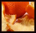
| 02/16/2003 10:34:17 AM | Peel + B4by redfigComment: Greetings from the Critique Club
By Inspzil
Composition - Firstly you have some outstanding color here. I like the very bright hightlights on the orange. The fleshy peels look pretty good. The crop is a little tight for my liking. The shadows on the peels are a little distracting as well. I would've like to see the emphasis be more on the orange and a little less on the peels. Composition overall is pretty good though. Great idea.
Technical - Photography is terrific. Well taken , nicely focused, Good sound photo. Processing - The orange looks almost too orange, to the point it looks fake. Other than the crop being a little tight, It looks great
Overall - This is a difficult picture to critique because its actually a pretty good image. You did a good job with this. There are only a couple of minor things that I think you could change to make this a better image, to this voter anyway. Keep up the good work! -Inspzil | | Photographer found comment helpful. |
|
Showing 1781 - 1790 of ~3109 |
Home -
Challenges -
Community -
League -
Photos -
Cameras -
Lenses -
Learn -
Help -
Terms of Use -
Privacy -
Top ^
DPChallenge, and website content and design, Copyright © 2001-2025 Challenging Technologies, LLC.
All digital photo copyrights belong to the photographers and may not be used without permission.
Current Server Time: 08/18/2025 12:38:32 AM EDT.
|