| Image |
Comment |
| 03/13/2003 11:45:12 PM |
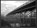
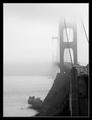
Bridge to Independenceby Ricky CleaveComment: Awesome. The perspective is great. I like the little bit of reflections in the wetlands below. Its a nice taste without choking on it and it remains very clear. Very, very well done - 10 |
 Photographer found comment helpful. Photographer found comment helpful. |
| 03/13/2003 11:43:09 PM |
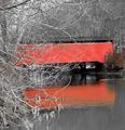
Reflections of the pastby GrenComment: There is too much foreground stuff. A hint here or there would've been good but I don't think this much is necessary. Actually it's quite distracting to this wonderful bridge. |
| Photographer found comment helpful. |
| 03/13/2003 11:37:51 PM |
blueprintby tomzinhoComment: Looks like it came out of the movie TRON. This effect works for this photo. I have a feeling you're going to have a lot of "love it" votes and "hate it" votes. I really like this photo. The part I really love is the buildings in the background more than the bridges in the foreground in all honesty. Great photo and effect. -10 |
| Photographer found comment helpful. |
| 03/13/2003 11:31:31 PM |
The Old Iron Bridgeby DoorskidderComment: Clarity is a huge issue with this picture. The angle and perspective of this photo are not really conducive to showing the essential elements of this bridge. |
| 03/13/2003 11:29:10 PM |
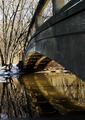
Bridgeby mediamstComment: I like the distorted reflections in the water and likewise the reflections from the water on the bottom of the bridge. I'm not real sure about the angle this was taken from . i think from a little further back it would've revealed a little more of those awesome reflections. |
| 03/13/2003 11:25:44 PM |
Mahebourgh Bridgeby JeanComment: I like the light reflections off the bottom of the bridge. Better with out all the stuff in the water. quality photo |
| 03/13/2003 11:24:05 PM |
|
| Photographer found comment helpful. |
| 03/13/2003 02:11:53 PM |
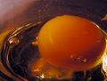
U n t i t l e d #12by lumbardhComment: Greetings from the Critique Club
By Inspzil
Composition - Nice simple composition. This is the strong, and weak point of this photo in my opinion. But I think that depends entirely on opinions. The simplicity of the composition in my opinion is what makes this image as good as it is. There isn't a lot of stuff to distract anyone from anything but the egg. On the flip side, this image is a little sterile for my tastes. I'm not saying its necessarily suffering from a lack of creativity, but that there is so much white and nothing else. I don't really like the degree that this photo is high key.
Technical - I think this image is effective overexposed, just not this much. Aside from that this is an extremely well taken photo.
Overall - Good image, just a bit bright for my tastes. It makes me think of hospitals for some reason.
Good luck in your future photos - Inspzil |
| Photographer found comment helpful. |
| 03/13/2003 01:47:19 PM |
Planet Eggby GinaRothfelsComment: Greetings from the Critique Club
By Inspzil
Composition - This particular picture is real real close to being very good. The composition is pretty good. There is a little naturally occurring noise that I think takes away from the image considerably. I think the ring of bubbles and stuff over the top of the yolk and around that arc are very distracting. I think if you could remove those, you improve the composition substantially. There is also a small bunch of them on the bottom right of the yolk that would be better if removed. The ones in the white of the egg are a bit distorted and don't look so much like grains of sand. I think they can stay and not be too distracting. The angle and the macro effect really make this picture.
Technical - I think this picture, well focused would've done much better. The image is just a little bit short of sharp. It may be just one more "sharpen" away from that actually. The exposure could've been just a little more too to really bring out the yellow of the yolk. Its close. That may be possible to fix with PS as well.
Overall - A good concept for a picture. I think with a little honing this will be a really nice image. I think your pic was graded a little harshly probably due to the sharpness. I'd be lying if I didn't say that was a sticking point of mine too. Hope this could be a little helpful for you. Good luck in future challenges - Inspzil |
| Photographer found comment helpful. |
| 03/13/2003 11:18:37 AM |
|
| Photographer found comment helpful. |
Home -
Challenges -
Community -
League -
Photos -
Cameras -
Lenses -
Learn -
Help -
Terms of Use -
Privacy -
Top ^
DPChallenge, and website content and design, Copyright © 2001-2025 Challenging Technologies, LLC.
All digital photo copyrights belong to the photographers and may not be used without permission.
Current Server Time: 08/24/2025 03:22:29 AM EDT.