| Image |
Comment |
| 03/28/2005 01:49:54 PM |
Sacredby ManicComment: I really like the colors and the exposure is perfect. However, if this was not a cemetary contest then I would have no idea what you were photographing. I wish you could have angled it slightly more so it's a little easier to tell that there is writing on the stone. |
 Photographer found comment helpful. Photographer found comment helpful. |
| 03/28/2005 01:10:27 PM |
A Easter Prayerby BigRComment: I really like your idea... I only wish it didn't look so dull... it's very grey and faded. You need some dark blacks. |
| Photographer found comment helpful. |
| 03/28/2005 01:04:38 PM |
|
| Photographer found comment helpful. |
| 03/28/2005 01:04:30 PM |
|
| Photographer found comment helpful. |
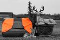
| 03/28/2005 01:01:49 PM |
Fallen Hunter (Deer's Revenge II)by buzzrockComment: Too funny! Thanks for adding some comedy to the compeition! haha. I love your composition, contrast and gre tones are perfect. And I really like how you left the vest open. Great job! |
| 03/28/2005 01:00:36 PM |
|
| Photographer found comment helpful. |
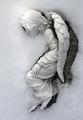
| 03/28/2005 12:58:37 PM |
Snow Angelby KaDiComment: I really like this photograph... the composition and lighting. =) It's a beautiful statue. However, I do not think that it really fits the challenge, even though I think I understand what angle you were taking with this. |
| Photographer found comment helpful. |
| 03/28/2005 12:53:31 PM |
In Loving Memoryby efrenComment: I really like this idea! I only wish the girl was in focus... the picture looks blurry. Also, the flowers next to the tree look very over-exposed. |
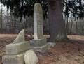
| 03/28/2005 12:52:15 PM |
Neglected.....by DrakeComment: With this photograph it is difficult to tell what is the subject without reading your title. Since the broke tombstone is the center of attention I would have revised your composition... because right now it looks like the tree is the focus. It's as if the tombsones are leading my eyes to the tree. The picture looks very dull... maybe changing it to black and white then increasing the contrast would make it "pop." |
| Photographer found comment helpful. |
| 03/28/2005 12:49:14 PM |
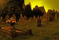
Peacefulnessby JamesterComment: I like your composition and subject... I just do not like the color. The sky looks very pixellated and the picture looks a little out of focus or not very sharp. I think I know what you were going for with the color... but I think that you need to tweak your technique a little. |
| Photographer found comment helpful. |
Home -
Challenges -
Community -
League -
Photos -
Cameras -
Lenses -
Learn -
Help -
Terms of Use -
Privacy -
Top ^
DPChallenge, and website content and design, Copyright © 2001-2025 Challenging Technologies, LLC.
All digital photo copyrights belong to the photographers and may not be used without permission.
Current Server Time: 08/01/2025 05:19:45 AM EDT.