| Image |
Comment |
| 04/15/2005 11:58:00 AM |
|
 Photographer found comment helpful. Photographer found comment helpful. |
| 04/14/2005 09:51:00 PM |
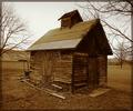
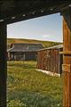
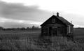
Century Barnby glk5406Comment: I'm struggling to pick out the barn in this. Your color is pretty good, but it's really hard to focus on the subject. |
| Photographer found comment helpful. |
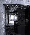
| 04/14/2005 09:48:25 PM |
Forgottenby cloudsmeComment: Nice tone, nice subject. But it's just too centered. Work on the composition a little on this and you could have a really great photo. |
| Photographer found comment helpful. |
| 04/14/2005 09:46:37 PM |
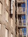
Blue Escapeby neophyteComment: Very good composition. Nice patterning. I'm not sure what it is, but it just lacks that little extra something that could have made this a great photo. (if I could figure it out, I'd tell you) I still like it though and I think it's going to do well. |
| Photographer found comment helpful. |
| 04/14/2005 09:42:45 PM |
Hardscrabble Timesby autoolComment: Nice change from all the others. Nice to see someone looking out of the doorway instead of in the doorway. |
| Photographer found comment helpful. |
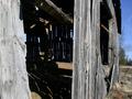
| 04/14/2005 09:41:33 PM |
Saneteriaby Gil PComment: I imagine it's what you intended, but I think the window is just too bright. The chipped wall in the front and the door is much more interesting, but the window keeps grabbing my attention. |
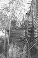
| 04/14/2005 09:39:38 PM |
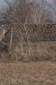
Reclaimed By Natureby WawaaComment: Not too bad. The left side of the building gets lost in the hillside. I keep finding myself staring at the front right corner of the building (but I think the doorway is more interesting). |
| Photographer found comment helpful. |
| 04/14/2005 09:37:30 PM |
Open barn doorby ShamanComment: It lacks a good attention grabber. I'm torn between looking at the inside or looking at the outside. I think the outside is better, but there just isn't enought of it.. |
| Photographer found comment helpful. |
| 04/14/2005 09:35:57 PM |
Dungenessby NobodyComment: Not enough contrast. With the sky being as bright as it is, I think you could have toned it down a little. I like the composition of it though. |
| Photographer found comment helpful. |
| 04/14/2005 09:32:47 PM |
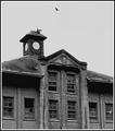
Empty Nestby MackFlixComment: It's too bad the upper right is so bright. This could have been really good if you would have been able to lighten it up just a bit. I like the composition and the overall appeal of this photo. |
| Photographer found comment helpful. |
Home -
Challenges -
Community -
League -
Photos -
Cameras -
Lenses -
Learn -
Help -
Terms of Use -
Privacy -
Top ^
DPChallenge, and website content and design, Copyright © 2001-2025 Challenging Technologies, LLC.
All digital photo copyrights belong to the photographers and may not be used without permission.
Current Server Time: 08/20/2025 11:59:52 PM EDT.