| Author | Thread |
Comments Made During the Challenge  |
|
|
04/19/2005 11:48:17 PM |
|
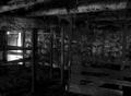
Nice perspective and photo really exemplifies abandonment, however I find the over all photo a little blinding/over exposed to the point of it being distractive. Still, nice composition overall. |
|
|
|
04/19/2005 06:41:15 PM |
|
Little too high-Key-- seems like it needs more contrast, not a bad photo, just not a WOW-- 6 |
|
 Photographer found comment helpful. Photographer found comment helpful. |
|
|
04/15/2005 01:17:28 PM |
Great composition. Your choice for making it a B&W was a wise one in my opinion. Contrast is a bit too low & little to no true black in it. Try this: Bring the brightness down a little, and the contrast up a little and see what happens.
Well Done! |
|
| Photographer found comment helpful. |
|
|
04/15/2005 09:10:19 AM |
|
black and white? I thought nthe rules said color and texture. |
|
|
|
04/14/2005 09:42:41 PM |
|
Interesting composition, but needs much more contrast. Sharpness looks good, but the shot is overexposed. You might try bracketing your shots. It uses more KB, but can be very helpful for the important ones. |
|
| Photographer found comment helpful. |
|
|
04/14/2005 09:35:57 PM |
|
Not enough contrast. With the sky being as bright as it is, I think you could have toned it down a little. I like the composition of it though. |
|
| Photographer found comment helpful. |
|
|
04/14/2005 08:23:02 PM |
|
Has too much of a painterly feel to the image (normally, not a problem.) It all looks too gray and not sharp to me. |
|
| Photographer found comment helpful. |
|
|
04/14/2005 01:34:39 PM |
|
a little too overexposed for me but a cool subject with effective composition |
|
| Photographer found comment helpful. |
|
|
04/13/2005 09:52:10 PM |
|
A little to much light for me , but I still like it--7 |
|
| Photographer found comment helpful. |
|
|
04/13/2005 08:09:47 PM |
|
great subject, but too light on my monitor. suggest increase contrast (or ues red filter). |
|
| Photographer found comment helpful. |
|
|
04/13/2005 07:26:06 AM |
|
Interesting image. I like it a lot, but just wonder what it would have looked like being a little darker and with more contrast. The top of the image is a bit hot for me, as the details get lost. I think added contrast would hellp bring out more details in the woods and grasses of this image. <6> |
|
| Photographer found comment helpful. |
|
|
04/13/2005 01:41:27 AM |
|
I think perhaps too much light got into this shot which has made it less distinctive. It's interesting material...I just think that the contrast needs to be more if this shot is in black and white. |
|
| Photographer found comment helpful. |
|
|
04/13/2005 12:16:05 AM |
|
Upper portion of the pic seems a little blown out, otherwise would have been an excellent image. |
|
| Photographer found comment helpful. |
Home -
Challenges -
Community -
League -
Photos -
Cameras -
Lenses -
Learn -
Help -
Terms of Use -
Privacy -
Top ^
DPChallenge, and website content and design, Copyright © 2001-2026 Challenging Technologies, LLC.
All digital photo copyrights belong to the photographers and may not be used without permission.
Current Server Time: 06/29/2026 11:48:33 PM EDT.