|
|
| Image |
Comment |
| 05/10/2005 07:21:37 PM | Tiny spiderby rameviComment: Greetings from the Critique Club. Thank you for entering the DPChallenge, Minimalism.
A green spider in the flower, is a good capture. The tiny spider is almost hiding from view. You can see some of its features, slowly crawling into its own world. Probably looking for food or shelter.
Good details on the spider. Its a bit hidden though, some of its body is out of view. It would have been better to see the front body parts, especially more of its eyes.
Technically the focal point is the green spider. However, the flower that surrounds him is out of focus. A better depth of field shot would have been less distracting to the viewers. I am not sure what type of lens you used, but sometimes on "macro" and closeups, the camera acts funny. It does not know what to do. It looks like this shot is very close, probably less than 8 inches.
Another factor to consider is your aperture settings. I see that its on F/5. A photo attempt like this one would be better with small aperture. The smallest as possible on your lens. Most of todays lens go down to 1.8 and average about 3.5- 4.0. At F/5.0 your depth of field will not be good.
The smaller the aperture the (larger f/number), the wider the depth of field (range of acceptable focus). The larger aperture (smaller f/number the narrower the depth of field.
Overall a great capture of Mr. Spider. It certainly met the criteria for a minimalism shot. It would have been better image if you had gotten the eyes in the frame. I can see one eye open, and the other would have made this photo more appealing.
|  Photographer found comment helpful. Photographer found comment helpful. |
| 05/10/2005 12:31:28 PM | Disturbed by PedroComment: Disturbed by Pedro, (Peter Marlin), was an excellent entry challenge.
Pedro is very imaginative and skilled at finding ways to enter the DPChallenges. And through his own admission, he states that he thought that this photo would not win him a ribbon.
Like all unique artists, you make art for your own challenges and hope others will agree with your work. If this disturbs anyone, how about the nudes that appear every once in a while in our forums and challenges.
Look the other way if digital art "disturbs" you. | | Photographer found comment helpful. |
| 05/08/2005 10:35:53 PM | | | Photographer found comment helpful. |
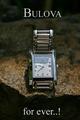
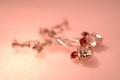
| 05/08/2005 10:24:08 PM | Bulova for ever..!by joaquinComment: Greetings from the Critique Club.
Thank you for entering the DPChallenge, Jewelry Advertisment.
Great capture. The choice of the watch and the rock creates a great appeal for your product. The light and dark tones also create an atmosphere of interest and uniqueness. The darker area's was a great place to the place the text. The entire photo scene almost feels like its near the beach, or a body of water. Your use of the frame and space, to position your watch is good. Your typeface, or font selection also gives the product a lot of class and value.
You have done an excellent job composing and photographing this ad.
Technically there are only some minor comments to make. One is the focal point of the watch. There is some blurrness in the center of the watch. The brand name "Bulova" is not "camera ready" sharp. The product name should be as clear as possible. Also the calendar date feature is also out of focus. There is a minor distraction on the left side of the watch face. Sort of a green color cast. This takes away from the silver coloring/material of the watch. There is also a shadow on the upper half of the watch's face which creates some distraction.
I am sure that you have notice newspaper and magazine watch ads. They set the watch to 10:10. The reason is be able to showcase all of the watch's features at a glance.
Like I said your typeface is an excellent choice. The title however probably does not need a ..! at the end. Bulova watches are very classic, elegant, and have very traditional style. The exclamation point is a cause for uneeded attention. Probably just ending it with three ... dots, would have suffice. You might get a difference of opinion here, but that is generally the advertising and marketing approach.
Just curious did you use a flash? Looking at the shutter speed of 1/500, I was wondering what light source you used?
Overall an excellent and well composed shot for the challenge.
Good luck in your next DPChallenge. Zagman.
|
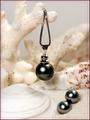
| 05/08/2005 01:44:39 PM | Fijian Black Pearlsby dkubinComment: Greetings from the Critique Club.
Thank you for entering your photo to the DPChallenge, Jewelry Advertisement.
Very nice capture of the black pearls displayed on sand and seashells.
Great compositional idea's. I am sure that many voters will find this presentation appealing.
Technically a hard shot to pull off. Their is a lot white balance issues to work with. This creates a struggle for contrasting one element to the other. There is also the flash area's that get hit in the foreground. I am assuming that you used a flash, because the pearls have a flash bounce on them.
The use of a more diffuse light and some fill in reflectors might have created a more even exposure and contrast.
Again a difficult shot if you only use normal ambiant lighting. Some of the background area's also lose detail. The ISO 800 settings sometimes gives off a grainy look. But you did a good job here, and those noise and grainy results are not visiable.
Overall a great image. The focal point and background elements make this photo very appealing. The use of some USM, in certain area's of the photo would have made it pop. The use of the white elements against the dark pearls was a great idea. It is also making a statement about where they originate in sea. The title and your framing left no question as to what you are selling. Great job.
Good luck in your next DPChallenge. Sincerely, Zagman.
| | Photographer found comment helpful. |
| 05/07/2005 12:38:01 PM | | | Photographer found comment helpful. |
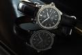
| 05/07/2005 12:17:23 AM | Omega DeVille Automatic Chronometerby fplouffeComment: Thank you for entering the DPChallenge, Jewelry Advertisment.
Wow, what a pleasure to critique this photo. Very well done. I have done many critiques so far and this one is a breath of fresh air. As soon as I saw it, I can tell that a lot of work went into this submission.
Yes one of the hardest photos to do is the jewelry display photography. The glare, lights, often take away valuable details from the jewelry that is being marketed and sold in the print media.
First of all looking at your notes I can see that you thought this well through. You knew your objective, even if it was intimating. You did not have all of the "pro light gear" but you forge through. Your determination paid off.
Technically its a beautiful image of a Omega wristwatch. Photographing a black and silver watch with a black face is a challenge. The reflection came out very well. The back light is well placed. The focus is spot on. I can see that this was an arduous attempt. Looks like f/11 at three seconds was the key setting. Also if you were not so honest about your shot, most people would not even notice the gray area's.
Some tips anyway. Most clocks when advertised show or read the time; 10:10, or 8:30. This shows area's of the watch better. This is especially true when you have a second hand, and a date calendar feature. Although your time displayed comes close. The other factor is the unfortunate angle of the image. Its almost leaning to the right too hard. It feels slightly precarious on the edge of the piano. It also forces the viewer to lean and refocus to enjoy the photo. Another suggestion that many members did, was to use type to promote their photo. Sometimes this helps or hinders the image, depending on the typeface that you use.
The yellow streak on the right hand side and some of the back white light is distracting but not enough to detract from a super job.
Great success, and good luck in your next DPChallenge. | | Photographer found comment helpful. |
| 05/06/2005 11:45:40 PM | L'amour Éternelby fotodudeComment: Thank you for entering the DPChallenge, Jewelry Advertisement.
Great idea and composition. The color and mood this image presents is worth looing at. Sounds like you did a lot of preparation for this challenge, and thought out the details. You have some good material to work with.
The jewelry is primarily out of focus. It is right in the middle of the frame and it distracts from the beauty of the jewelry. You needed to experiment with some better "Depth of field" options. You seemed to have the equipment, lens, camera, etc.
The entire jewelry piece is hard to see. It is blurry from back to front. Very unfortunate, since it has lots of potential for displaying well. You picked some great color combinations. Your light source also went well. Somehow between the execution and the final image, it came out blurry.
Technically looking at your camera settings. You say you shot this manually. You have a very fast shutter speed 1/400 of second. That's pretty fast for still life. Try experimenting with a much slower time and using a tripod. Also use the Nikon's auto timer, with the tripod. This should eliminate much of the blurness.
In jewelry advertisement, its very important to exact details. Its the details that sell product. People want to see all of the jewelry, as they imagine themselves wearing it.
Good effort, work on the DOF, and try different camera settings.
Good luck in your next DPChallenge.
| | Photographer found comment helpful. |
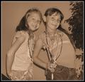
| 05/06/2005 11:27:51 PM | Girls can never have enough jewelry!!!by singsunshineComment: Thank for submitting your photo to the DPChallenge, Jewelry Advertisement.
Good candid photo of two young ladies. They look happy and willing to pose for this challenge. The twinkle in their eyes is priceless.There is an good amount of jewelry displayed. The frame is filled well with both subjects. I also see that the girls are both wearing "tiara's". Young princess' posing for you.
Technically the choice of sepia tone is well intended. But it does not show off the jewelry. The sepia tone treatment is an artistic choice, when you want to change the moood of a photo. Something that takes your mind and memories back. For jewelry advertisment is generally does not work well. The color cast of sepia tone down plays the jewelry's brilliance.
The photo effort as cute as it is, works away from the topic or challenge of the photo. The jewelry is not the main focal point here.
It's the kids wearing the jewelry. This image could better serve one of the people or family challenges. Also the two elments on the top right corner, the tree's and another object on the lower left corner are distracting to the viewer. Again it takes away from the reason of the challenge.
Your focus and framing are well done. Overall this submission would not normally run as a Jewelry Advertisment in a newspaper or magazine. You can't really tell what jewelry is being sold. The girls are having fun and I am sure that they would enjoy the final photo print out.
Always think about your subject and how best to present it. In this case it should have been the jewelry and anything else is secondary behind your product.
Good luck in your next DPChallenge.
|
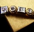
| 05/06/2005 02:30:33 AM | From the Gold Boxby loveComment: Thank you for entering the DPChallenge, Jewelry Advertisement.
A good capture of jewelry on a corner of a gold box. The jewelry looks like an older design, possibly from more than a few years ago. It's a good idea, trying to photograph your subject on the edge of the gold box. Your composition balances with the two elements on the frame.
There are some distracting factors however. One is the harsh light from the rear right side. The harshness of the light takes away valuable details of the jewelry. It also makes some the pieces lackluster, or dull. The area around the box on the top side is also wash out. Again the light which is providing a nice golden glow is also affecting the top half of your frame. The bottom portion of the box shows the actual texture of the box material.
It is still unclear what type of jewelry article it is. "From the gold box" could mean, rings, ear rings, bracelet. Sorry I can't tell.
Technically another approach could have been to try and shoot this on a manual mode if possible. Sometimes the auto settings are tricked by room light and temperatures. Flourecent lighting is very difficult to use as a light source as well.
But what you have here is a combination of strong lighting and very dark image contrasts. This gives the image a very uneven appeal. You created a very good layout with the jewelry and the gold box. Next you have to try different shots to generate more details from the available light.
Photographing jewelry is very hard to do. Its either too light or too dark. Its all about the lighting. Professional photographers use light meters, dome boxes, strong lighting equipment. And even those are not always perfect.
Good effort, good layout. Work on lighting resources.
Good luck on your next DPChallenge. | | Photographer found comment helpful. |
Home -
Challenges -
Community -
League -
Photos -
Cameras -
Lenses -
Learn -
Help -
Terms of Use -
Privacy -
Top ^
DPChallenge, and website content and design, Copyright © 2001-2025 Challenging Technologies, LLC.
All digital photo copyrights belong to the photographers and may not be used without permission.
Current Server Time: 08/03/2025 03:43:49 PM EDT.
|