| Image |
Comment |
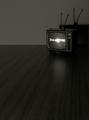
| 08/10/2005 09:29:22 PM |
1959by danderson107Comment: Nice use of negative space and rabbiit ears. This is easily the best use of rabbit ears I've seen in a very long time! |
 Photographer found comment helpful. Photographer found comment helpful. |
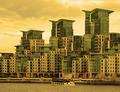
| 08/10/2005 01:31:59 PM |
Building Social Dividesby jseyerleComment: I found the golden color to be completely apropos to the theme. With the aid of the title, I was able to figure out that sometimes turning everything you touch into gold can have negative consequences. Social division is one. And I thought the photo managed to make that point better with this set of color choices - green and gold - than any other. I like the photo for the visual strength of its repeated elements, and for its unique color cast. |
| Photographer found comment helpful. |
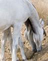
| 08/09/2005 04:55:13 PM |
Two For Oneby lynnesiteComment: I really like the composition and the textures. I find myself wondering whether that big gray patch of horse could not be treated in a more interesting manner. |
| Photographer found comment helpful. |
| 08/09/2005 04:47:44 PM |
Finger extensionby RUEDISCHMUTZComment: The white painted nails and black background proved an inspired choice. Nice texture and lighting. The illusion just about works in the thumbnail version. Nicely done. |
| Photographer found comment helpful. |
| 08/09/2005 04:43:54 PM |
Humpty Dumpty and the Floating Eggby Pug-HComment: Very funny, especially the stool. I wish the perspective were just a little lower and that mr D. figured a little more prominently in the photo. Finally, I wonder whether a nice clear blue sky with just a touch of cloud might have added to the illusion. In any case, It's clever and funny. |
| Photographer found comment helpful. |
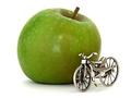
| 08/07/2005 11:28:48 PM |
Health and fitness programby GinaRothfelsComment: It seems to me that the photo correctly depicts the relative importance of EATING and exercise. I am entertained by the fact that at thumbnail size the bicycle looked briefly like a real one. In any case, this is a very droll shot. It is crisp and clean (as an apple ought to be.) And I find its simple composition compelling. |
| 08/07/2005 11:19:41 PM |
the umbrella boyby imagesloyolaComment: It's a photo that satisfies in many ways, at many scales. As a thumbprint, the beautiful color palette of white, charcoal and pink and the powerful use of space makes the photo compelling. At a larger scale, the details in the umbrella and the figure add interest. And at this scale we see some of the child's features and realize he is wearing goggles on his forhead. The sense of whimsey adds a humorous touch and a bit of pathos. It's really an unusual sort of photo - beautiful, quirky and compelling. Very nice. |
| 08/07/2005 10:43:03 PM |
Sign at an old hardware storeby puzzledComment: I like the simple composition, especially the way the shadow echoes the sign so clearly. The bumpy stucco wall adds interest. I also like the close crop (but I tend to crop more tightly than a lot of people at this site.) |
| Photographer found comment helpful. |
| 08/06/2005 12:33:14 AM |
Divasby whiteroomComment: What gloriously provocative expressions! Each is from a totally disparate emotional space. One might mount a heap of trivial quibbles about shadows being too strong or the background being just a tad distracting; but those three faces overbalance any hypothetical weaknesses a dozen times over. Very Very Nice. |
| Photographer found comment helpful. |
| 08/06/2005 12:29:21 AM |
360 Modena Spiderby wmprkgComment: Cathcing the reflection in the hood was a nice choice. Even if the room was that golden tone, it feels just a litte oppressive to me - a little desat might help. While this may be the right level of sharpness at which to print the photo, I think it looks a little unsharp for monitor presentation. And curiously, even though the stallion is anything but static, the framing of the horse left to right has a static effect. It feels static. Still, this is a nicely observed shot; and the treatment is solid. |
| Photographer found comment helpful. |
Home -
Challenges -
Community -
League -
Photos -
Cameras -
Lenses -
Learn -
Help -
Terms of Use -
Privacy -
Top ^
DPChallenge, and website content and design, Copyright © 2001-2025 Challenging Technologies, LLC.
All digital photo copyrights belong to the photographers and may not be used without permission.
Current Server Time: 08/04/2025 12:32:24 PM EDT.