| Image |
Comment |
| 07/07/2006 10:50:33 AM |
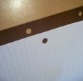
Light Slips Through Holesby right_fieldComment: I like the idea. I find the glare on the wall rather distracting. And I wish the paper had no lines and showed more texture. Knowing I usually crop too tightly, I think the photo would be a bit better with some cropped from the bottom. Finally, I might have played with hue and saturation a bit. This photo might be better as a sepia or b&w to emphasize the form rather than the color - which is not that interesting. |
 Photographer found comment helpful. Photographer found comment helpful. |
| 07/07/2006 10:41:59 AM |
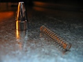
Spring to Actionby BK26Comment: I love this photo: the natural textures, the two-toned light and the simplicity of design. It takes a bit of time to understand that this is a piece of a writing instrument... |
| 07/07/2006 10:29:14 AM |
Pen to Paperby H700256Comment: The form is interesting. I like the repeating and amplifying loops. There is a sense, however, that the highlights are blown. And I guess I don't get the great empty space at the top ( if the title is referring to the great vacuum of space, then we would be expecting to see the pen at some distance from paper floating in the blackness of space as in "Pen to paper, pen to paper. Come in paper. Over" ) |
| Photographer found comment helpful. |
| 07/07/2006 10:23:14 AM |
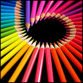
Sixby sherpetComment: A lovely arrangement of stationary pencils. Does one draw on stationery? I hope so, because I like this photo. |
| Photographer found comment helpful. |
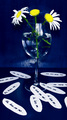
| 07/07/2006 10:21:45 AM |
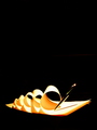
Love Notes...by SavannahComment: Very funny, but I'm not sure it will score well, Flowers are tough to do well. Since stationary is supposed to be the subject, but photographically the flowers are the subject here the photo does not fit the challenge well. The lighting causes a number of problems; glare on the glass and a distracting light 'hot spot' on the backdrop. On a positive note, I like blue. |
| 07/07/2006 10:17:21 AM |
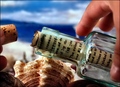
Captivating Correspondenceby maestroComment: I love the idea. Photographically speaking the execution is superb. It seems like it ought to be a quibble, but I really find the font on the document to look too anachronistic. The message in a bottle is a seventeenth century thing, isn't it? |
| Photographer found comment helpful. |
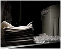
| 07/07/2006 10:14:33 AM |
Lost Evidenceby SherwinJamesComment: Great idea. Great lighting. I think I might have desaturated that tie a little more. And I find the vertical crack a little distracting. |
| Photographer found comment helpful. |
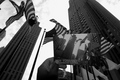
| 07/07/2006 10:12:26 AM |
I WAS THERE!!by Car54Comment: Clever idea. It takes some time for it to make an impact. But the more I look at it the more I like it.
Isn't it interesting how once the plaza had space for a numer of international flags but now its dozens of flagpoles fit only American ones? |
| Photographer found comment helpful. |
| 06/30/2006 11:33:21 PM |
|
| Photographer found comment helpful. |
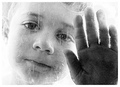
| 06/30/2006 11:21:17 PM |
Through the Looking Glassby L1Comment: Somehow the graininess works to strengthen the pensive mood set by the model and the high key treatment of him. It's a great shot!. |
| Photographer found comment helpful. |
Home -
Challenges -
Community -
League -
Photos -
Cameras -
Lenses -
Learn -
Help -
Terms of Use -
Privacy -
Top ^
DPChallenge, and website content and design, Copyright © 2001-2025 Challenging Technologies, LLC.
All digital photo copyrights belong to the photographers and may not be used without permission.
Current Server Time: 08/01/2025 02:29:09 AM EDT.