| Image |
Comment |
| 05/23/2008 05:03:03 AM |
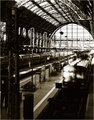
King Kongby JrodComment: reminds me of JL's earlier "transformer war" studies...;D
nice colors and angle, just not too impressive overall. |
 Photographer found comment helpful. Photographer found comment helpful. |
| 05/23/2008 05:00:59 AM |
Follow The Leaderby ak2007Comment: one of the best in this challenge, i love that boys little finger almost touching her hand. toning is very nice, i dunno what were going for with the selective desat tho ("we're both sitting in the same boat"?), would have liked to see it all monchrome. 8 |
| 05/23/2008 04:56:44 AM |
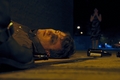
The Hitchhiker's Guide To The Galaxyby tccComment: is that a dirty car window? whatever it is is looks cool, like an angel or something...love the abstarct feel and vision that went into this shot. 7 |
| Photographer found comment helpful. |
| 05/22/2008 04:53:24 PM |
|
| Photographer found comment helpful. |
| 05/22/2008 04:39:52 PM |
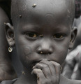
I Dreamed of Africa by scooter88Comment: extremely strong and provoking image. it's actually the first one in this challenge that made me search for info about the actual movie.
this picture is straight forward and makes us see that our daily-life problems are sooo very insignificant compared to what's going on in some parts of africa. these brandings are the most horrible part to look at. thanks for sharing this! an instant 10 and favorite |
| Photographer found comment helpful. |
| 05/22/2008 04:24:15 PM |
|
| Photographer found comment helpful. |
| 05/22/2008 04:21:52 PM |
|
| Photographer found comment helpful. |
| 05/22/2008 04:21:12 PM |
Punch-Drunk Loveby spiritualspatulaComment: this is quite story-telling and cinematic, i like it.
the colors are slightly odd, but just adds to the overall impression of the shot. 8 |
| Photographer found comment helpful. |
| 05/22/2008 12:21:14 PM |
Far and Awayby jgriecoComment: this has potential, but the composition unfortunately lacks interest.
i would have cropped the left part completely just so that the person is on the left edge of the frame. that way you would have gotten rid of the bushes, some of the stones and the railings with the post, whichare very distracting elements. also including more of the water would have added to the serene feel of the image and what were trying to accomplish with the title. what also bothers me is that the head looks really dark as if the person has a herlmet on or something, really strange.
the colors and the processing are very well done. overall a 5 |
| Photographer found comment helpful. |
| 05/22/2008 12:02:06 PM |
Twinsby asdisyrComment: concerning this image i'd rather say "clones"...;)
but honestly it's a beautiful study, the lighting and tones are wonderful as well as the simple composition. i think i'll have to start looking for a reflecting surface like this one to use in my studio... |
| Photographer found comment helpful. |
Home -
Challenges -
Community -
League -
Photos -
Cameras -
Lenses -
Learn -
Help -
Terms of Use -
Privacy -
Top ^
DPChallenge, and website content and design, Copyright © 2001-2025 Challenging Technologies, LLC.
All digital photo copyrights belong to the photographers and may not be used without permission.
Current Server Time: 08/12/2025 12:41:51 AM EDT.