| Image |
Comment |
| 09/23/2002 08:03:00 AM |
Wipe-Out by rcrawfordComment: This happened to be the very first image I saw when voting last week and it remained a favorite as I reviewed the others - congratulations on getting 3rd! |
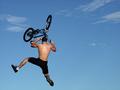
| 09/16/2002 08:40:00 PM |
Wipe-Outby rcrawfordComment: Wow! This photo is amazing! Excellent sharpness - composition is perfect; good use of space. |
| 09/19/2002 09:31:00 AM |
Light Danceby bobtburgComment: very tasteful and pleasing image - love the almost abstract quality. Excellent interplay of contrasting b & w with a hint of red. I actually think the thumbnail version is appealing in its own right because it is even more abstract - almost like a pen and inksketch, whereas the discernible detail in the full-size image creates a very different effect. |
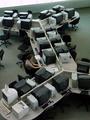
| 09/19/2002 09:36:00 AM |
Assignment Due Tonightby kwinterComment: I like this a lot - and it's not just because I like Macs! :) Very pleasing composition - nice almost monochromatic tones. I think this is a good example of how negative space does not have to be a plain texture or single color - the neg space also provides the interesting context for an otherwise humdrum subject. The layout of the other workstations is interesting from a graphic design p of v. I wish the chair at left middle wasn't there, though. Nice job! |
| 09/19/2002 09:39:00 AM |
Yellowby JackoComment: Classic example of this theme - love the colors, exposure, composition, focus! I was at a photography presentation recently where the professional photographer speaker showed several photos of this theme - not one of them had the Wow factor that I think yours does. Nice work! |
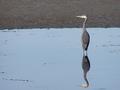
| 09/19/2002 09:45:00 AM |
Reflectionsby waltomlComment: Good use of negative space - nice tones. Pity there were ripples in the water around the reflection of the head. |
| 09/19/2002 08:57:00 AM |
flowerby notashamdComment: Clever use of negative space and (almost) rule of thirds! I like the ' mainly "greyscale" with single color point of interest' effect too. Nice texture on the neg space. |
| 09/19/2002 09:16:00 AM |
Cowspaceby RemieComment: Wow! Masterful framing - I think this has wit and holds great appeal! Excellent shot! |
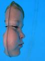
| 09/19/2002 09:14:00 AM |
Out of the Blue by JeanComment: Clever juxtaposition - how did you get the water to stand up vertically? :) |
 Photographer found comment helpful. Photographer found comment helpful. |
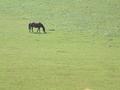
| 09/19/2002 08:58:00 AM |
Horseby DazzermasComment: Love this composition - good use of rule of thirds. I like your chosen size ratio of subject to background. |
Home -
Challenges -
Community -
League -
Photos -
Cameras -
Lenses -
Learn -
Help -
Terms of Use -
Privacy -
Top ^
DPChallenge, and website content and design, Copyright © 2001-2025 Challenging Technologies, LLC.
All digital photo copyrights belong to the photographers and may not be used without permission.
Current Server Time: 08/02/2025 02:02:28 AM EDT.