| Image |
Comment |
| 02/01/2011 08:15:39 PM |
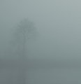
Mistreeby aircooledguyComment: I would have loved to see a liiiiiiitle more contrast in the tree. |
 Photographer found comment helpful. Photographer found comment helpful. |
| 02/01/2011 08:14:53 PM |
Caledonia in Snowby bassboneComment: Love this photo!
However, I gave it a lower score than I wanted for these reasons:
In editing, the whites in the snow were over-blown white bumping up the contrast/brightness. This is bad because the white over takes the snow on his face. The whites need to be even.
I like the horizontal orientation but I feel it needs to be taller to complement the long shape of the dog's face.
-7 |
| Photographer found comment helpful. |
| 01/07/2011 08:11:11 PM |
|
| Photographer found comment helpful. |
| 01/07/2011 06:59:02 AM |
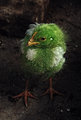
alienby UrfaKComment: Excellent use of editing, color and light! Totally a 10! |
| Photographer found comment helpful. |
| 01/07/2011 06:51:21 AM |
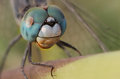
buggedby prashant_168Comment: Push the vibrance of the color and I would have given it a higher score. -4 |
| Photographer found comment helpful. |
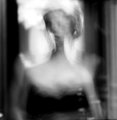
| 01/07/2011 06:47:28 AM |
drama queenby jmritzComment: I dig how there was some thought put into the blurs of this. Very fine art. Nice shot. |
| Photographer found comment helpful. |
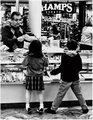
| 01/07/2011 06:45:23 AM |
Little Window Shoppersby crikComment: Looks way too much like a surveillance camera shot. Way too fuzzy, blacks are too black and nothing intersted about your subjects. |
| Photographer found comment helpful. |
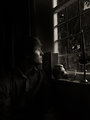
| 01/07/2011 06:43:29 AM |
Contemplatingby AdzComment: Lighting, awesome.
Subject, well posed.
Only suggestion, get rid of the props in the window sill. Takes away from the guy's face. Photo would seem less cluttered. |
| Photographer found comment helpful. |
| 01/07/2011 06:39:24 AM |
portraitby bvyComment: While I'm a sucker for a good texture shot, next time push the lighting and orientation a bit more. I think this would have been stronger vertically oriented. Also, using a higher aperture the make the shadows contrast more with the highlights. Remember this is white snow, so it looks like one big highlight. |
| Photographer found comment helpful. |
| 01/07/2011 06:34:22 AM |
Always Watchingby izadoodleComment: While the image quality and subject is great, more of the story could be told if more of the subject could be seen. |
Home -
Challenges -
Community -
League -
Photos -
Cameras -
Lenses -
Learn -
Help -
Terms of Use -
Privacy -
Top ^
DPChallenge, and website content and design, Copyright © 2001-2026 Challenging Technologies, LLC.
All digital photo copyrights belong to the photographers and may not be used without permission.
Current Server Time: 06/27/2026 10:12:20 AM EDT.