| Image |
Comment |
| 02/20/2005 04:56:44 PM |
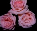
pink powerby gtp1164Comment: gina
I have two criticisms of this image: the composition and the tocal range.
Compositionally, the points of focus are the center of the roses; the lower right rose is well placed, but the left rose could be moved into the image more, to place it's center in a more powerful position, and to eliminate that black space between the roses that prevents them from being one 'subject'. The frame could be opened to prevent the top of the frame from decapitating so much of the upper rose.
Exposure-wise, this needs to be opened up a half stop or so. The colors suffer from desaturation, and the specular lights aren't crisp enough. After lightening this image up, the details could be enhanced by tweaking the contrast.
Just my thoughts. |
| 02/20/2005 02:13:07 PM |
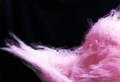
Found Artby grawkComment: Dan
I think this has a lot of obstacles. The eye is first drawn to the bright spot at the lower middle of the image, but there's nothing to draw the eye away from it: the detailed are to the right lacks sufficient contrast or (focussed) detail to be of interest, and the line the cotton candy makes isn't sharp enough to make the eye follow it.
I think your shutter speeed was about a stop too slow to freeze the motion, which is why the image appears out of focus.
I fear there's nothing here to hold a viewer's attention. |
| 01/23/2005 08:10:06 PM |
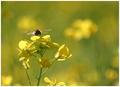
A bee in my bouquet!by arpitaComment: Excellent shot. Even the background elements are nicely placed in the composition. The only distraction for me is the blossom at the bottom of the image, but I think cropping it out would destroy the balance of the piece.
Guess we can't have everything *grin*
Nice job. |
 Photographer found comment helpful. Photographer found comment helpful. |
| 01/23/2005 08:06:51 PM |
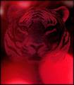
Shadows of Redby ace flymanComment: The tiger has insufficient sharpness and contrast to pull it away from the background. It looks too much like it is the background, and there's a key element of the composition missing. Then, the bright lights pull the viewer's eye away from the tiger, further alienating the viewer from the composition.
Just my thoughts. |
| Photographer found comment helpful. |
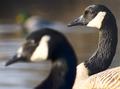
| 01/23/2005 08:03:24 PM |
Two Geese and A Mallardby ImagineerComment: A nice job framing the scene, and the middle goose is sharp and nicely side-lit. The large blob of unfocussed goose head that dominates the image is bothersome to me. It controls too much of the image for me, and is located in a position of dominance generally reserved for a subject, which (to me) should be the focus and in focus.
I don't generally consider myself a traditionalist, but I find the layout bothersome.
Just my opinion, of course. |
| 01/23/2005 07:46:42 PM |
Cell Towerby melsterComment: Bokeh aside, it's a nice stock shot. You did a nice job separating the top phone from the others, but at closer inspection, the focal plane of your lens did not match that of the phone. The top is slightly out of focus. This is a difficult shot, unless you're using a studio camera with an adjustable focal plane.
The corner burns are a nice touch. The only thing off-putting is the bright top right corner. which (imo) would look to have more natural light fall-off if it were burned in also.
Just my thoughts. |
| 01/23/2005 07:40:56 PM |
A Piece of the Frozen Forestby KekiinaniComment: While a good example of bokeh, and the pine needles stand out nicely agains the background (the water drops are a bit out of focus), the main subject as you have composed it is the snow, which is slightly over-exposed and lacking any detail that would make it interesting.
The viewer's eye is drawn straight to that clump of snow and stays there. |
| Photographer found comment helpful. |
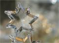
| 01/23/2005 07:37:22 PM |
Crystal Glowby Kathryn8Comment: Kathryn
This is a nice shot, technically. Nice detail and sharpness. The problem is the cut-off star. Both stars have nice, distinctive lines. The human eye follows a line in a composition (leading lines). You don't want a line that leads the eye out of the image, and that's happening at the bottom - those specular lines take the viewer out of the picture.
If you have a chance sometime, recompose the shot so there are no lines htiing the edge of the frame.
Just my thoughts.
Jerry |
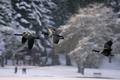
| 01/23/2005 02:27:21 PM |
Concertoby ellamayComment: Lynn
A lovely example of bokeh. Enough clarity in the background for the detail to engage the viewer, while still making the midground subjects leap off the image.
I think the only thing I would ask is a little more space between the third bird and the edge of the image: rather than being part of the triad, he seems left behind, as the edge pulls at him.
Beautiful work. |
| Photographer found comment helpful. |
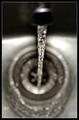
| 01/23/2005 02:23:05 PM |
Mid Flowby ManicComment: Hey Manic
I'm not sure this was the best subject for 'Bokeh', as a lot of the interesting detail is in the bottom of the sink, as a result, there isn't much to hold the viewer's attention. I'd like to see a little more on the bottom of the frame, also, to trap the eye and keep it from following the lines off the botttom of the image.
Just my thoughts. |
| Photographer found comment helpful. |
Home -
Challenges -
Community -
League -
Photos -
Cameras -
Lenses -
Learn -
Help -
Terms of Use -
Privacy -
Top ^
DPChallenge, and website content and design, Copyright © 2001-2026 Challenging Technologies, LLC.
All digital photo copyrights belong to the photographers and may not be used without permission.
Current Server Time: 05/13/2026 03:40:14 PM EDT.