| Image |
Comment |
| 02/10/2005 12:49:12 PM |
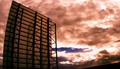
Credit Painby sir_bazzComment: Whoa, I hope that is not YOUR balance. Maybe would be better if the focused area was moved up more towards the center. A little too much blurry space on the top, but don't get me wrong, a very good picture (8) |
 Photographer found comment helpful. Photographer found comment helpful. |
| 02/10/2005 12:33:37 PM |
|
| Photographer found comment helpful. |
| 02/10/2005 12:25:30 PM |
|
| Photographer found comment helpful. |
| 02/08/2005 03:25:44 PM |
Filamentby NitinComment: Great idea, just too much white space (dead space or whatever you want to call it). Maybe if you cropped it a little more. However I do like how it is offcentered. |
| Photographer found comment helpful. |
| 02/08/2005 01:35:47 PM |
|
| Photographer found comment helpful. |
| 02/08/2005 01:30:22 PM |
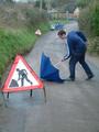
DESTINATION REACHEDby bairasComment: great tones, would probably be better if you included the front of that sign in the picture |
| 02/08/2005 01:28:20 PM |
|
| Photographer found comment helpful. |
| 02/08/2005 11:44:45 AM |
|
| 02/08/2005 11:39:11 AM |
|
| 02/08/2005 11:34:25 AM |
|
Home -
Challenges -
Community -
League -
Photos -
Cameras -
Lenses -
Learn -
Help -
Terms of Use -
Privacy -
Top ^
DPChallenge, and website content and design, Copyright © 2001-2025 Challenging Technologies, LLC.
All digital photo copyrights belong to the photographers and may not be used without permission.
Current Server Time: 08/19/2025 03:07:53 AM EDT.