|
|
|
Showing 201 - 210 of ~256 |
| Image |
Comment |
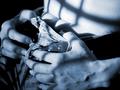
| 06/23/2002 11:08:00 PM | Moonlight Sonataby jmsetzlerComment: this is a great shot, john, but something bothers me about it. i think it's the cropping, mostly. it's kind of an awkward section and pose. but everything else is really nice. the focus, lighting, and "shadows" are great. i like the blue tone a lot, and i like that the blacks are very true black. good job. |
| 06/23/2002 11:18:00 PM | |
| 06/17/2002 10:33:00 AM | >>by mciComment: thanks for all the comments. a few remarks for those of you that asked: i did this by leaning out the passenger side window of the car with a short tripod. i put the tripod up against the side of the car and snapped some shots. i tried a lot of different angles, and was torn when submitting on which type of angle to go with. some showed a lot more of the road, which i was suspicious might do better in an "on the road" challenge than one without any real road at all. i ended up submitting this one as i really liked the effect that was going on and it was definitely the most "arty" shot of the bunch. i was happy with the shoot as a whole. the reason the right side is blown out is probably pretty obvious. it was a bright day and i was using a 1 or 2 second exposure to capture the blur. this, coupled with the fact that it's a dark green car (my girlfriend's mitsubishi eclipse, btw) made the photo hard to expose properly in all places. in the end, i liked the effect it gave, especially where it blends into the car on the top portion of the fender area. if i was really serious about making this photo look its best, and i had had more time, i would have had the car washed and waxed to get rid of some of the dust and pollen that you can see in certain areas of the photo. i think that was the only thing that i didn't really like about this shot. anyway, thanks again. |
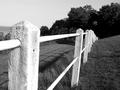
| 06/09/2002 11:19:00 PM | crooked fenceby mnewmanComment: marc, this is a great shot. my only wish is that the sky weren't so grey. otherwise, all the other contrasts are great, the depth of field is sweet, and the angle is perfection. great shot. |
| 06/04/2002 02:02:00 PM | Hair Cutby KimblyComment: this is really great. perfect lighting, great contrasts, and that negative space is scrumptious. this might look neat on a lighter background to introduce a tad more contrast, but you'd lose that amazing light streak and that would be a shame. great work. |
| 05/30/2002 08:19:00 AM | Fountain shadow girlby daclozerComment: great silhouette and great colors. i like the real dark blacks here. my only suggestion would be to try this with the subject off to one side instead of centered, and maybe zoom out a tad to increase the off-center effect. i think it would add a lot to this shot. good job. |
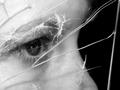
| 06/03/2002 11:27:00 AM | Glass Housesby mciComment: Thanks to everyone for the kind comments. I totally didn't expect this shot to do so well when I submitted it, but I'm glad it did. My original concept for this shot was to take a framed piece of glass and shoot it with a bb gun to crack it up a bit and shoot a picture of a person through the broken glass, preferably outdoors. Unfortunately, I never got a chance to put things together for that so I modified it at the last minute late Sunday afternoon. I cracked a plastic CD jewel case with a hammer and took some shots through that. I started with the whole face, then a profile, and finally after about 3 or 4 different sessions of taking pictures and seeing what they looked like, I decided to focus in on the eye area. Since the lighting in my apartment is pretty dark, I used a Canon Speedlight 420ex external flash to light the shot. If I had more time and a more patient model, I would have fixed a few things, especially the lack of detail in the eye itself and the one crack/highlight that goes right through the eye. I did, however, make a concious decision to leave the border on the right side of the shot. I thought it framed it better and added some life to the black. Anyway, thanks again for the comments. |
| 05/28/2002 05:22:00 PM | wonder in wonderland ...by magnetic9999Comment: i like this shot, but i think it's really underexposed. looks like you may have tried to compensate for it in photoshop and got the whites a little too exposed without really making the rest any better. everything else about the shot is good, though. |
| 05/30/2002 08:14:00 AM | April in May by connieComment: this is a great portrait. some might say that the right side is overexposed or blown out, but i think it works nicely in this shot. good job. |
| 05/30/2002 08:13:00 AM | Disappointmentby arnitComment: i really like this shot. the flat white background is perfect and the contrast is fantastic. good job. |
|
Showing 201 - 210 of ~256 |
Home -
Challenges -
Community -
League -
Photos -
Cameras -
Lenses -
Learn -
Help -
Terms of Use -
Privacy -
Top ^
DPChallenge, and website content and design, Copyright © 2001-2025 Challenging Technologies, LLC.
All digital photo copyrights belong to the photographers and may not be used without permission.
Current Server Time: 08/01/2025 04:29:23 AM EDT.
|